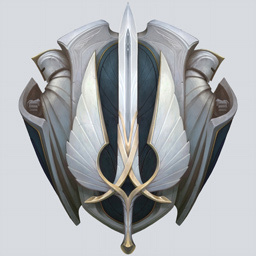
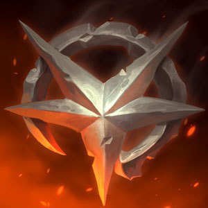
I have had 3+ people on the boards call me a "silver" because they thought my plat icon was silver.

Jesus is Savior·2/23/2016, 8:26:42 AM·4 votes·2,419 views

Why is this not being fixed? Why is Riot intentionally ignoring it? Why can't you just move the color slider from gray to green?

This is a REALLY shitty version I did in like 2 seconds. Yes, I know it's too green, but if an actual artist spent 30-60 seconds on it, I'm sure they could figure it out. Why can't it look more like this?

http://i.imgur.com/C2GKYHu.png[/img]

Quote from Riot KateyKhaos:

> [{quoted}](name=Riot KateyKhaos,realm=NA,application-id=mNBeEEkI,discussion-id=RvH9TUV5,comment-id=000200020000,timestamp=2016-01-15T17:23:40.388+0000) > > I brought it up for discussion, but the verdict was that changes weren't going to be made.


32 Comments

Riotmoonstones2/24/2016, 5:48:48 PM6 votes

We're not ignoring it - I've acknowledged the issue, as you've stated, and it's not something we are going to change.

Krigjer2/23/2016, 7:13:44 PM3 votes

You could just take solace in the fact that if they're insulting your rank, they've lost whatever argument you were having. Your rank doesn't automatically invalidate your opinion.

SailorPsycho2/24/2016, 6:05:25 PM3 votes

Who actually uses the icons? Honestly there's better icons to be using where as the season reward icons are kind of always meh.

WabberJocky2/23/2016, 10:27:47 AM3 votes

You sound like a cry baby

Aikata2/24/2016, 6:27:25 PM2 votes

How about you stop stalking red posts posting your crappy icon and just play the game?

Trylobyte2/24/2016, 6:30:36 PM2 votes

Fun fact: Platinum and silver are very hard to distinguish in real life just by their looks, and if you want to be annoying about it, platinum is actually duller and less shiny than silver is.

Axests2/24/2016, 8:55:58 PM1 votes

personally i liked the blue gem on the silver icon better, it had more "presence" then the sickly green gem on the plat icon. In fact i thought that gold and challenger came out with the best/most colorful icons. However compared to years before, while more original, i thought that the icons this year (including the ward) were lackluster. They just lacked color and felt bland, hopefully next year there will be an improvement? Not to blame Riot's artists, sometimes designs just don't click with the community, they'll surely take this into account and use it to improve in the future.

Digielf2/23/2016, 9:21:12 AM1 votes

Your icon looks 100% silver to me, i remember the platinum icons and they dont look like this

CatboyAsbel2/23/2016, 11:20:43 AM1 votes

what the heck? I thought you were silver cause that icon looks silver on my screen

Forbidden Siren2/23/2016, 3:55:54 PM1 votes

Well, maybe they're color blind. Most common colors to be blind with is red, green or blue.

tman30002/23/2016, 6:56:37 PM1 votes

THIS WHAT SILVER IS

Lauchmelder2/23/2016, 8:34:28 AM1 votes

Tbh I don't see a Problem with that. If they mock you about this you can retaliate with: "At least I climbed a few tiers already"