The Good and Bad: Kat's New Splash

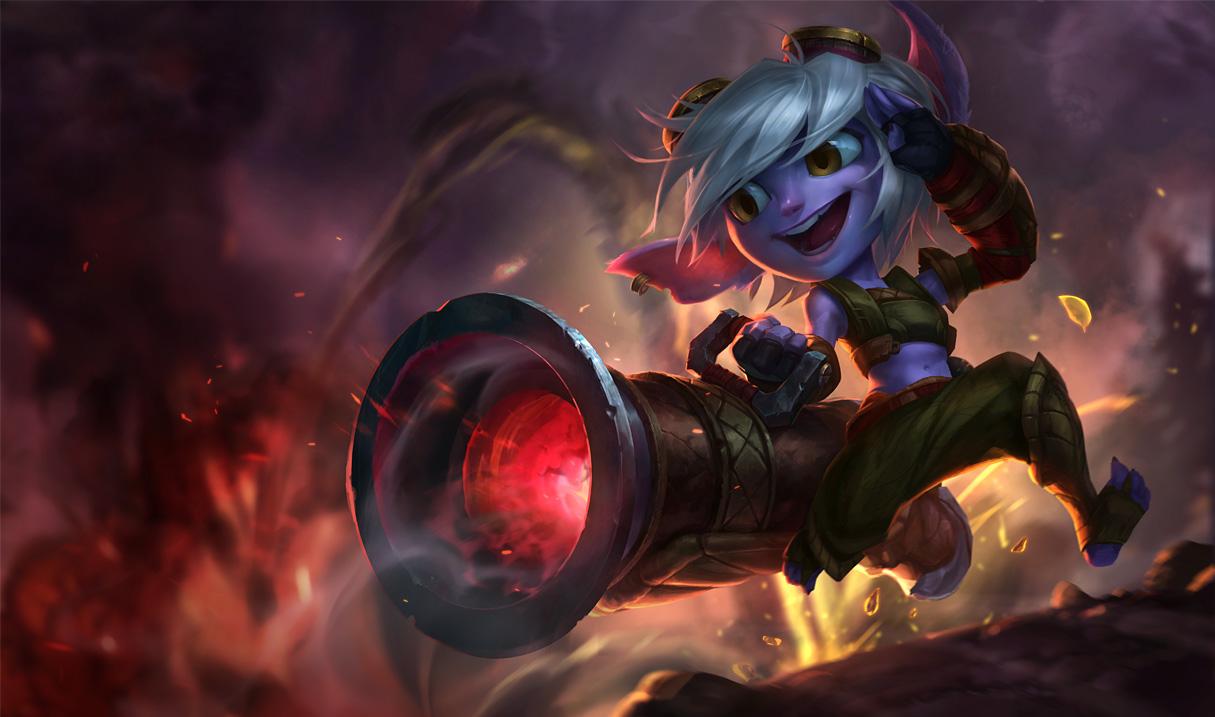
I've had some outspoken opinions on some of the new splash arts before. I thought the new Trist splash was absolutely terrible, mostly because she looked creepy and alien and deformed, like someone trying to realistically render a cartoon character. Her eyes were too big and she looked like a fuzzy blue fish. But, this is supposed to be about Katarina's new splash art, currently up on the PBE. Apparently the artist responsible, according to the Internet, is the same individual responsible for the wonky, bucktooth, distorted Siver splash that still exists in the client.
So, what's wrong with Kat?
Well, for starters, immediately, what is it we're supposed to be looking at here? I mean, it's Katarina, and dudes are dying around her, sure, but, what even IS that? The image is so distorted with action and foreshortening it's hard to identify what, exactly, she's supposed to be doing. The glowing effects are also red, and she looks like she's stepping out of a portal of some kind. If that's supposed to be Shunpo, her only portal-like ability, the artist got it wrong. Shunpo is blue, as are its effects, as we've seen several times in Riot's cinematics, and ingame. The only one of her abilities that's red, to the best of my knowledge, is her W, Sinister Steel. And that doesn't look like its being displayed here. if it is, it's being obscured by the distortion.
Wasn't Riot's design philosophy focused on "readability" and "clarity"? This art is not clear on what's going on.
Is it Shunpo? Is is Sinister Steel? Is it both?
And the readability is also off on what she's doing in general. Even if Sinister Steel or Shunpo aren't being used, people are dying around her, and she just looks like she's running ahead. There's a disconnect from what's happening in the scene around her. The image suggests motion, and quick and deadly motion at that, but what she's done or how she's done it isn't shown or suggested to the viewer in a meaningful way. The image just "looks cool" and makes no sense beyond that. And, honestly, it doesn't really look that cool. The colors seem off (her hair is highlighted with pink instead of red or orange from the lighting effects?) and ultimately her distorted body does more to put off the viewer than draw them in. This suffers in a lot of the same ways as the Sivir Splash does.
Yes, it's an interesting pose, but it makes no sense and has poor readability as to what is going on. The blade dominates the upper left of the frame, which is cool, and we can readily see her tattoo, her scar, and her eyes, but her eyes are subdued and faded. Compared to everything else going on, your glance is drawn anywhere but her eyes, and when you DO look at them, they look faded into the background of her face, and just a little hard to distinguish. The eyes are the window into who Katarina is when you look at her face, and when you look at them, you don't really get a feeling from them. Her face is too long, and while I like the "tougher" look that's been used here, that really needs to change. All the action is down by her waist and legs, and her main leg is warped by the effects going on.
It sacrifices clarity for appearance and dynamic action, and I don't think that's a good concept as far as demonstrating what a champion can do, or what they're about. Now, don't get me wrong. The contrast of light and dark, and the way in which the art was painted looks very good, and is far superior to a lot of splash arts currently in the game. That's a marked improvement. And, I understand Riot wants to move away from using the Chinese placeholder artwork and use their own, which is cool. Other splashes have looked good, like Gnar's or Azir's, Xerath's, and even the most recent Warring Kingdoms Katarina looked pretty solid, in my own opinion.
But this splash honestly just comes across as poorly finished. It looks far too distorted, confused, and unsure of what is going on. It doesn't flow, and has poor readability, and even the skills being highlighted in the splash are questionable. We can't tell exactly what's going on, and it looks more confusing than interesting.
So, that's my take for feedback. Hopefully, it'll be taken into consideration.
ADDENDUM: I should make note that ingame, Shunpo is, in fact, a red flash, while in every recent cinematic it's been portrayed as blue. So, there seems to be a disconnect with consistency on Riot's part. And, for that matter, I think the art, overall, is an improvement, but ti still has faults that prevent it from really hitting the mark, I feel. But they could be improved upon and the art used more or less as is with some changes.










 not this


 splash art. Man-face...