Fix Sona's Robe Design

Pika310··16 votes·12,636 views

In the recent Sona visual nerfs, they removed the Treble Clef design from her robes and replaced them with Bass Clefs.

This is a Treble Clef:

http://www.lunabellboutique.com/images/detailed/7/flair-music.note-400.jpg

It is used by most instruments, Soprano and some Alto ones. Including Sona's Etwahl. They were appropriately placed on Sona's original in-game model's dress design. They are also visually apparent in her current splash art.

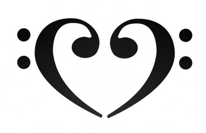
This is a Bass Clef:

http://clipart-finder.com/data/preview/bass_clef_144115.jpg

As you can guess, it's used by Bass instruments and other lower octave tools. It does not belong on Sona's model and is extremely offensive and disgusting to her character.

Seriously Riot, get your act together. Her original in-game model designer clearly knew what they were doing. How could you not take a few moments to research what you're doing so as to not make these horrendous mistakes?

Current model with Bass Clefs:

http://i.gyazo.com/975469378c8d54e68a8995becf59b24d.png

Old model and splash arts with Treble Clefs:

http://i.gyazo.com/1509438c15e667a97eeb2b9795adc538.png http://img3.wikia.nocookie.net/__cb20110222183950/leagueoflegends/images/b/b6/Sona_OriginalSkin_Ch.jpg http://i.gyazo.com/10553621e34156ae8252c3fc3eaee266.png

22 Comments

It Is I Emoto10 votes

I prefered her older robes much more because of the treble clef. Sona is playing quite a high pitched instrument, wich makes the bass clef quite weird on her dress. Even if they're usually located at the lower half of a bar, they're also on her robe, and even funnier that they're doing a heart shape, made me surprised. http://i.gyazo.com/7ac3f6dacef084f0897fc175ff43aa4c.png

. It's cute, but it doesn't fit Sona at all. The treble clef design was also much prettier.

The Stoic Hero4 votes

Agreed

Miku Hime sama5 votes

I doubt I would've ever even noticed the heart shape if you hadn't pointed it out. The two halves are so disjoined that it looks rather awkward.

I wonder if anyone on the skins team actually plays an instrument. They should've been able to notice the inconsistencies. It feels like some random kid googled "music symbol" and used the first thing he saw without realizing her dress design was already musically themed.

It Is I Emoto8 votes

You know whats even funnier? That heart shape is actually on her old base skin!

on the back robes.. never noticed them, but they do look less awkward on them than the ones she has right now LMAO

Miku Hime sama5 votes

Huh, the more you know I guess. Agreed they look better on the old model, but like I said they're disjoined now and that's what looks so off-putting. They're actually conjoined on her original dress.

This all aside, they have no place replacing the Treble Clefs on the front of her dress. It just looks awful, bad, awfully bad and badly awful.

It Is I Emoto8 votes

I think its still sad that Sonas current model doesn't shine as much as her older one. the robe is quite really dark, while on Sonas splash it's shining in a pretty gold tone. And still there no rioter who responses to this.. too busy at nerfing Sona

Pika3107 votes

I have to give due credit to Riot's old skins team who designed the original models. Some were true works of art, as far as game graphics go. I was truly awe-struck the first time I played Silent Night after picking her up in last year's x-mas sales. The vibrant colors were absolutely stunning and it remained my favorite skin up until they nerfed. Now the colors are gone. I can no longer see the colors. I feel as color-blind as my diabetic mother, now that the colors have gone away.

It Is I Emoto8 votes

Yeah, her older model is compared to the current one prettier. I really liked the gold effects on the robes, because they really shine on the skin. http://i.gyazo.com/0fb141542c22bd906f7ebee31a94076a.png

Her current one is really quite dark, and thats really sad, because christmas is all about being bright and beautiful :/

Pika3106 votes

Not to mention her hair on the new model is green. They quite literally started with a blue base, then plastered yellow over the bottom half. No effort whatsoever trying to transition or even at least separate the two colors. As we learned back in 1st grade, what happens when you throw yellow on top of blue? Voila, you get green. Surprise surprise. It looks disgusting.

They were sort of able to get away with this lack of effort on the Arcade skin, solely because blue is already a component of purple. Even so, that's still no excuse as it still came out looking bad as well.

Miku Hime sama3 votes

I can't help, but wonder if whoever painted this is color blind. Green hair aside, her upper robes aren't supposed to be red, they're more of a reddish-violet. Moving down, her bottom robe isn't supposed to be whatever horrible blue they're trying to pass off. It should be a blackish-violet. I think that's why the old Silent Night looked better, she had those magnificent contrasts between the varied shades of violet and the bright golds sitting opposite the color spectrum. I don't think they used any kind of violet a single time on her new model, it looks like they just used a 6-color box of crayons, with the purple crayon missing.

It Is I Emoto6 votes

Though, the ethwal on that skin is even less detailed on the original skin LOL I think fearless team was really just a bunch of unexperienced designers and this is really disappointing :/

Pika3105 votes

People with less experience get payed less. This is something companies do, they fire people that know how to do their job to intentionally replace them with noobs for a lower salary. I can only assume this is the exact reason League's quality keeps continually declining. In every deapartment: skins, balance, et cetera.

Rinky Dinky1 votes

You are starting to blow this out of proportion friend. I agree with most everything you have said, but come one.

Lets not over exaggerate.

Pika3105 votes

I'm not certain, it doesn't feel like an exaggeration. Within the past half-year, with the unbalancing and all all the skin and splash art complaints, this seems to be the type of business model Riot has begun to employ. I still mean what I said and that's why I originally said it.

Pika3106 votes

Honestly, the in-game skin designers take far too many liberties and stray much too far from the splash arts, sometimes to the point where champions don't look anything like they're supposed to. Some get to the point where you ask yourself, "Who is that?"

That's not to say splash art artists don't take liberties of their own. Sona had gold eyes in her original portrait, but in her current they were changed to blue. Mayhaps this was done to match Miku's eyes, who can say? I didn't play League at the time they did this, but I understand there were a lot of player complaints about it. I even still hear some to this day.

Pika3106 votes

#BetterNerfSona

fr0ztbyte2 votes

But Sona is all about that bass.

YoungVayu2 votes

{quoted}

But Sona is all about that bass.

I SAID IT FIRST!!!

Emmy Cha0s3 votes

Can we not... I'd really rather we didn't.

FantasySniper2 votes

Good eye, never noticed that they were bass clefs, but I guess that was just because the dots are positioned low. (And I'm always using skins)

I want a red right here and now.

Pika3106 votes

I want a red right here and now.

We all do, hence the purpose of the thread's existence. Sorry to say, the skins team is too busy lolifying Morgana and doing more nerfs to other skins that look perfectly fine as-is. The balance team is busy nerfing her kit.

Miku Hime sama2 votes

Welcome to the League of Lolis

Annie

More from Concepts & Creations

More by Pika310