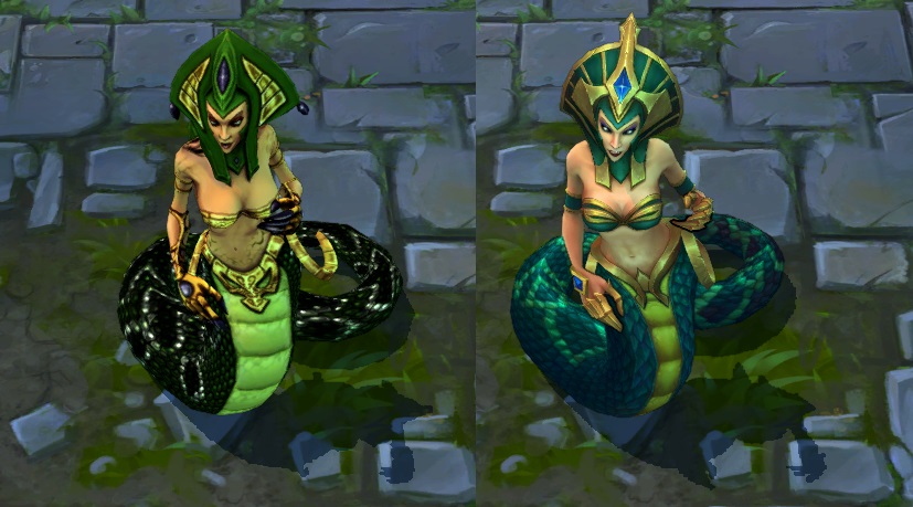
@ironstylus cass's VU is meh

http://www.surrenderat20.net/2014/08/827-pbe-update.html
- It looks like her head model is a little less human now. Or at least you really upped the size of the cheekbones into over-exaggerated.
- The visual details in the texture seem to be muted and more cartoony. I really like some of the colors, but there seems to be a bit too much of a trade off. That loss of shadows baked into in the texture are a big minus.
- Model tweaks seem to be minimal overall. Her headpiece on the base skin has changed but not much else.
- Did her rigging or animations get improved any?
- Mythic's tail looks nicer. The base skin isn't as contrasted, but looks nice in its own way. Desprada's tail is the worst of the changes. I'm not sure what to say about Siren. Her boob armor does look a lot better, but the pattern on the tail of the old texture was better. I kind of wish you changed her head piece more than her tail.
- Overall the skin tones on her human parts look a lot better though.
- The cleavage in the texture on the base model needs to be highlighted to match desperada's and mythics.
- Desparada is a disaster. I really, really love the black and lace corset motif on the new one, but it doesn't match her hat and the snakeskin textures on the old one were just so much richer it isn't even funny how bad this skin is. At least make it match the color of her hat (that should have gotten a new model as well to fit the new motif). I almost want to say you need to create a new skin based on the new clothing style on this skin and bring back the old style of texture for this one.
Gothic Cassiopeia? I'd buy that. Make her a blonde or a red-head and give her one of those cute little hats. Maybe a nice black tail with white underbelly to match... sort of like the black racers that live in my part of the US. Give her the current corset look on the VU.
Overall I'd say this is okay for most of the skins, but I was expecting something a little nicer. I don't think colorful cartoony works too well for cass. She needs some of those darker shadows she lost.