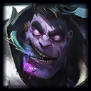
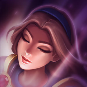
New Swain's icon looks too much like Graves

1 Wing··1 votes·801 views

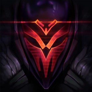
The icon used on scoreboards etc, for Graves and Swain: these icons look too much a like.

Graves Swain

a head looking left, in the same position, taking up the same amount of space. Light is lighting the same parts of the body. both feature a darker background for the character.

Why couldn't Swain be standing on the left, for example?

6 Comments

Glaedr2 votes

They look nothing alike

Slythion1 votes

Wut

Athenes Lulu1 votes

It's like saying Aatrox looks like Katarina

DU Baymax1 votes

Cassiopeia also looks like DrMundo

both have heads looking from the left taking up close to the same amount of space, therefore they're basically copies of each other

Bobloser35551 votes

The profile picture oft the New Swain is ugly, Roit pls

Irelia Bot1 votes

Meth...

Not...

Even...

Once...

More from Gameplay

More by 1 Wing