Project Ashe's arrow needs to be more visible on Summoner's Rift.
Rim Surfer·8/5/2016, 4:22:42 PM·243 votes·14,563 views

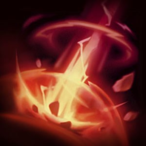
I'm colorblind, and Project Ashe's ultimate blends in extremely well with the grass on Summoner's Rift. The arrow is also very wispy looking, and that makes it even harder to see. I've been hit with so many ults from Project Ashe simply because I was unable to see them, especially when I'm focusing on something else. Please change the color, make it less wispy, or somehow more distinguishable for colorblind (or even non-colorblind) players like me.
84 Comments

Nahui8/5/2016, 4:25:17 PM60 votes

My only problem is the arrow doesn't look like an arrow, it looks just like a massive energy cloud. Although I'm not dumb and can identify it as the ult, my reaction time to that is much slower than any other skin. They could've made it cool and Project-y but still retained the look of an arrow.

Although not color blind, I understand where your frustration is coming from and I would not be surprised if League made visual changes soon.

R FLASH XD8/5/2016, 7:28:11 PM29 votes

I'm not colorblind but I agree that it's really hard to see

Riotmoonstones8/7/2016, 2:20:33 AM26 votes

Hey folks!

Thanks for taking the time to point this out (and to everyone who upvoted/commented as well)! I'd be happy to follow up with the team on Monday to talk about this. ^-^

EDIT: We're discussing the pain points listed in this thread and are discussing the best way to solve for the issues.

Kivolan8/5/2016, 7:39:35 PM16 votes

It looks too similar to hawkshot.

Dominick Destine8/5/2016, 11:37:32 PM15 votes

I am not color blind.

I have been caught off guard by Project Ashe's arrow because it doesn't stand out at all.... it blends in with her other skills and is a blatant advantage.

RookPusher8/5/2016, 7:30:38 PM13 votes

It's just visually similar to everything else in her kit. I'm thankful the enemy Ashe whiffed 3 before I had to pay attention.

As it stands, the Project skin now gives players who buy it an advantage.

YJRBqwXJcS8/5/2016, 9:41:43 PM13 votes

colorblind isn't even the problem, i legit can't see the arrow until it hits me

DrCyanide8/5/2016, 4:44:13 PM9 votes

Honestly, something about it makes me think "Hawkshot", which leads to me not dodging it, which leads to bad times. I wouldn't be surprised if Ashe has a noticeable win rate improvement with this skin on vs with it off.

DeathBurst8/5/2016, 4:42:29 PM7 votes

Agreed, +1. It's too wispy. And I'm not Color Blind.

DREADN0UGHT8/5/2016, 6:23:14 PM6 votes

Not color blind and that shit still evades my attention.

Canastus8/6/2016, 10:00:02 AM5 votes

I also can't seem to differentiate it from her usual Hawkshot, that thing definitely needs a visual overhaul. Right now the skin's pretty much pay-to-win.

Remember Vilemaw8/6/2016, 7:20:09 AM5 votes

Hi, I'm also colorblind, I understand that it can be difficult to accommodate for some players who are. But I feel that potentially adding some contrasting borders to the Ashe arrow could help a lot. I am also struggling to see the edges on ekko's stun, once again I feel that adding any form of edge to the particles could make it far more visible and less advantageous.

TY RIOT

rescued8/6/2016, 2:03:56 AM5 votes

I honestly thought hawkshot was her ult a couple times. They look too similar.

DarkRitual8/5/2016, 8:53:00 PM4 votes

It also doesn't have a super distinct sound when she fires it, at least the difference is much less than her other skins, where it should probably be amplified a little more.

Galihan8/5/2016, 8:38:35 PM3 votes

I'm pretty certain that unless they change how the arrow looks this will be one of those "banned from LCS" skins.

Xeruon8/6/2016, 12:06:49 PM3 votes

I'm not colorblind, but even I have a hard time reacting to it due to the color blending in with the river very well.

The Yukeh8/6/2016, 12:25:03 PM3 votes

I cant say anything regarding colours, but i do agree the arrow needs way more clarity. Right now it's just like a flickering ball of plasma - its about half as wide as the hitbox, and half as long. That means its extremely hard both to pinpoint where it'll hit and to dodge it.

SSShutTheDuckUp8/5/2016, 8:32:13 PM2 votes

and here comes pay-to-win LoL

Adauchi8/5/2016, 6:13:21 PM2 votes

+1

Thuban8/7/2016, 9:22:20 AM2 votes

Looks like an arrow to me. I don't have an issue with seeing it/noticing it either. Funny part is I'm near legally blind without correction. But my color vision is literally laser accurate. I have a large problem with many moniters. I will be adjusting my monitors 500 times a day if even one color was off. Contrast is even worse, the slightest contrast changes hurt my eyes if it isn't near perfect.

But I can see how it could be a problem. It's always good to have a color blind graphic designer around. When I was in school for graphic design, I liked to work with someone that was colorblind in my class. I would always adjust my designs to be in his favor.