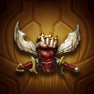
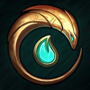
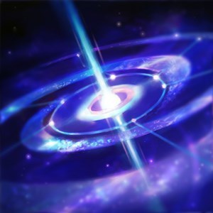
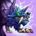
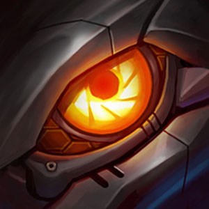
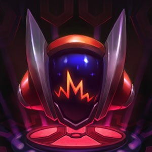
@meddler @kateykhaos The dragon icons need tweaking for clarity
Hyrum Graff··299 votes·23,989 views

It's important to know at a glance which dragon is going to spawn next. Right now, if you follow your intuition, you'll be wrong about which dragon will spawn. The air emblem is the worst offender, looking like water even after I look at it closely. You can figure the other 3 out, but at a glance they all look like earth because of the spiral, plus muted natural colors.

Current emblems look like this:

https://4.bp.blogspot.com/-JY0PM6v23Hs/VyLohVTfYXI/AAAAAAAAOVI/oiXmC0iU6ucxyf25gCM2hjOGymlSezp9QCLcB/s640/4rune.jpg

For reference, the dragons look like this

https://4.bp.blogspot.com/--MxYUj6CJiY/Vxbk214uSiI/AAAAAAAA6AE/K1xZwuJboRYbuGDwbcwsahiRFWAd59NHQCLcB/s640/%255EFFDDA78945E1D6C0F99381C91E7B75158CA848C6DD883E16BC%255Epimgpsh_fullsize_distr.jpg

Emblems should look like this:

http://i.imgur.com/kxD10lO.png

I made the water emblem blue instead of green so it's easier for colorblind folks to tell apart from the fire emblem. I'd rather see them change the dragon to be more blue than keep the icon green.


Edit2: I played around with this in grayscale, which is the best I know how to simulate being colorblind. Here's what that looks like for the current emblems. I found it pretty interesting how the "random blotches" actually play a big role in telling them apart, by changing how bright they appear.

http://i.imgur.com/ROjkpgc.png

The above emblems are easier to tell apart in grayscale than mine, except for air (although part of this is just because of loss of clarity as I have put them through filters). Here's another edit, changing the color/lumosity a little bit to help, including a revert back to Riot's earth emblem. If I were willing to do a bit more work to make it look good, I'd make the water a little brighter, but if I take the shortcut it'll look bad.

http://i.imgur.com/fHMeJCB.png


Edit1: it never fails to amaze me how much more people vote in polls than vote on the thread. And I didn't even include a joke option..

Edit3: I'm talking about, 500 poll votes compared to 175 thread votes. This isn't a complaint about people not upvoting -- I care about the visibility from votes but if my thread is on the front page already, who cares; it's just really interesting to me, that people will use a poll if I make it but not the poll that's built in to the system.
155 Comments

Wînter Fox57 votes

The Air one definitely screws with me - "Where's my regen!? Oh...it was the air one"

rinsujo11 votes

Yeah, as I was reading the thread, I thought the initial four pictures were water, earth, fire and air. I didn't realize the fourth was water until I scrolled down to the corrected ones. The three bar things look like waves on a shore when they're in blue. Once I get used to iit in game after a while I might be able to start picking it up easier, but this is so counterintuitive for a new change...

Dantone2 votes

Doesn't help that the symbol looks like waves (to me at least)

RiotSparkle51 votes

Hey friends, just a heads up that we're going to continue to do some polish around the dragons and these symbols in particular. :3

Flemman20 votes

the color is the problem imo, why green for water and blue for air, that make no sense in term of videogame standard (it's like if in a rpg collecting heart would kill you)

TurquoiseYoshi3 votes

Someone hasn't played Default Dan.

Nilok3 votes

And that game is designed to break common tropes on good game design. That actually more proves his statement.

TurquoiseYoshi3 votes

Ik. It was mostly just a joke, the first thing I thought of when he said that.

BADxW0LF9 votes

I really like this guy's idea of making the Air Dragon icon white rather than blue. When I think blue, I think water. Never seen blue air before.

Ackelope2 votes

.... But air is what makes the water blue .-.

Water is not blue, unless something is in it or it's reflecting something. It appears blue because it reflects the sky, which is blue.

Overall, I do think it's better to update the icons for more distinctions between each one, although I personally haven't made the mistake, it's obviously something that can happen, and it's such an easy fix, anyway.

Rendarkan3 votes

Actually...

The ocean is blue because water absorbs colors in the red part of the light spectrum. Like a filter, this leaves behind colors in the blue part of the light spectrum for us to see. The ocean may also take on green, red, or other hues as light bounces off of floating sediments and particles in the water.

Ackelope1 votes

Okay, maybe I was wrong, in which case, pardon me, I stated incorrect information without doing research to prove my point.

Regardless, water isn't blue. Its interactions with other things are what may give it a hue, not the water itself being blue.

Hellpyre7 votes

Well, interaction with photons is what gives everything its color. Water is a light blue-green in the same way that a tomato is a bright red. The sky is blue because it scatters light, and the ocean is blue because it absorbs red light.

FînalSpark2 votes

Tornado's aren't blue Janna

Hyrum Graff1 votes

[{quoted}](name=Riot Sparkle,realm=NA,application-id=3ErqAdtq,discussion-id=14opGQRM,comment-id=0031,timestamp=2016-05-06T19:58:21.855+0000)

Hey friends, just a heads up that we're going to continue to do some polish around the dragons and these symbols in particular. :3

Thank you for the changes this patch. They make a world of difference.

RiotSparkle2 votes

[{quoted}](name=Hyrum Graff,realm=NA,application-id=3ErqAdtq,discussion-id=14opGQRM,comment-id=00310007,timestamp=2016-06-07T04:15:36.141+0000)

Thank you for the changes this patch. They make a world of difference.

Hey, thanks! It's nice when people notice. :)

AMYS GRAVE1 votes
A little Peepo27 votes

Oh shit lol I thought the water icon was the air because why in the hell would air be blue? And why would water be green? Well at least now I know

Voluug133 votes

Hey no shittalking the Cloud Dragon!

Lord Galvatron7 votes

Thats a Cloud Dragon? I thought that it was a cyanotic Pigeon with cotton glued to it. My B

ArcticSirius2 votes

Don't anger it when it mega evolves. You wouldn't like it when it mega evolves...

Lord Galvatron8 votes

Bruh, I have seen Mega Gengar.

A day after I saw that, a person with a Jason mask came at me with a chainsaw at 10 pm, and my response was: "isn't it a little late for Hockey season?"

TurquoiseYoshi16 votes

I remember starting a game and having a debate between both teams on what the hell the first dragon was. We were guessing between water, earth, and air. Turns out it was water.

WHY IS IT GREEN?

Hyrum Graff3 votes

{quoted}

I remember starting a game and having a debate between both teams on what the hell the first dragon was. We were guessing between water, earth, and air. Turns out it was water.

WHY IS IT GREEN?

It's the same color as the water dragon.

The water dragon is that way because water is indeed green/aqua sometimes.

This doesn't make the emblem any less confusing.

Voluug137 votes

To be fair its a river, not an ocean, so the waterbeing green(er) makes sense.

But for everyone water = blue, decades of videogames and animation have taugh many this.

Kolinichu9 votes

Your edit is exactly as I imagined it would be, nice one friend! Let's hope someone at Riot sees your post! :)

Hyrum Graff2 votes

{quoted}

Your edit is exactly as I imagined it would be, nice one friend! Let's hope someone at Riot sees your post! :)

They will, don't worry ;)

Darkslayer852 votes

And lie to us. Like Solo Queue. RIP.

Hyrum Graff6 votes

{quoted}

And lie to us. Like Solo Queue. RIP.

wat

Sorry, I just don't see the connection, here. I know they will because I sent Meddler a link in client. Of course that's no guarantee he'll respond, but it does mean he'll see it.

Automatis8 votes

The air one used to be teal and the water was blue.

Then at the last minute they inexplicably changed it. I have no clue why.

Its another one of those Riot Head Scratchers.

Yours look infinitely better by the way. The professionals at Riot could learn something from this amateur.

IGII26 votes

The air and water dragon icon similarity is the biggest mess up for sure (why is air blue? why is water green? wut)

Also I feel like the dragons themselves should be recognizable from one another a bit more, I'm not really sure which one I'm fighting till it attacks and I see which type of attack it has. The elder dragon has clear distinctions, he is bigger, has horns and purple scales, but the basic dragons are basically just a recolor.

Why not make the Air dragon's wings look somewhat more thin (like a butterfly), Fire dragon's scales a bit more fiery and bigger (molten scales), Water dragon's scales a lot smaller (like a fish) and Mountain dragon should honestly be the biggest and the most robust one out of all the basic dragons (still smaller than Elder dragon).

GaleWinUnleashed5 votes

Biggest single offender is Air, I think. Make that white and Water will be more obvious.

Dr Poro3 votes

Also, I'd like it if the dragon icons on the scoreboard had different colors rather than all blue. I was excited when I saw we had a blue dragon icon on our scoreboard. Turns out it was earth, I was like "why is earth blue??" but everything is just blue for your team. There is enough blue on that side of the scoreboard to let you know that those dragon buffs are also yours. Or should we turn all champion icons blue as well?

Numb3rs3 votes

the only one that should be changed is the cloud emblem from blue to white. it kinda reminds me of a wave which makes me think its the ocean dragon. the other ones are fine

excodar2 votes

I would change all of them except the mountain drake.

Hyrum Graff3 votes

{quoted}

I would change all of them except the mountain drake.

Yeah, after I made the changes I considered reverting that one back to the live version, but I'd already spent around an hour working on the mockup, and I was ready to be done.

Probably a good 30-25 minutes of that hour was the air one. Converting to white while keeping it looking nice... shit's hard. Most of it is actually redrawn over the old one.

macromite2 votes

other than the stone one this is correct. the stone one is better brown, and not yellow.

Hyrum Graff4 votes

{quoted}

other than the stone one this is correct. the stone one is better brown, and not yellow.

Yeah. I actually agree, but by the time I was done and looking it over I was too tired and impatient to change it back.

GhastlyGhoulMan2 votes

I agree, why they made water green is beyond me.

Also, my favorite is the Fire Emblem. The Fire Emblem also happens to be Riven's favorite too. Huehuehue.

+1 bonus point to those who understand why.

Meep Man2 votes

Why isn't there an option for "No, it's not a problem, but this makes clarity even better."?

Hyrum Graff2 votes

[{quoted}](name=Inept Maverick,realm=NA,application-id=3ErqAdtq,discussion-id=14opGQRM,comment-id=0028,timestamp=2016-05-06T15:38:16.660+0000)

Why isn't there an option for "No, it's not a problem, but this makes clarity even better."?

Just didn't think of it.

PSOCALY2 votes

I think that the chat should say what dragon was slayed instead of just

"(summoner name) has slayed the Dragon"

so I think it should be better if it said

"(summoner name) has slayed (Element) Dragon"

Nameless Voice2 votes

To be honest, the shapes of all of those icons are extremely unclear. Your recolours help to make sense of them, but the icons themselves really don't convey what element they are meant to represent.

I don't understand why they didn't go for the traditional setup: Air = breath / cloud Earth = mountains Fire = flame Water = waves

http://i.imgur.com/OicF0Rd.png?noredirect

Instead, the current symbols look more like: Air = blue claws Earth = broken brown shield Fire = poorly-drawn red spiral Water = green caster minion head

https://4.bp.blogspot.com/-JY0PM6v23Hs/VyLohVTfYXI/AAAAAAAAOVI/oiXmC0iU6ucxyf25gCM2hjOGymlSezp9QCLcB/s640/4rune.jpg

GhaelWinds2 votes

As a color blind member, I was shotcalling during a ranked game to fight over (what I thought was) Ocean Drake losing giving the nemy 2 kills to get dragon so a decently worth trade, only to find it was the air dragon... #notworthanymore

Jonheath2911 votes

I actually love the green color of the Water dragon one, though I would like the Air one changed to white haha

Aheadatime1 votes

I'm colorblind, and not only do I agree with your photoshopped version of the icons, but I also feel like the icons themselves could be more intuitive. A small flame, a water droplet, etc. These current emblem/color combinations make me have to click on dragon to read which type it is, which sucks.

Hyrum Graff1 votes

{quoted}

I'm colorblind, and not only do I agree with your photoshopped version of the icons, but I also feel like the icons themselves could be more intuitive. A small flame, a water droplet, etc. These current emblem/color combinations make me have to click on dragon to read which type it is, which sucks.

I'd be interested on your opinion of the originals vs my first version vs my 2nd version (see edit to OP).

Aheadatime2 votes

I still like your first version most, under the bolded words "Emblems should look like this". The colors are saturated and distinct enough for me to tell the difference, which is important for us colorblinds. But yeah, the shapes are unintuitive. This is perhaps even more important than the colors for colorblind people. If we can tell the shapes apart at a glance, it wouldn't matter if they were all the same color. Here's some more intuitive shapes;

https://lh3.ggpht.com/kuskOgZvjr5tefLkXUqGxt3wxFy1IUIqHEowuZfi8a6Qd9XeASiXulDDMhcq1yKGGII=w300

https://cdn1.iconfinder.com/data/icons/weather-elements/512/Weather_VectorWind.png

http://homesteadgardens.com/wp-content/uploads/fire.png

https://d1u1p2xjjiahg3.cloudfront.net/910d6695-2c15-4af0-94c3-bf40a3b3379a.jpg

More from Gameplay

More by Hyrum Graff