Splash Arts that are worse than before

Lithium Rosa·2/8/2016, 2:10:38 PM·9 votes·3,088 views

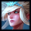
This is good http://i.imgur.com/aXvjfVS.png This is still good http://i.imgur.com/pLnqM3T.png But this http://i.imgur.com/bVw3YBc.jpg Who dafaq is this square faced ugly b*??? Where is my blonde qt? Hair color isn't the greatest issue but her face is obviously uglier than before. It's not proper to use the word "uglier" since she used to be beautiful, but you get my idea. I loved Janna SO MUCH before the so called visual "update"

This isn't perfect http://i.imgur.com/L14emzp.png But this http://i.imgur.com/CslkUw6.jpg I never knew Fiora is at her 40s. Even Riot with their terrible art taste found out how awful this is, so they changed it urgently. http://i.imgur.com/p8jC0Yb.png Helped a bit, but still under the region of "ugly" while she used to be "not far from beautiful".

Where did you even find those artists? You are really good at wasting your money Riot. Soraka and Poppy's VU are very successful, why don't you just keep using that guy?


15 Comments

Blood Magicks2/8/2016, 2:15:11 PM8 votes

Idk as a person with some experience in art (not much, but have studied anatomy, textures and stuff) and several artists friends I can definitely say that the new splashes are better in terms of art quality. And the women are fine too, they just look less anime.

Fowus2/8/2016, 2:18:22 PM5 votes

the katarina splash update was bad

UomoAfide2/8/2016, 8:24:40 PM5 votes

I really can't understand why you call these arts ugly. Sure the artistic style is a matter of tastes, (i didn't like this style too at first) but saying it's horrible/ugly/badly drawn isn't right at all.

magic pole2/8/2016, 5:25:19 PM3 votes

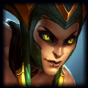
agreed. Janna Fiora Cassiopeia KatarinaAhri original or pre-update splashes were way better.


especially salty about the Cassiopeia Katarina updates

most of the yordle ones are improvements though

Tenant2/9/2016, 4:41:46 AM3 votes

I really don't understand why so many people have a beef with Janna's current splash. If we're going to criticize how the characters look in their splashes by how "beautiful" (an extremely subjective term) they look, I'd say the current splash is definitely more "beautiful" than what she had previous.

Not to say I hate the old one; I don't mind it, but she looks a lot more baby-faced and playful in it. I always considered her something of an "ascended human" character, so her looking a bit more contemplative and almost god-like meshed better with me, especially since her magic looks way more powerful than what she's doing in the old one.

Dafthar2/8/2016, 7:56:52 PM2 votes

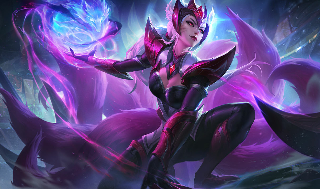
With all due respect to the authors, there's no doubt they have great skills. New splash arts are dynamic, they have superb color palette, contain lot of details etc., but some champions have lost their personality on the way. I mean look at Ahri: such a good piece of art, but I don't see the actual Ahri there. It's like looking at someone else.

Fashion Mage2/8/2016, 4:59:55 PM2 votes

Totally agree on the Janna one. They made her look old in her latest one despite the fact that she's supposed to have a youthful appearance.

Dominick Destine2/8/2016, 6:39:48 PM1 votes

Wow, the original Janna splash was beautiful.

Another contender for awful change is Cassiopeia's original splash compared to the butt-fugliness she has now.

KQarberroh2/8/2016, 3:44:13 PM1 votes

It's kind of like deadpool said, that is too much dude for me.... regardless of texture upgrade

Embertine2/9/2016, 8:18:25 AM1 votes

Honestly I cannot see what you are talking. The splash arts look fine to me. Even the older ones to be honest.