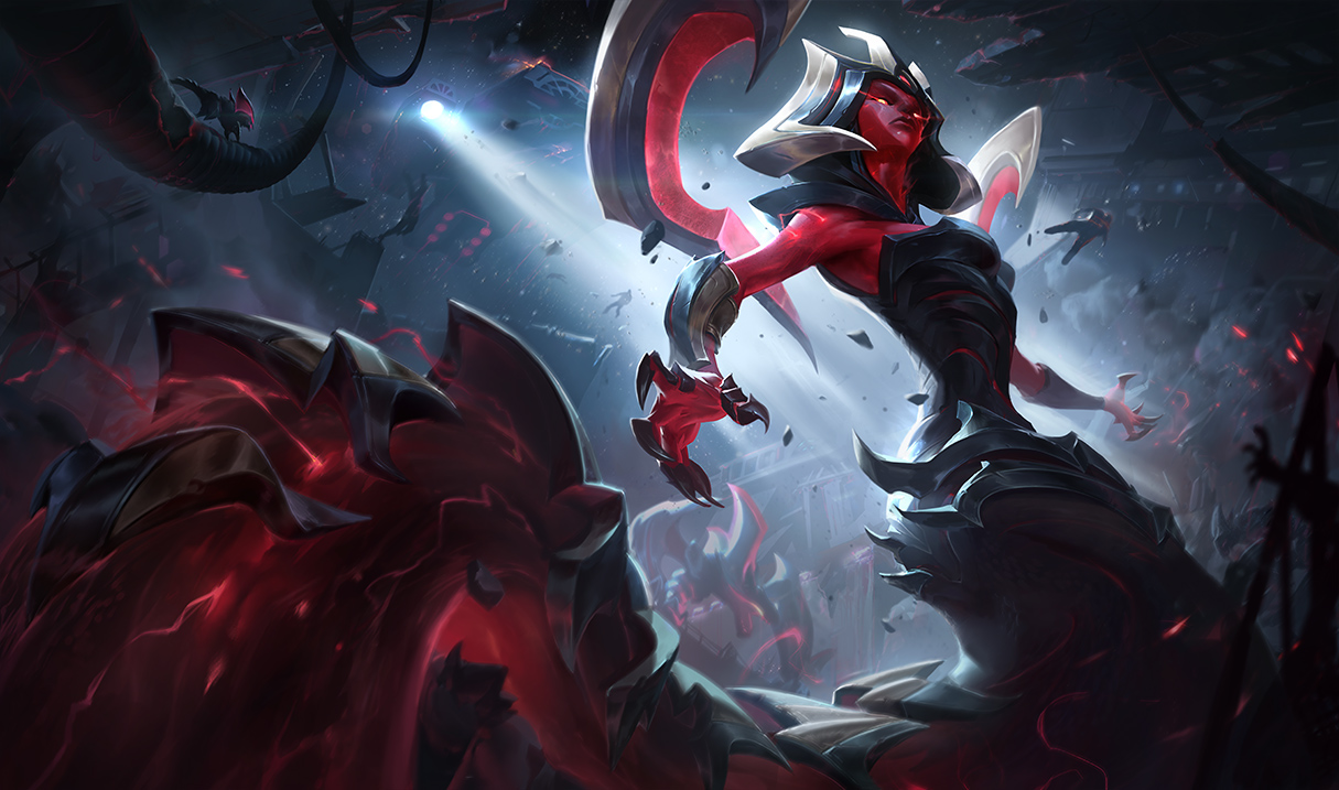
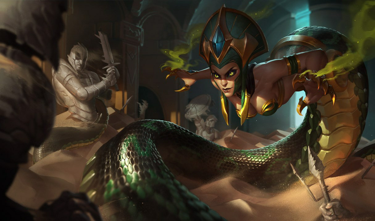
@Riot - Eternum "Cassiopeia's" face isn't Cassiopeia's face...

Oleandervine··36 votes·5,648 views

https://3.bp.blogspot.com/-5jA0ZXWR3W4/WZ3QXWQSw5I/AAAAAAAAsrM/xbC_VCVr8xcTWMOkrzpA2WJTltHuOEhvgCLcBGAs/s1600/d907a5efba9df2bd.jpg

This is not Cassiopeia. Sure, she's got a snake tail, but physically in the face, this is not Cassiopeia. Her eyes are tiny, and spread far apart. Her nose is wide and huge. Her lips are way too big. Cassiopeia distinctly does not have these features, and in fact has the complete opposite features. Please correct her face in this splash.

Actual Cassiopeia if you need a pictoral reference: http://ddragon.leagueoflegends.com/cdn/img/champion/splash/Cassiopeia_0.jpg

Thank you Riot! You fixed it!! https://pbs.twimg.com/media/DIB6HYoUIAAJ7dh.jpg

50 Comments

Nixtarma16 votes

I think once you account for the viewing angles (default is viewed from a neutral plane, Eternum is viewed from below) and their direct opposite facing directions, the differences you site go away. For example, the nose will naturally look bigger when viewed form below, that is where it is wider.

Besides, this is a skin, it does not have to be a perfect clone, nor should it be. In-game, her face will probably look much more similar, as it will be using the same rig.

Cheers, -Nixtarma

Oleandervine4 votes

Jade Fang is also from a lower angle, and you are looking up at her, but you're not experiencing such a different character as you are with Eternum. Sure, Jade's lips are slightly plumper, but her nose and eyes are the same as the main skin Cass, and not so heavily distorted by their angle. http://ddragon.leagueoflegends.com/cdn/img/champion/splash/Cassiopeia_4.jpg

Linna Excel1 votes

As much as I don't like the helmet design, Jade Fang is a better skin all around.

ModAcademy Kayn5 votes

You're viewing her from such a lower angle in Eternum, and in Jade, she's facing the camera. Like, an extreme lower angle.

Kissie1 votes

[deleted]

Solitair1 votes

{quoted}

well ahris legs in the academy ahri vs ahris legs in the new star guardians skin is so different ones skinny 1s thicc

Because star guardian Ahri is a higher tier skin. It includes a new model, while academy Ahri uses the usual one. Star Guardian Ahri also is intended to imitate teeny anime aesthetic, and as you'd say, the "T H I C C C" thighs fit into that aesthetic.

Kissie1 votes

[deleted]

Solitair1 votes

{quoted}

But syndras is the opposite She became skinnier

Maybe she appears skinnier, but it is using the same base model

Kissie1 votes

[deleted]

Solitair1 votes

{quoted}

looks at star guardian syndra splash looks at atlantean syndra splash

way dif leg sizes

its the opposite of ahri

their bodies should be reversed

Uh yea, splashes don't actually directly represent the in-game proportions.

inuitmailman1 votes

Jade Fang. Always thought it's a Green Bay packers fan just recolored

TheHappyReaperz8 votes

It's a skin, it's supposed to look different.

Oleandervine4 votes

Skins look different, but they're supposed to be the same character. Characters are defined by their features, and if it doesn't have Cassiopeia's facial features, it isn't her, it's some other snake woman.

TheHappyReaperz7 votes

https://vignette4.wikia.nocookie.net/leagueoflegends/images/4/45/Nocturne_OriginalSkin.jpg/revision/latest/scale-to-width-down/640?cb=20170621014540

vs

https://vignette1.wikia.nocookie.net/leagueoflegends/images/4/4e/Nocturne_EternumSkin.jpg/revision/latest/scale-to-width-down/640?cb=20170621014254

Note the differences in the eyes, with base Nocturne having more oval-shaped eyes, while Eternums are far more angular. Eternum's face is also more angular, the chin is longer, and it lacks the more defined facial features of Nocturne's base skin splash.

Solitair1 votes

{quoted}

It's a skin, it's supposed to look different.

I personally think the splash just wasn't finished/finalized in the first version. This isn't an uncommon thing.

Blood Magicks5 votes

She looks like a female Voldemort imo.

Anyway, I too am disappointed she isn't cuter.

revliledpembroke1 votes

Well, both do have snake features in their "new" bodies, so.... It isn't an unfair comparison.

forist4 votes

Translation:

Her face is very unattractive in this splash and I'm mad about it!!!

(basically 90% of complaints about skins for female champs)

Oleandervine2 votes

I'm not mad about an unattractive splash. I'm upset because that face isn't Cassiopeia, just like this face wasn't Lucian: https://4.bp.blogspot.com/-seiJqipkOnA/WGxDjGNOR_I/AAAAAAAAbOQ/kbkDIZokDsEQ649YkecF9GzMlFvp2XN4wCLcB/s1600/LucianLoadscreen_7.png

forist1 votes

That's fine. I know it's an unpopular opinion, but I actually do like the fact that skins sometimes make a champion look dramatically different than they normally do. I see no point in buying a skin that doesn't have significant differences from the base splash.

ElfOfTheDesert1 votes

Skins should still have the appearance of the champion in them. If they don't it's like seeing some one else.. Like with that Heartseeker Lucian one for instance, oh dear god that face was so off. The eyebrows were massively thick and pointed so weird at the ends.

The with the Cassi one, she's got like this flatten face. She's kind of looking up yes, but it loses all the definition of Cassi making it look like it's almost someone else. I don't even recognize her in that splash. The fixed one brings her look as if she's glaring at an opponent and has a more sinister feeling coming for her. Plus the lighting overall changed around her face now and it actually flows better with the whole image.

forist1 votes

I mean that's just your opinion though. There are probably more examples of skins that dramatically change the facial aesthetics of the champion in question, than ones that don't.

ElfOfTheDesert1 votes

Not really. All of the splashes that Riot makes keep the appearance of the champs the same as they want them to hold clarity.

Guiboulou4 votes

They already updated it

[slayer-jinx-catface]

Catastrop3 votes

{quoted}

They already updated it

[slayer-jinx-catface]

It looks 100x better now. The face was pretty much the only let down about this skin.

Sukishoo3 votes

That fix is SOOOOOOOOOO much better. It's no longer flat.

Spęctre1 votes

Are you blind? The new face has no definition what so ever, it is so much more flat then the original.

Sukishoo2 votes

You are nuts. It looked nothing like her first of all, and second, it was completely flat... it had nothing that defined it as her face. Now the position has changed and you can see the facial features and it looks like her character.

Colonel J2 votes

zzz

Cassiopeia mains are so annoying.

DeadUnborn2 votes

the face portrait is going to be fugly XD

WinTheWarOnPants2 votes

Honestly the old one was better. Skins rarely match the faces of the champs. In the old one her face is menacingly looking down on you aka her prey. In the new one its just boring blank stare into the distance. Very disappointing.

Moonboy653 votes

they changed it so it would be more in line with the model

WinTheWarOnPants2 votes

well it's not lol The change took essentially all definition out of her face. She almost doesn't even have a nose in the updated version, and her lips a straight and flat unlike her model and classic splash. Her face isn't even human in the updated version. Not saying the orginal couldn't ahve used work, but they made it much worse IMO W/e though, I'm not buying the skin anyway. You guys can have your silly robo face skin lol

Edit: OK i was confused. OP was talking about what the "real" Cass looks like(which this update looks nothing like). The model for the eternum Cass skin looks much more like the update with very flat features. I legit thought you guys were blind lol but it was just OP that was crazy.

Crystal Rush2 votes

I personally liked the first splash better; she looked badass and had that flash in her eyes and similar details on her face and neck. The updated version is a bit blank.

Moonboy653 votes

no her face look horrible, it wasn't faithful to the in-game model at all

Jerry SeinfeId2 votes

so we went from a face shown form a slightly lowe'r perspective to voldemort. kk sure w/e boats your float.

Thefrostyviking2 votes

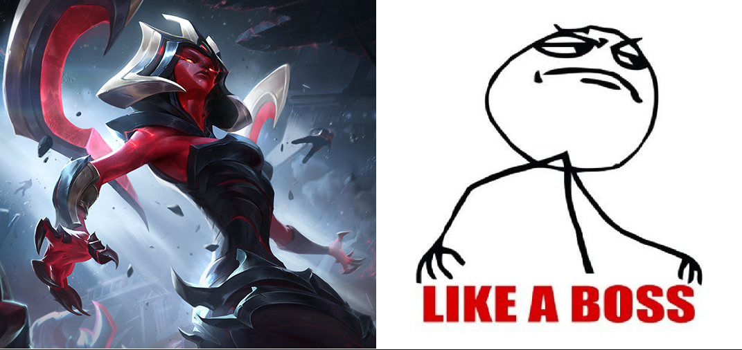
OP you are a boss O_O

They actually fixed it-

Zyranium1 votes

Her jaw in this skin is so big, I mean I like monster girls, but it's not what I expected for Cassiopeia, and many people complained about her face, it doesn't look like Cassie, it reminds me of Kalista

Please fix her face

Moonboy651 votes

they should at least give her better face

N Komaeda1 votes

Unlike Jade Fang, which you stated in a previous comment, this skin has a 20° angle upwards, meaning that the features you named stand out. Classicopeia, on the other side, is seen almost directly from the same height, thus meaning that her features are slimmer, and more streamlined.

Some Noob Dude1 votes

Honestly, the skin overall is pretty meh overall, I wanted a new Cass skin, but I don't even want it anymore. It's a shitty red recolor of her stuff that also makes her uglier.

I Main Swain1 votes

honestly a big part of it is the angle, its a HORRIBLE angle, like possibly the worst they could have picked

Sexy Jack Rabbit1 votes

You can't say "It doesn't look like her" because every female champion has the exact same fucking face. They are all generic af looking.

Spęctre1 votes

Yeah first face was better, people are just directionally challenged whiners.

Silvarspark1 votes

https://orig02.deviantart.net/14f7/f/2017/237/8/f/cass_splash2_by_shockowaffel-dbl8ky6.jpg

The splashart update is a lot better, but there are still two things that can be fixed to be more faithful to the skin. 1 These eyebrow extensions 2 The dark lips

Also I experimented with the skin a little. I feel like the gold parts on the head are somewhat distracting and the head is a bit too orange. Please, tell me what you think.

https://orig13.deviantart.net/4ec9/f/2017/237/e/2/cass_skin_by_shockowaffel-dbl8ky9.jpg

More from Story, Art, & Sound

More by Oleandervine