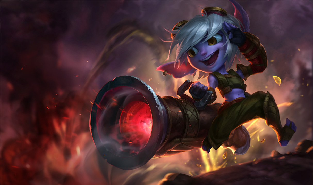
Anyone else not liking how this splash is looking?

Rew711··76 votes·5,708 views

http://4.bp.blogspot.com/-3vzbLyDxBjs/VMGcFG_v29I/AAAAAAAAiO4/zhe4Zl2Iatw/s1600/Tristana_Splash_0.jpg

Well, I mean, its definitely better than no update but... I mean, its no one-up from

http://ddragon.leagueoflegends.com/cdn/img/champion/splash/Tristana_0.jpg

It's just... those eyes...

I say, Riot should look at the first "new" splash art and try and take what made it neat and throw those into this new one.

52 Comments

The Red Warden16 votes

It makes her look like a smurf even more than her old model. It looks like a cartoon character, and doesn't match the art style Riot seems to have been going for.

Rew7116 votes

I'm just sad it doesn't really match (at all) the look and feel of the visual in-game.

http://3.bp.blogspot.com/-oAZCZwOixhI/VLXJoipRZFI/AAAAAAAAheo/itJgIqrVsio/s1600/heyguyswhatisup.jpg

I mean, look at the face. It's so much more round. Her arms are much thicker, not sure about the legs, though. Her eyes balls are much bigger. And her ears curve more. I think that if they could fix these, then we might have a much better splash art.

I want to know what made them go from this

http://na.leagueoflegends.com/sites/default/files/styles/scale_xlarge/public/upload/tristana_promo_background_-_2.jpg?itok=wixnbknf

to that. It makes no sense.

They went through all the trouble of making her so cute and adorable.

http://news.cdn.leagueoflegends.com/public/images/articles/2015/january_2015/TRSTUP/Tristana_Loop.mp4

http://am.leagueoflegends.com/image?f=http://news.cdn.leagueoflegends.com/public/images/articles/2015/january_2015/TRSTUP/tristupdate_comic.png&resize=1024:

http://am.leagueoflegends.com/image?f=http://news.cdn.leagueoflegends.com/public/images/articles/2015/january_2015/TRSTUP/Lineup.png&resize=1024:

I mean, just what happened?

The Red Warden3 votes

I kinda have a feeling that the reason the splash ended up like this is because they wanted to keep most of the old splash instead of making it fully unique. Since they based it off the old one they had to keep the angle of the shot which means that the new one would have to recieve a few body distortions to make it fit in the shot.

Grouchy Poro1 votes

It looks to cartoony. Like way too cartoony. I'm glad I wasn't the only one who thought this splash looked wrong soon as I saw it.

Sansix

[{quoted}](name=The Red Warden,realm=NA,application-id=6kFXY1kR,discussion-id=KqYUtEVt,comment-id=0003,timestamp=2015-01-23T03:22:46.858+0000)

It makes her look like a smurf even more than her old model. It looks like a cartoon character, and doesn't match the art style Riot seems to have been going for.

It's unfinished.

Sisuwolf1 votes

The problem is that it exactly matches the art style Riot is going for, cartoon / paper looks. Since the "VU's" have been coming we consistently see these type of changes, trading realism for over the top cartoonification, totally ruining the beautiful art style of this game.

Heimer was one of the first to go, and before the "VU", WAS my favorite character. They totally killed his scientist identity, and now is just some bumbling idiot cartoon.

That was part of the reason I started playing this game, the wonderful and realistic art. Atleast more realistic than most video games, it is was the FFXI(MATURE REALISTIC ART STYLE) to the rest of the WoW's(OVER THE TOP CARTOON ART STYLE) It is getting closer and closer to looking like a complete replica of DOTA.

Part of the reason I chose LoL over DOTA was the art, and now they are stabbing us in the back. Might as well go sign up for Heroes of the Storm.

TRIST LOOKS LIKE GARBAGE, ALONG WITH MOST OF THE OTHER MAJOR VU'S

RITO B TROLLIN'

aaronconlin9 votes

She looks more like a little kid/cat version of Jinx.

Meruvin7 votes

This new VU Splash art looks so incomplete and totally less charming compared to the old one.

Nagirah5 votes

Not a fan. Not at all. And I usually like these new splashes riot makes...

The Soulforged4 votes

It's like they're trying to make her look as goofy looking as possible.

ArcticSirius4 votes

Too, cartoony. While there's something in the face that just screams "no", there's also those pants that are killing it for me

Silmaril4 votes

I think the base idea is ok, but there are a few spots that make her look kind of weird.

  • Her head is football shaped, while currently her head is more egg shaped. I think if they made the new one a little bit thinner and taller, it would look better.

  • Her eyes are too big. The current one has abnormally large eyes as well, but the creepiness factor is heavily abated by having one eye partially covered by her hand, while her hair hangs over the other, so she can have those cartoonishly oversized eyes without being overly creepy. The new one has her eyes on full display, and it just looks unsettling.

  • On the subject of her eyes, her right eye is drawn poorly. From the perspective, her right eye is supposed to be farther away, but her pupil seems to be slightly bigger for some reason. Her right iris is positioned to close to the center of the face, making her look cross-eyed. On top of that, the iris seems to be too tall, possibly as a result of poor shading, so she seems to have one normal eye and one cat eye. That eye is probably the most disturbing part of the whole splash, tbh.

  • The mouth is way too big. Current Trist has this problem too, so I guess it's more of a lateral move than anything. Not a terrible issue on its own, but doesn't match with any of the other League champs.

  • Her upper body doesn't match her lower body. Tristana's always been fairly stocky, but her new splash makes her look thin and willowy. However, her legs seem to be about the same size as before, so there's a bit of a mismatch between her upper and lower body.

  • This is a bit more subjective, but the background is better on her current splash.

Purodyuusaa3 votes

Right click > Set as desktop background

femmé3 votes

it just doesn't look right for league i guess, no one can put their finger on it but i think the style just isn't the same as lol

i really like it doe i've hnnnnnng to hard already

DynamiteGazelle3 votes

I wish they would've just modeled the new Tristana straight off the (old) new splash. Her armor looked so cool and it was everything a Yordle should be in my mind. And I get that they wanted to make her "go commando" but I think the lack of armor, and not just that but bare stomach does not fit at all. It's like taking a cute little stuffed animal and trying to sexualize it :P But the new visual direction is just too human-esque for me. I miss the cute squat little yordles of yore and their little round faces :'( I just feel like the new Yordle direction is a visual style that has just been done soooo many times..

Tilomentry3 votes

I kinda miss the devilish grin she had in the preview. Otherwise its not bad

MrBuffington3 votes

They've reverted it and are working on improving the splash:

http://www.surrenderat20.net/2015/01/122-pbe-update.html#triremove

Rew7111 votes

ty

JØJł2 votes

Yeah I don't like the new one they made for her.... I prefer the one she has right now... I don't know... but the more I look at the new one and she just looks.... kinda creepy.

RavenKouhai2 votes

I like everything except those goddamn cartoon eyes and the grin. They look like there were done in another art style from the rest of the picture.

EverTokki1 votes

Yeah. I agree. The bog cartoon eyes are so much different than their original art style. I can't get used to it. It's cute, but not League of Legends likely.

Rafael Merlo2 votes

Her and Firecracker Jinx Jinx splashes are tooooooo subpar and incongruent in Art Style for Riot stantards. Please go back with them both :/


Brenticus123 votes

I actualy like firecracker Jinx' splash.. But the art style is nowhere close to the ones we've been getting lately.

LockonMe2 votes

I don't even use Tristana but it just seems too "cartoony".

Embertine2 votes

Wait they're changing her eye color from blue to brown? But she looks good with blue eyes!

doom bot 82 2 votes

dude u can make all the threads you want about splash arts but riot just doesn't listen,countless posts have been made about splash arts but none have been effective. ahari's chin look just aweful , cait looks cuter in the pic,janna looks better in the game and so on.......and some of them don't even match look like what they really are in the game for example go to this weeks sale and u can see that junkyard trundle has like less than 3% similarity to the thing you see in the game.

http://am.leagueoflegends.com/image?f=http://news.cdn.leagueoflegends.com/public/images/skin_screenshots/Trundle_Junkyard_Splash.jpg&resize=1536: http://am.leagueoflegends.com/image?f=http://news.cdn.leagueoflegends.com/public/images/skin_screenshots/Trundle_Junkyard_SS.jpg&resize=1536:

Remlap12231 votes

Some guy tweaked the splash art to make the colors better, but yeah, that head has got to go. I'm ok with everything except the face, the hair, and the ears.

gubigubi1 votes

Just make her ears on the old one fuzzy and gg you have a perfect splash art.

Jolly Rogered1 votes

Her eyes are effed up. She's got that crazy eye going on.

Gray Fanchon1 votes

It's definitely different. I'm fine with it, though some people don't seem to be. It does look pretty goofy, but I kind of like that, actually. It feels like League kind of started out with a certain irreverence, then moved away from that over time. It'd be nice to see Riot return to that with the Yordles if nothing else. :) Maybe second time would be more the charm, in this case?

Crett1 votes

I think it looks great, I don't know why we have to be so critical about cartoony characters. That's the yordle motif. If this was changed to be more like the original Tristana and less like the new one, that would just be moving away from how the character actually looks now. It's honestly awesome as it is

cwleungaa1 votes

Her face looks like she has turned into the dark side already.....

and she just too thin.......

UomoAfide1 votes

It seems like nobody is considering the fact that the splash is still work-in progress. Before making any judgment we could simply wait for the final version and then maybe complain about not liking it. Just saying.

Borbland1 votes

Oh god those eyes.

Duobyte1 votes

Wish tristana didnt look like a rat in the new splash art

sungold1 votes

i would be happy if the ears were smaller and her eyes still blue

Moonglow Nami1 votes

the splash they had before this recent change was spot on wonderful. the outfit made sense, the colours were great and the textures on the outfit were pretty fantastic. i like that the look was reasonable - protection from the explosives incorporated into her outfit.

now it's just some cutesy thing that feels boring. that look has indeed been done before and it really doesn't feel like tristana.

also the exposed feet/toes make me cringe and i really don't understand why it was necessary to remove the bottom half of the armoured outfit and put her in some flimsy clothing - i also definitely don't understand why she needs her stomach to be showing either but that's another conversation entirely.

all in all, the current splash is a complete disappointment and a severe downgrade from what it was before.

Neo Cyrus1 votes

It looks like a goblin.

mirAcIe1 votes

Reposting my thoughts from another thread.

It seems like the details on her face are little bit more human-like which makes it... creepy? Like the uncanny valley effect.

http://4.bp.blogspot.com/-3vzbLyDxBjs/VMGcFG_v29I/AAAAAAAAiO4/zhe4Zl2Iatw/s1600/Tristana_Splash_0.jpg

I mean she totally looks like a cute little creature in her updated ingame model http://3.bp.blogspot.com/-oAZCZwOixhI/VLXJoipRZFI/AAAAAAAAheo/itJgIqrVsio/s1600/heyguyswhatisup.jpg

But the new splash art somehow doesn't have that touch. Like something is a bit off. Is it the "hamster cheeks" she has in game? Or a little less detailed-face which makes her less human-like?

inmUGco1 votes

3D model trist style better splash!

Gapybo1 votes

Her face is just too human and trollish. There is no femininity in her expression. Her ingame model does it much better.

Junkο1 votes

And that's why you don't use old splash arts as base

Jungle Lux God1 votes

I feel that this splash has too much of a "cartoonish" feel than it should have. The current splash doesn't have this problem, but the new splash does, and it's not a matter of Tristana becoming more cartoony, is a matter of the splash art becoming as such.

MeleeNuke1 votes

Looks like disney collaborated with riot for a project.....

Señor Karthus1 votes

It went from a believable fantasy creature, to a cartoon. I like the VU, but the new splash is hideous.

DWT123451 votes

i dont like it much, but the important part is that her in game model looks great

Vesarixx1 votes

She looks like a cartoon mouse in the new splash

catraven1 votes

looks good to me...

More from Story, Art, & Sound

More by Rew711