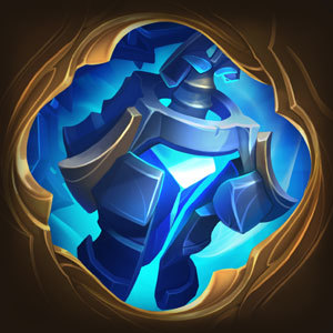
EWWWWWWWWWW New Ranked Borders

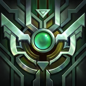
These new ranked borders look absolutely disgusting. I mean just look at them.
They're horrible. The only ones that look decent to me are the master and challenger ones. All the others are just....ew.
They look like just straight up recolors with some minor flair differences. The ones this year made me want to get a higher rank, they looked great and I thought I could be proud of having a border. These seem uninspiring and dull, they're not to show off, they're just as good as if we had a text at the bottom saying "Plat V".
I don't really like the idea of markers depending on which division you ended up in either, especially not like this since the higher your rank, the less dots you have, making it seem worse. Kinda counterintuitive.
I know Riot usually likes constructive feedback, and I wish I had some to give myself. But I really can't think of anything I remotely like about these borders.