Maokai Update: What do we think of it?

Since the Maokai Update is now on PBE, I was interested to see what we all thought of it. What's the general opinion on new Maokai?
http://am.leagueoflegends.com/image?f=http://news.cdn.leagueoflegends.com/public/images/articles/2014/november_2014/CHAMPUP/maokaisquare.png&resize=1024 : http://1.bp.blogspot.com/-tlNh_WBruL0/VGE38yqZI0I/AAAAAAAAdAQ/GET9T9xGI5g/s1600/mao2.jpg
Here's my personal thoughts on it. I had actually already written this, but then clicked submit, got logged out randomly and lost all my work, so forgive me if this seems rushed:
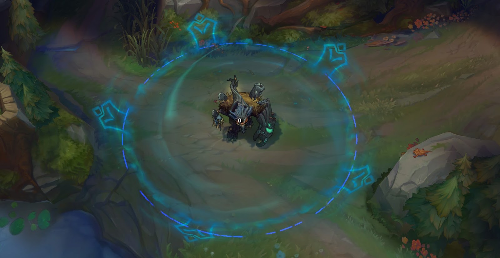
Overall, I am really happy with the upgrade. Maokai's textures are cleaned up and look more like bark. The lantern on his rear branch has realistic swinging animations. All of his particles are updated and look much more clear, especially his Twisted Advance which is much easier to track. Best of all, his walking animation was fixed to look much better and now he's a much bigger tree, as he should be.
Here come my complaints about the update, and there seem to be an awful lot for how much I actually like the update. For starters, while the new ability icons all look good, they're all blue. Take a look:
http://4.bp.blogspot.com/-8xl7xxJXKPA/VF0s-SAgbvI/AAAAAAAAc3M/om4HKgL1lsc/s1600/Maokai_Passive.png http://3.bp.blogspot.com/-GpdAe6AaEUc/VF0s-ZbNLAI/AAAAAAAAc2w/y47bpHjBSkM/s1600/Maokai_Q.png http://4.bp.blogspot.com/-9XtHAwqGoPk/VF0s-8O6udI/AAAAAAAAc24/yC6k4_jelq8/s1600/Maokai_W.png http://3.bp.blogspot.com/-9YH9NWb-_gE/VF0s-eIY_AI/AAAAAAAAc2s/EG0GxWVcgUA/s1600/Maokai_E.png http://1.bp.blogspot.com/-YDmeyKBTXT0/VF0s-q_h7GI/AAAAAAAAc20/h-7O-pycjD4/s1600/Maokai_R.png
There's not a smidgeon of color in here other than ghost-y blue. Why? Maokai is a tree. And furthermore most of his new particles are green. Where's all this blue coming from? His ult is the only blue thing and I'm assuming that's for gameplay purposes. But why can't his ult be green also?
That brings up my second problem: his ult. It no longer spins around the area, which is great! It makes it much easier to read during an intense teamfight. However the icons that encircled the ult have been replaced by lame blue laser images:
http://1.bp.blogspot.com/-xA4XvbbHgxs/VGFB1EtN9aI/AAAAAAAAdDE/0ZlX38jkf5Q/s1600/maoult.jpg
What's worse about this is that Charred and Totemic don't have unique icons anymore, which is a real shame. One of the cool things about Maokai skins was that each had a unique Vengeful Maelstrom icon, and now he doesn't have that anymore. Festive has a unique one though:
http://4.bp.blogspot.com/-Jm4jtun8Ha8/VGFVB5ETUxI/AAAAAAAAdFY/rs_K7NerV30/s1600/rxmas.jpg
Once again, why the blue? Can't we get just a little bit of red in there for the berry? Blue isn't the last color I think of for Christmas but it certainly isn't the first. I know this is for gameplay readability, a person needs to know on the fly whether this Mao ult is friendly or not, but all most abilities need for recognizability is a colored circle on the ground. Why take away his icons for lame blue laser images? I miss my Christmas Tree Cookie Maelstrom. :(
The one good thing I can say for the particles and ability icons is they match perfectly with Haunted Maokai. This skin got unique, suitably spooky particles and they look great. Twisted Advance has cool, creepy vine animations and the ult has spooky wind feel. I can still say I am happy to own Haunted Maokai.
http://4.bp.blogspot.com/-H6WYB3h4Ec0/VGFf1ybqAMI/AAAAAAAAdF8/ktCVPzXw1H0/s1600/w4.jpg http://2.bp.blogspot.com/-W-xdufVItfE/VGFf1593ASI/AAAAAAAAdF0/bfROCCJlJrg/s1600/WWWww.jpg http://4.bp.blogspot.com/-1FST7UkP7rA/VGFQbURL7pI/AAAAAAAAdE8/4ODQghJaBik/s1600/rGYU.jpg
Speaking on Twisted Advance, I'm concerned if the root animation is less clear than live. Seeing as the main goal of this Model/Texture Update is gameplay visibility and most roots/snares have huge animations, the Twisted Advance branches seem kind of small and blend into the ground too much. I have Zyra's Grasping Roots and Morgana's Dark Binding below for reference:
http://2.bp.blogspot.com/-k8xaoECx6iY/VGFB13sDjCI/AAAAAAAAdDU/3yBeOKC1mTM/s1600/wroot.jpg http://www.onrpgblog.com/wp-content/uploads/2012/07/GraspingRoots.jpg http://media-copper.cursecdn.com/attachments/29/227/morg_q.png
My last point concerns Totemic Maokai. He no longer looks like a totem pole and looks more like a scary east Asian mask. Don't get me wrong, new Totemic Maokai looks super cool, I'm just not sure if it looks "totemic" anymore. I'm not sure, it feels like something was missing from the skin in the first place, and this new version still didn't get the "totemic" feel. Here's a side-by-side, along with a totem pole to get a feel for the look:
http://3.bp.blogspot.com/-Lxmx_uAEkX0/VGE7IyZ5ZeI/AAAAAAAAdBY/a-KL8Xx67b0/s1600/totem1.jpg http://fishcreekalaska.com/bmz_cache/c/c8eb22aa5ef97bb087ece4036a0fa58c.image.350x495.jpg
Complaints aside, I actually do really like this update. He looks a ton better and is bigger, like a tree should be. I am really looking forward to playing Maokai with his nice new visuals!
What do you guys think?




 to goofy face maokai.