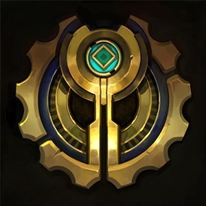
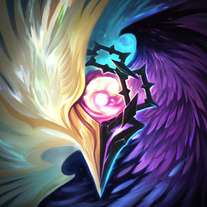
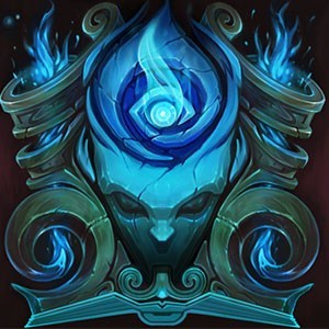
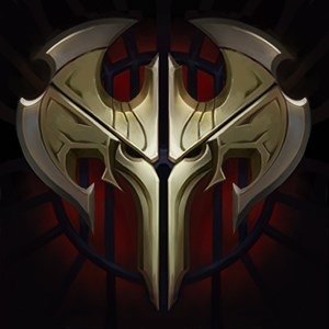
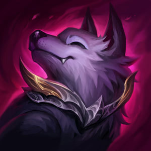
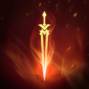
Anyone else gushing over the new faction emblems?

Valor Bot··18 votes·8,419 views

They're all so beautiful, well-crafted, and characteristic of their respective nations that I can't help but fangirl over them a little bit--even if some of them are slightly overdone or on the cheesy side of things (looking at you, Zaun and Noxus).

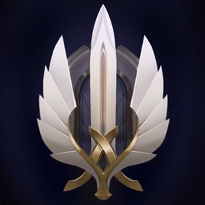
http://i.imgur.com/Lt0T3Mo.png" The Demacian one has got to be my favorite; I'd lose my shit if it ever became available as a summoner icon, I'd never have to change it ever again.

The new crests also raise some questions about whether they are truly the symbols used to represent these nations in the canon, or if they are just meta icons in place to give readers/players a sense of visual direction. If they are indeed canonical emblems, though, then I have to wonder who designed each one, and why certain choices were made in their crafting (Shadow Isles uses a very ghostly design, for example, instead of paying homage to its Blessed Isles ancestry).

Either way, cheers to those who worked on 'em :)

50 Comments

Valor Bot3 votes

I wanted to, but I was afraid my post would be removed for containing too many images, as has happened to me once before.

Thanks for posting them though. Here's the Runeterran emblem:

http://i.imgur.com/eB6xBJI.png"

LJMcLean1 votes

[{quoted}](name=Valor Bot,realm=NA,application-id=6kFXY1kR,discussion-id=48dsVY3m,comment-id=00010000,timestamp=2016-11-27T08:00:33.889+0000)

I wanted to, but I was afraid my post would be removed for containing too many images, as has happened to me once before.

Thanks for posting them though. Here's the Runeterran emblem:

http://i.imgur.com/eB6xBJI.png"

All I can think is, "future tattoo."

Valor Bot1 votes

Not gonna lie, I seriously considered getting that Demacian crest as a tattoo

Sharjo7 votes

I'm very eager to see what the non-minimalistic versions of the Bandle City and Void logos are like.

EROTIC RAID BOSS1 votes

where did you find all these? I've seen the straight up gold ones on the universe page, not these detailed ones though.

GreenLore1 votes

You can see them on the champion pages. Though the runeterra,bandle city and void icons only have a gold-version

Warden Karma1 votes

When I look at Piltovers Icon I have to think of an Owl, whereas Zauns looks like a Rat (Twitch?).

Eye of Twilight4 votes

Do you happen to have a link to the rest of the emblems? It would make it a bit easier to vote :P

Duke Anax2 votes

They are almost hidden in the background of the Universe Region sites. I linked them here.

Eye of Twilight1 votes

Thank you!

Oglaf2 votes

Freljord because as a Swede anything related to snow, ice and Vikings in general gives me a boner.

Sharjo2 votes

All of the emblems are great; they're layered in terms of design, have very distinct and identifiable shapes, and all give off their own vibes and ideas about what their respective nation is about just by looking at them. They're awesome.

I think my favorite is Demacia's, because the colour scheme, the shapes and imagery involved all invoke the feeling of something enduring, stable and unwavering. It's the kind of crest that looks like it wouldn't be weathered by the passage of time, and would have eternal meaning no matter who looked upon it. Something about it almost seems just "right" about it, like there's a meaning behind the very way it's been designed and an indication as to the greater values and history of Demacia itself. I feel it's a perfect fit for Demacia.

Mount Targon's is a close second because of how layered it is. The mountain is depicted in gleaming stone, already indicating its importance and the power surrounding it, the Targon iconography frames the celestial bodies, giving subtle indication as to Targon's influence, and the cosmos as viewed in the centre feels symbolic of the wider mysteries of not only Targon, but the universe as a whole. The stone backdrop also helps it out, as it gives the impression of something truly ancient, from a past long forgotten and unvisited by men, but also enduring and almost timeless, such that you can immediately understand the importance of what the emblem signifies.

l Helios l2 votes

I can never turn my back on the great nation that is Noxus.

Noxus is love. Noxus is life.

Splision2 votes

Out of all the faction emblems, I would have to say that my favorite is the Mount Targon one. I honestly love all of them so it was a rather difficult vote to make.

Astronomy has always intrigued me and always get a sense of wonder and mystery from it, and the Mount Targon emblem conveys that sense of astronomical wonder with those connected circles (which remind me of planetary bodies) and the outline of the mountain peak at the center with the background of what appears to be a starry, night sky. It's just aesthetically beautiful and it inspires wonder in my opinion.

DeathBurst2 votes

Just my guess, but I think that...

On one side, for the factions that do have a real emblem (Demacia/Noxus/Ionia/Shurima, at least) the one on the website is probably canon.

On the other side, some "Factions" are not really united, and may not have an in-universe emblem at all, but still got one on the website for players to not feel lost. And those would not be canon. I was thinking of Shadow Isles at first, but on second thoughts... Freljord: we know that there are at least 3 in-fighting factions, but we still have only one Freljord crest, probably the one used by the Watchers back in the day if I had to venture an hypothesis. (If I wasn't so lazy, I would go and check on the old Freljord lore re-work website.)

ABlueQuaker2 votes

Pretty hard to decide between Piltover and Zaun.

TyrekGoldenspear1 votes

The Demacian one has got to be my favorite.

Same dude. Man I wish that was an icon.

Tesla Effect1 votes

Piltover one, cause Hextech/Art-deco is da best.

RiotBioluminescence6 votes

[{quoted}](name=Tesla Effect,realm=NA,application-id=6kFXY1kR,discussion-id=48dsVY3m,comment-id=0004,timestamp=2016-11-27T16:50:22.186+0000)

Piltover one, cause Hextech/Art-deco is da best.

We doing 'justify your answers'? Awesome :D

I picked Zaun, but I concede that I can't draw a clear line between where my love of the idea and place of Zaun ends, and my love for the emblem begins. Look at it, though! (And thanks to Duke Anax for linking them.) The subtle asymmetry in the lower half with the perforated tank and the blasted tank, as well as the piping that connects them, isn't immediately what draws your eye (the garish glowing, perhaps even bioluminescent*, green wins there) as is instead a... what... third read? Maybe even later.

My brain goes:

  1. GREEN!!! ->
  2. Twisty sharp helix-shaped drill thing ->
  3. Pointy sharp claw bits that look a bit like the biohazard symbol ->
  4. That ornate metalwork across the top that remind me of train station ironwork ->
  5. The perforated canister in the bottom right.
  6. Syringe needle

It's got layers, you know? Like Zaun.

It's got beauty (that ornate ironwork) that's almost been hidden by the flashy body horror stuff in front of it. It's got practicality and function, even while it looks cobbled together from mismatched pieces. It's revolting and fascinating at the same time. It has shadowy parts made all the murkier because it's literally generating it's own light.

It's making light! F*#& all those haters trying to keep it down - it'll make it's own bloody light! Shove it in the shadows, try to obscure its beauty, give it nothing but mechanical scraps and labware to use and BY GOLLY it'll make an emblem out of them nonetheless!

So yeah, Targon - you may have a window to the heavens, and Shurima might be literally creating water from the Sun Disk, but none of them (in my opinion) hold a candle to Zaun's.

Whew!

Did I mention I'm a bit obsessed with Zaun right now? I am. None of the above is official Riot verdict on any of these, blah blah, etc. etc. - and I think they're all cool (plx don't kill me for having a favorite, Worldbuilding team!). Zaun's just the coolest and the rest of you are wrong :P

[slayer-jinx-wink]

######* Bioluminescent bias much?
EROTIC RAID BOSS2 votes

Hmm I really like the simplicity and bold colors and contrast of the shurima emblem, but I might be biased too, since I love Azir and pretty much anything Shuriman themed already. Also really like the colors on Ionia's. That teal and bronze really captures that feeling of serenity you want from Ionia.

Zaun's emblem is okay, but I was really blown away by the art of Zaun on the universe page and how it intertwines with Piltover, as a region its so much more interesting to me than its ever been before

DwarvenGiant1 votes

I agree with you so much, Bio. Couldn't have said it better myself. :P

xScarfy3 votes

I totally agree with you on the Zaun emblem! I love it, even though Zaun isn't my favourite faction (that place is already taken by Shurima :3), but I started loving Zaun more with the recent lore we got from the universe page. Now Piltover and Zaun are actually more then a technological more developed Demacia and Noxus. Also Bio, may I ask you what your current job at Riot is and why you aren't already on the lore team? You love the lore as much as we here on the story board and have so many creativ and interesting ideas (like with the dead birds that are used by Bilgewater as a warning from the black mist, which got actually implemented in the lore!) But well, if it would mean that you weren't able to speculate with us here about the lore anymore, than I'm glad you aren't already part of the lore team ^^

RiotBioluminescence5 votes

{quoted}

(like with the dead birds that are used by Bilgewater as a warning from the black mist, which got actually implemented in the lore!)

AW shucks! You remembered that!

I totally get the Shurima love. If you'd asked me last year, I might have said the same.

I've put a lot of thought into what Shurima could be like - what their day to day is in this incredibly tumultuous time with the unbearable weight of their once-phenomenal empire on their shoulders. A land that's at once unfathomably ancient - that has forgotten kingdoms and countries older than some of the most revered around today - that possesses secrets and mysteries that have gone from fact to legend to fairy-tale and back again more times than we can count. A people whose cultural psyche is still scarred from being cruelly enslaved and unexpectedly abandoned - proud of their history and at the same time violently desperate not to repeat it.

Also, I love shouting SHURIMA (often internally) whenever someone mentions Azir. Can't help it.

Regarding what I do - I've got a day job I'm not allowed to spill the beans on (R&D), but I keep inordinately busy with side projects too. If I'm very very lucky, I may get to talk about one in the near future.

xScarfy1 votes

{quoted}

AW shucks! You remembered that!

No way I could forget about it! I was so amazed of this idea, since it was so creative to use the fact that birds once were used in mines as a warning from a low oxygen level for something similar with the black mist, but at the same time it felt somewhat obvious after reading it, so that I asked myself why nobody else has already thought of it. I was so happy when I saw that it actually became canon!

I totally get the Shurima love. If you'd asked me last year, I might have said the same.

I've put a lot of thought into what Shurima could be like - what their day to day is in this incredibly tumultuous time with the unbearable weight of their once-phenomenal empire on their shoulders. A land that's at once unfathomably ancient - that has forgotten kingdoms and countries older than some of the most revered around today - that possesses secrets and mysteries that have gone from fact to legend to fairy-tale and back again more times than we can count. A people whose cultural psyche is still scarred from being cruelly enslaved and unexpectedly abandoned - proud of their history and at the same time violently desperate not to repeat it.

Yes, Shurima just amazes me in so many ways! The Ascension ritual, their culture (especially the old shuriman language), their connection to the void, all the mysteries, their history with the downfall of Shurima dooming this once so far developed land to stagnation and the recent return of Azir and Nasus giving finally some hope but in the same time Xerath and Renekton brining even more danger, their fauna (I love all kind of animals and Shurima gaves us a lot of different creatures through stories and champion bios) and some of my favourite champions are from Shurima (like Nasus, Rammus or Sivir with Rammus also being the first champion I ever bought) and my favourite skin line (Guardian of the Sands/Risen) and so many other things!

Also, I love shouting SHURIMA (often internally) whenever someone mentions Azir. Can't help it.

Can totally understand you on this one x)

Regarding what I do - I've got a day job I'm not allowed to spill the beans on (R&D), but I keep inordinately busy with side projects too. If I'm very very lucky, I may get to talk about one in the near future.

Ah okay, good luck then! :)

Photos of Ghosts1 votes

The Zaun one could maybe have used being a bit more grey and Giger-like

RiotBioluminescence3 votes

[{quoted}](name=Photos of Ghosts,realm=EUW,application-id=6kFXY1kR,discussion-id=48dsVY3m,comment-id=000400000003,timestamp=2016-11-27T23:05:51.522+0000)

The Zaun one could maybe have used being a bit more grey and Giger-like

Giger? I'd never considered that. What elements of Giger's art are you looking to see in Zaun?

Photos of Ghosts1 votes
  1. MOAR SPOOKY TUBES
  2. The continuous confusion between mechanical-industrial and biological material.
  3. The phallic symbols :^)
A Superb Villain2 votes

Honestly, I suspect to see more Giger influence in The Void's emblem, especially since The Void has been recently described as a source of biomechanical creations designed for warfare in all it's fields; Voidborn are engineered.

RiotBioluminescence3 votes

[{quoted}](name=A Superb Villain,realm=NA,application-id=6kFXY1kR,discussion-id=48dsVY3m,comment-id=00040000000300000002,timestamp=2016-11-28T02:34:17.683+0000)

Honestly, I suspect to see more Giger influence in The Void's emblem, especially since The Void has been recently described as a source of biomechanical creations designed for warfare in all it's fields; Voidborn are engineered.

I associated Giger with the Void (if anything) first too, which is why I was surprised.

I get where Photos of Ghosts is going with the tubes references, and even the occasional biomechanical identity crisis - though personally, I could do without the phallic/yonic themes. That's just me though.

A Superb Villain2 votes

Likewise; while I can appreciate the unnerving intent behind Giger's work, I do not think the emphasis on particular anatomy suits League of Legend's design philosophy.

Photos of Ghosts1 votes

WHAT? When was it said?

A Superb Villain3 votes

The Void is a nightmarish dimension said to exist outside space and time, where terrifying living weapons were wrought to win an ancient and long-since ended war. . . Those few scattered grimoires and madmen that dare speak of the Void at all, speak of it as an infinite realm of unfettered creation, tortured landscapes of crazed organic machinery, magical weapon-looms and mountainous flesh-forges.

Taken from the Universe site.

Burnt Iron King1 votes

So... Pacific Rim?

A Superb Villain1 votes

I was thinking more along the lines of Phyrexia.

ElectroScalar2 votes

Zaun is my favourite city-state. But I liked it because it was its own fault for being so gloomy and broken. Now it's gonna be the old trope of "it's someone else's fault we're trash (Piltover's)" and there's no complexity in that... :(

xScarfy2 votes

I like the direction they went with Zaun and Piltover and how Zaun has become the lawless part of Piltover. Their relation makes a lot more sense to me now and even though Zaun is now like the shadow of Piltover, the people of Zaun are still very proud of their city.

ElectroScalar1 votes

This is exactly what I don't like. It makes sense for a trope with an oppressed slums below the gleaming rich part of the town, but that's just it: that's a trope which doesn't fit the earlier established version. This trope is so old, it is literally in a movie that started this genre, the German "Metropolis". They could have made the exact same thing with Piltover and its own Slums, without having Zaun loose its layers.

There could have been perfect sense even if they were kept as separate city-states, but now Zaun got reduced, its population lost separate historical origin, countless possibilities were sacrificed just so that they could be pushed into the mold of the trope.

Photos of Ghosts1 votes

Well, imperialism is something that exists and the consequences of which we're facing everyday...

TeCoolMage1 votes

I like Ionia, the other ones are a bit sharp on the edges in my opinion, and the broken symmetry without intentionally trying to come off as chaotic/complex is a nice touch.

something about the book in the shadow isles emblem makes me feel like it's from some old WoW or runescape ripoff, I don't know why.

Skaarl D Lizard1 votes

Always loved shurima,always will Nasus Renekton Xerath Sivir Azir

some degenerate1 votes

It's a tie between Piltover's and Ionia's for me.

Blue Moon Wolf1 votes

Damn, was not expecting Ionia to be the favorite. I mean, it's my favorite, but wasn't expecting it to get majority vote O_o

mr Boombastic7871 votes

I can't pick one, my favorits are Bilgewater, Ionia and Shurima. Bilgewaters is so Epic and really reminds me of the first time I read Burning tides. Ionias just looks really sick overall and Shurimas is just so iconic. I really like mt. Targon but the colors look a little weird (my personal opinion). I also really like the Freljords Icon!

Tesla Effect1 votes

I wonder what Yordle is gonna be part of the Bandle City Emblem, or is it just a generalized Yordle on the Emblem?

Tesla Effect1 votes

Would be so cool if we ever got specific faction login screens (or at least music themes, besides Demacia, which already got one), like we once got for the Shuriman event.

Oakleaf Ranger1 votes

BLOOD FOR NOXUS

bad arcade kitty1 votes

may be it is just me but this:

http://i.imgur.com/Lt0T3Mo.png

looks kind of like this:

http://i.imgur.com/6LQ728p.jpg

it's the death of mami from madoka anime, a monster bit her head off while she was hanging in the air with her head in its mouth

i mean those black thingies aside the sword look like legs

Xodiathe4bdn11 votes

die hard shadow isles crest Ghost stories have just always been my thing

More from Story, Art, & Sound

More by Valor Bot