New Splashes! What do we think?

As you all may or may not have heard, there are 11 updated classic splash arts up on PBE right now. I thought it would be nice to have a place to give not only my own feedback, but also anyone else who wants to comment can. Before I begin I should mention that, regardless of my feedback, every splash page here is top notch in terms of quality and technical skill. They all look great, and any feedback I give is what in particular I like or how they can look better and fit the character better.
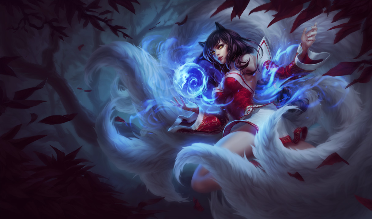
http://i.imgur.com/tqTS1sd.jpg Ahri - This splash takes everything about Ahri's old splash and bumps it up. The tails look great and surround her, the lighting from her blue orb really affects the scene and she still has that alluring look on her face. Top that off with a subtle forest-y background and we have a really good Ahri classic art. My only gripe is about her outfit--the old "kimono wrap" look around her bosom was more "Ionian." This current one just contorts too much to each individual breast; I know showing some skin is important for Ahri, but I think the old outfit look did that just fine, perhaps could do it better! Her fox-like features could also do with some playing up: namely her ears and her whiskers.
Edit: Some people have been expressing their displeasure about Ahri's face, and I have to say I agree. Not only are the fox-like features kind of lost, but Ahri's entire face is completely different, really losing that "Ionian" feel (much like I thought her outfit lost)
I found a thread with some fantastic edits to her face. This one is my favorite:
http://i.imgur.com/PSPdPkh.png
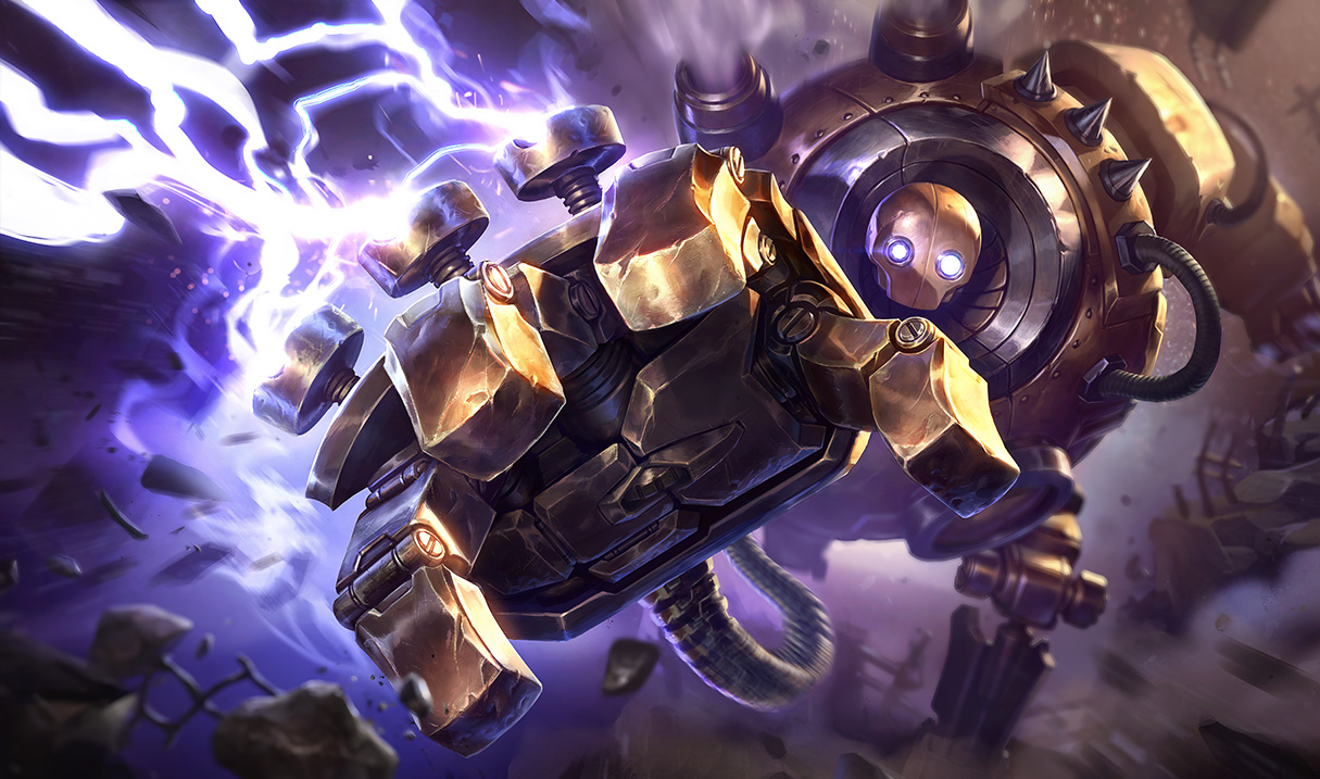
http://1.bp.blogspot.com/-BtSUkQ19PZc/VDwpN_QlLDI/AAAAAAAAbJ0/xwci7i8_pqg/s1600/Blitzcrank_Splash_0.jpg Blitzcrank - Not much to say here; Blitz's old art was long in need of an upgrade. This adds the black that's in his new texture and does a good job of breaking up the same-y color scheme. Having him in the Rocket Grab action is pretty cool, although is the fist a little too obstructive? I'd rather see more of Blitz himself than just his hand. Overall, a good splash, and the obstruction is minor.
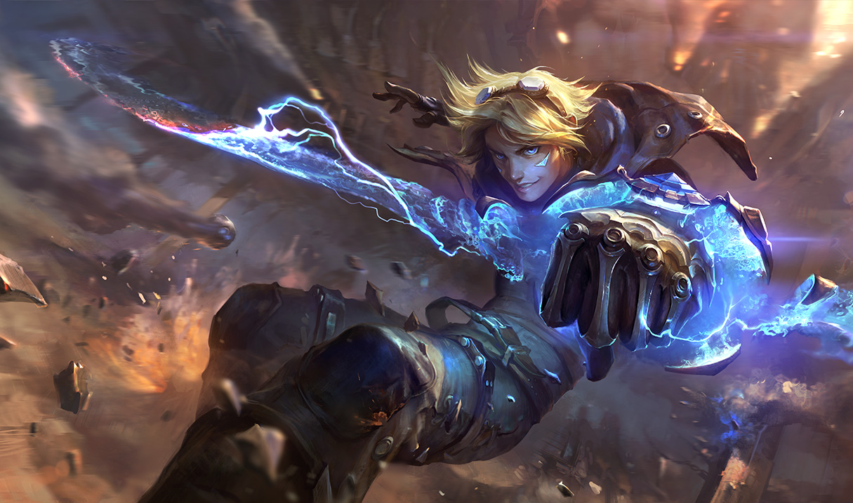
http://1.bp.blogspot.com/-_RAIO_Urguw/VDwpNclM3zI/AAAAAAAAbJs/onxlwvMSYNc/s1600/Ezreal_Splash_0.jpg Ezreal - Another instance where we see Ezreal's current splash, and make it better. He retains his cocky smile while still showing off his skills. The background serves its purpose without being in the way. I understand its an action shot but I do wish he was standing up a little straighter to show off more of his design.
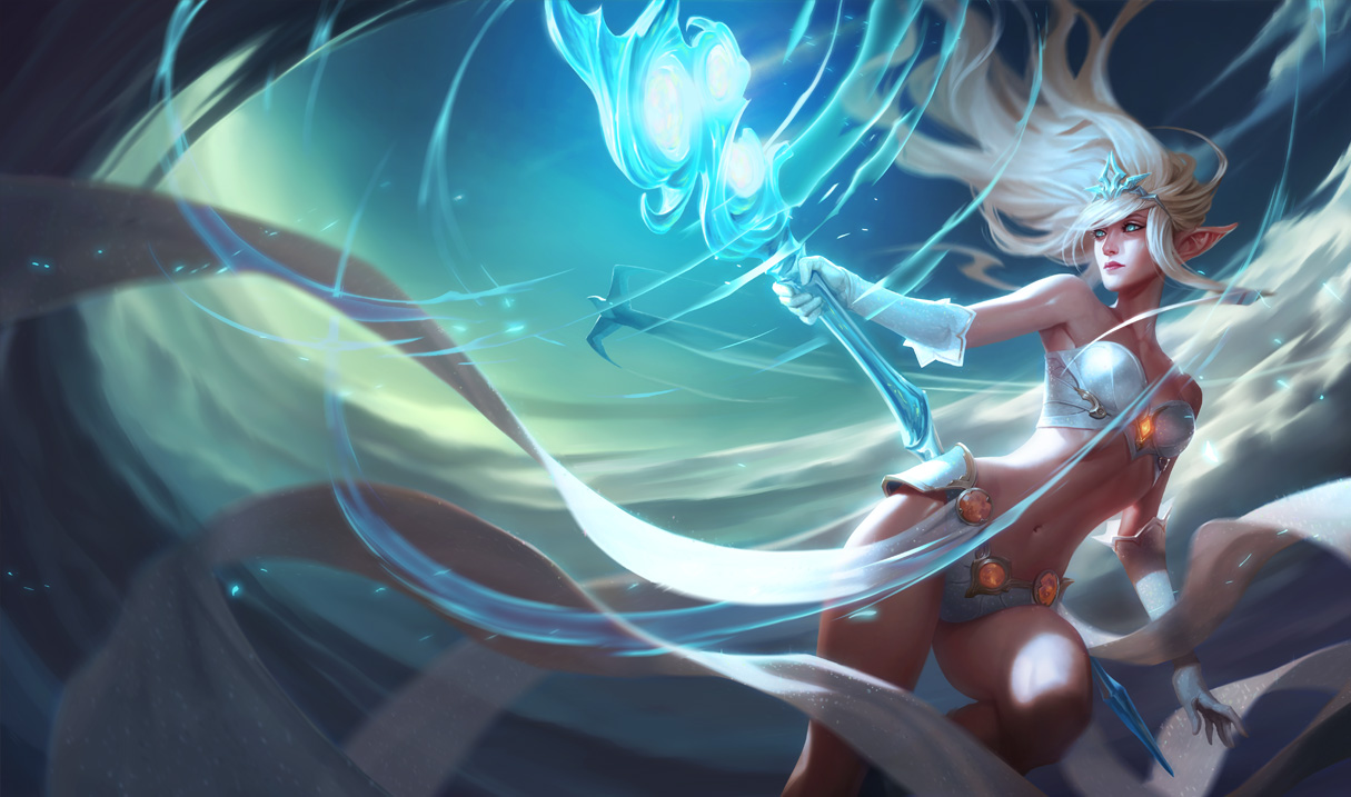
http://3.bp.blogspot.com/-kAVW8jWV44E/VDwpOHJdPFI/AAAAAAAAbKE/xCjp3PlRVmE/s1600/Janna_Splash_0.jpg Janna - I'll be honest, I really like Janna's current splash so I might be a tad bias here, but I'm not a huge fan of this new splash. First off, her face looks like Ginny Weasley or the actress who plays her anyways: her chin is kind of pointy and her cheek structure is completely different. And Ginny Weasley face just isn't fitting for a magical, almost elf-like person. I almost feel going for the "Galadriel" look would be more suitable. Also, Janna's skin looks too shiny, almost like plastic. Her tattoo is also gone--this isn't a complaint, I'm just wondering if there was a reason for that? All-in-all, I think her current splash just does the whole "Wind swept, flowing hair with my outfit billowing around me whilst I float majestically" thing better.
Edit: Here's another tweak from this thread that fixes a lot of the problems I had with the face. It also makes the lighting much warmer and changes Janna's hair color to better match the current splash.
http://i.imgur.com/7RII8eL.png
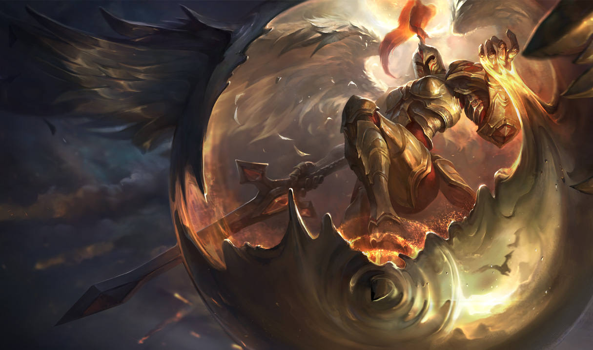
http://2.bp.blogspot.com/-TA9OyOPfy1I/VDwpOe6TikI/AAAAAAAAbJ8/a5CY8Pd7f4o/s1600/Kayle_Splash_0.jpg Kayle - I think this one is the hottest topic, and for mainly one reason--many people feel Kayle is being sexualized here, and that's just not Kayle's character at all. And I think I mostly agree. Mainly, the boob plates are way too defined here--and seeing as one of the charming, cool things about Kayle is you can't really tell her gender initially, this effect is totally ruined by her huge boob plates . No one was complaining about not being able to tell Kayle's gender, so this was a totally unnecessary addition. Second--and this has nothing to do with sexualization--the lighting is oddly dark. Why such dark lighting for someone who considers herself a beacon of justice? Lastly, the melted gold thing was an odd interpretation of her ult...not terrible, just odd.
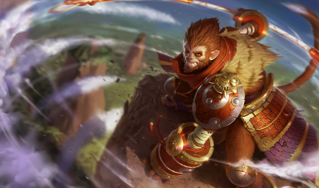
http://2.bp.blogspot.com/-CsZppjBWNoY/VDwpOpV0UvI/AAAAAAAAbKQ/qLtrV0zPHmY/s1600/MonkeyKing_Splash_0.jpg Wukong - I love how bright the colors are in this image, and how it appears Wukong has just landed from an ultimate. Textures on his fur and hair are really nice, and his armor is wonderfully detailed. My one complaint is his expression: gone is the cocky determined smile and instead we get a grimace straight out of Rise of the Planet of the Apes (not bad mind you, just way too serious for Wukong).
Edit: Found a really great edit that actually makes the colors less flat and much better. http://i.imgur.com/me27DMO.jpg Thread: http://boards.na.leagueoflegends.com/en/c/story-art/v1pWYr3x-wukong-splash-tweaks
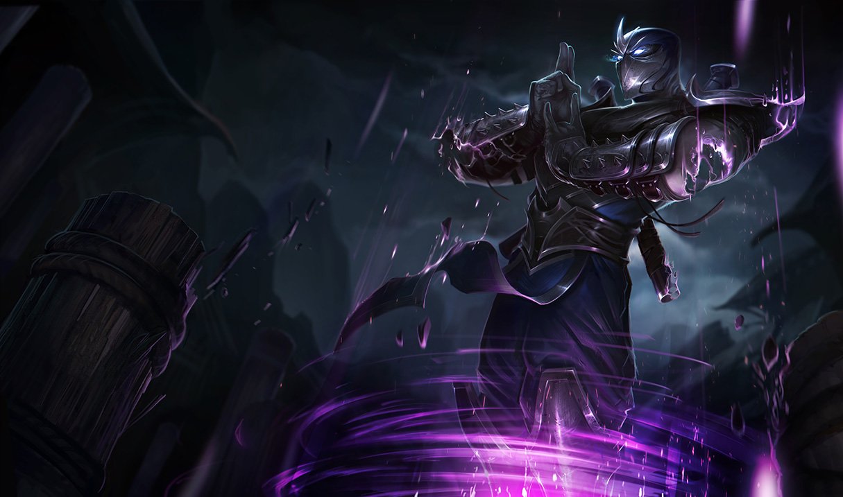
http://3.bp.blogspot.com/-jVyrJosBbgk/VDwqU2lRXXI/AAAAAAAAbKc/FqICli7tM_w/s1600/Shen_Splash_0.jpg Shen - This one is a great example of a non-action scene...which is refreshing, because not every splash has to be an action splash (coughLee Sincough). We get a great scene of Shen ulting, with very dark and ninja-y lighting and setting. Not much else to say about this other than "good job!"
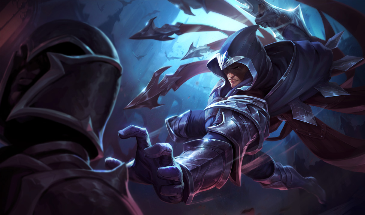
http://4.bp.blogspot.com/-30ltiRzPr8k/VDwqVQa-mtI/AAAAAAAAbKg/gHeme2UEiuQ/s1600/Talon_Splash_0.jpg Talon - Not really any complaints about this either. Talon looks great, his blades are really shiny and sharp and menacing, the colors are just right and he's shown doing what he does: assassinating things. I especially like the way his...blade...tassel... cape-thing is twisting around him as he rears back his blade arm.
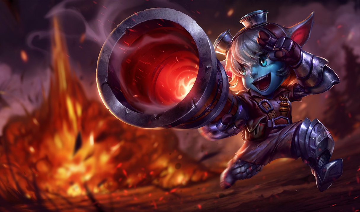
http://2.bp.blogspot.com/-h8IVa50hPFw/VDwqVXTz9NI/AAAAAAAAbKk/3LhpIs9z0yc/s1600/Tristana_Splash_0.jpg Tristana - This one is by far my favorite of the set. Its perfect for Tristana. She looks delighted, there's a nice explosion in there, the detail added to her outfit is especially great--makes her have an actual body instead of, as I think IronStylus once described, a "potato with a huge head." I really like how they tweaked her appearance, making her more in-line with the new unified look of Yordles but still looking like Tristana. This splash really makes me excited for any future updates to Tristana's look!!
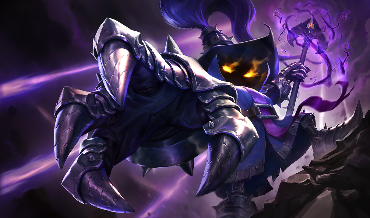
http://3.bp.blogspot.com/-iSSqyBkCP6c/VDwqVpypeUI/AAAAAAAAbKs/rQgKtxOvcvM/s1600/Veigar_Splash_0.jpg Veigar - Not much to say here. A good update to the current splash, really playing up the "eviiiiil!" Part of me wishes there were more Yordle attributes added like in Tristana's, but there was a definite need to keep Veigar's face in shadows, too. I think my one complaint is similar to my Blitzcrank complaint: why is his hand taking up so much real-estate? Again, not earth-shattering, just something I noticed.
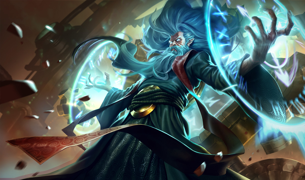
http://2.bp.blogspot.com/-a3yRqWVxGBI/VDwqVz7lCwI/AAAAAAAAbKw/0vkR-v0PILA/s1600/Zilean_Splash_0.jpg Zilean - Zilean, what happened!?!? I always thought of Zilean as this more quiet, sometimes melancholy old man but GOOD GOD WHAT HAPPENED? Now I'm not saying this change in demeanor is bad, I think the culprit here is Zilean's personality--do we even know what it is? Demeanor aside, I feel like the clock on his back doesn't take precedence enough in this image. Its a really defining feature of Zilean's silhouette and here it just sort of fades into the background. Other than that, really like the "time magic" design coming from his hands, and the "powerful old man" motif is definitely impactful.
That's all of my two cents. What do you all think?