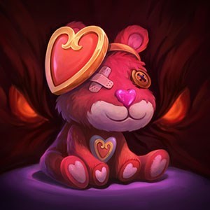
New Wukong icon in champion select
Is unacceptable and needs to be removed/changed. The old one was fine, if you try to improve something and completely ruin the *(#& out of it, leave it be.
Is unacceptable and needs to be removed/changed. The old one was fine, if you try to improve something and completely ruin the *(#& out of it, leave it be.
 Shro0mie2 votes
Let me clarify, its only the mini icon that looks awful. His skin is fine at regular sized, but when shrinked.....
 21496640_DEL1 votes
Yes his icon needs to be tweaked a bit.