These VU's are getting ridiculously bad. Rito please change?
Nikushimi Zero··2 votes·2,965 views

While I am all for visual updates, and updates in general I have to say that lately two of them have been sticking out the most to me.

  1. Malphite. His Texture update.
  2. The upcoming Fiora changes.

Now, I was a pretty big Malphite tank main whenever I needed to tank. The old Malphite looked like a BEAST. A lumber hulk of rock. While this new TU (Texture update), albeit still a lumbering rock, looks more like a Sonic character who got turned to stone and has a constant sad pose with his head being so low in positioning.

Visual example: New Texturel: http://vietboom.com/wp-content/uploads/2014/11/245.jpg Old Texture: http://img4.wikia.nocookie.net/__cb20140807130216/leagueoflegends/images/1/1b/Malphite_Render.png

You can see the differences. While I like how much more "rocky" the new one his, what is up with the head being so low?

Then, there is the upcoming Fiora. I LOVE Fiora. She is my love in the League of Legends world much like Katarina and Miss Fortune are for the majority of other people.

This new update is COMPLETELY changing her kit (which I don't quite love since they ALREADY changed Ryze to a way that just doesn't really fit me anymore, and I used to main Ryze), and so I'll see when it gets out. But this visual update....

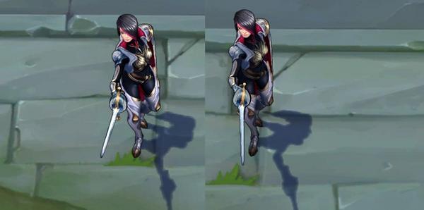
I have seen it and in all honesty it looks incredibly cartoony. I mean EXTREMELY cartoony. Brighter colors, a bit more extravagant outfits, and just all around more puffiness to her style. I get that she is meant as a duelist and they tend to be a bit flamboyant in their attire, but this is ridiculous. She looks like a cartoon now.

Example 1: http://4.bp.blogspot.com/-r_KJBnrwX3o/Va7GwE5BmYI/AAAAAAAAFII/etQMryYifRs/s640/fiora2compare.jpg Example 2: http://1.bp.blogspot.com/-nCwaLnCv-rM/Va7GwORX2TI/AAAAAAAAFIQ/UYUQs3QjjWo/s1600/fiora1compare.jpg Example 3: https://i.imgur.com/d5zsd3h.jpg https://pbs.twimg.com/media/BxXKldcCcAAqKBk.jpg Example 4: This is the worst one of all next to the classic skin. http://i.imgur.com/uTUhyaG.png

These. Look at them. First of all, her face is a lot more angular. Why? Why was that changed? I can understand slightly brighter colors, but look at how much more poofy and cartoony her skins look now. You can't look at that and tell me it's fine. You can even downvote me if I am being ridiculous, but I stand by my choice.

RITO! Please! If you are reading this, before you Visual update change the face and hair back! I love purple and everything, but the original hair should be red and her face a lot more round and less angular! She looks, like someone pointed out, like Cruella De Vil with such an angular face. I will deal with the kit changes (Though I really, REALLY, don't like them, but we'll see), but this visual update hurts. I got over Malphite slightly when you made his head his belly button, but this...please Rito, if you hear this plea from a fan of the game and of Fiora PLEASE do not make those outfits. The original skin got COMPLETELY changed. I will miss her signature armor T_T But the cartoony looks....please Rito. Why? WHY!?


34 Comments

Vistha Kai3 votes

Malphite wasn't updated yet. It's a new texture he got last year(this?).

Nikushimi Zero1 votes

Well, apologies. Since he changed I assumed it was a VU. Well, the texture update is pretty silly then. I mean they made his head his belly button.

Vistha Kai3 votes

He always had his head on the belly.

Personally, it took me over a year to learn that little spherical thing in the middle of his height is the head. But that was like 2 years before he got that texture update.

Nikushimi Zero1 votes

Then I never noticed it. I love how opinions are hated though xD Oh well. Don't even care that I was downvoted so much for this post. Lol.

Did they increase the spike height then? Idk, the new Malphite looks silly for some reason. My main reason I posted this though was for Fiora.

Vistha Kai1 votes

No, it was entirely a texture change.

Nikushimi Zero1 votes

Idk, just looks insanely different to me.

SSmotzer1 votes

I am pretty sure Malphite's head has always been that low. There is a difference between a model and a render. The render is taken from a lower position, in a pose he does not make in the game. Also if you want realistic graphics and gameplay, go play DoTA.

Nikushimi Zero1 votes

Apologies, since he looked so drastically different it seemed like a VU intead of a TU (Texture Update). Either way it looks silly to me. Especially with Fiora.

Sp33d Zer01 votes

I don't like the the school teacher one, but the rest I think all look better.

Nikushimi Zero1 votes

Really? Idk, they're all so poofy and cartoony. They completely changed the classic skin. I could deal with everything else but that classic skin....I wish they'd kept her regular armor.

Sp33d Zer01 votes

To me, she is a duelist, and she is based off of french culture, especially in a more classical time. Back then, this was very much the style of it. I can fully understand the want for a fully slim model, but I think it makes her looked more interesting.

Nikushimi Zero1 votes

She is based off of that, yes. I do know she is a duelist and even stated that duelists wear flamboyant outfits, but she is also a Demacian duelist. I mean, she really does look cartoony a bit. Especially with all the bright colors. I can also live with that.

It has nothing to do with a "slim" model imo, but duelists are usually quite slim and not so puffy. Their outfits are, but imo that classic skin change is HUGE. Out of all her skins I loved the classic and Nightraven Fiora the most. The others were always too silly and pompous looking for me.

I really wished they had kept the classic skin the same. Maybe added a few changes, but idk. The armor is the main thing I loved. It just looked so badass.

Sp33d Zer01 votes

I'm sure they will have a traditional skin. That being said Demacians are all very bright (Looking at you Lux) and colorful. Noxians tend to be dark and basic for their schemes. I personally love the way the majority of her skins look in comparison to the old (in particular the musketeer skin), but you know what they say, different strokes for different blokes.

Nikushimi Zero1 votes

Yeah, I mean. I don't mind the brighter colors. It's mainly that she looks cartoony. Even lux doesn't look that cartoony. The change that hit me the most was the Mustketeer and the Classic skin. Not to mention the Teacher one.

We'll see, but I just really hope they will have a traditional skin for her and they don't get rid of it completely.

GreenLore1 votes

Malphites head was always like this. He received a texture rebalance,just like almost every other outdated champion. these texture rebalances just adjusted the textures of the champ a bit,that means they changed around some colors and thats about it.They are not meant as a replacement for a VU.

Nikushimi Zero1 votes

You sure? Cause I swear his head was higher up and not his belly button.

And yes, I apologize. He looked so different from his original that I thought it was a VU not a TU (texture update).

GreenLore1 votes

Here's a comparison of the updated Malphite and the old one: https://www.youtube.com/watch?v=2liDgAPEpVc

Nikushimi Zero1 votes

Huh, weird. Must've been cause of the darker colors. The brighter brown pronounces it more.

chipi991 votes

Putting aside malphite, Fioras jaw looks disgusting.

Nikushimi Zero1 votes

She just looks so different.

DwarvenGiant1 votes

Malphite only got a texture rebalance, nothing too big. He basically always looked the same- He has always looked very bad (at least IMO).

Nikushimi Zero1 votes

Apologies, since he looked so different I thought it was a VU and not a TU (texture update). Either way, he looks silly. I preferred the old Malphite because I do NOT remember his head being so low and his spikes being like Sonic.

Sp33d Zer01 votes

That is exactly how I remember it http://s2.dmcdn.net/DeBpE/1280x720-Yh1.jpg

DoctorInju1 votes

Fiora's VU looks terrible. Just awful.

Nikushimi Zero1 votes

I know right? I love Fiora, and always will, but she looks waaaay to much like a cartoon character rather than a champion. Especially with that classic skin out, the bright colors of all the other outfits, and do you SEE the difference of the school teacher skin? Looks like she should be in an anime or something.

Vbunnie1 votes

ok brightening her textures is actually a good idea before you could lose her in places like the river and such where the pallet is darker then the normal green pallet of lanes. Brightening makes her stand out more. The visual updates are more befitting of a duelist and are flaboyant for that reason duelists like bards are flamboyant and rightfully so... The update to her kit was necessary as she had little to no counterplay before and was more on the idea of a point and click kill which is fine for mages but not so fine for fighters. Her bonus damage for leveling her w was outrageous. the kit change makes her more difficult to play just as the changes to ryze makes him more difficult to play it also makes them more rewarding if played properly you obviously do not know how to play them and i understand the changes makes them very different then the original way you used to play but they needed to have these changes to make them balanced more at higher leveles of gameplay... diamond 1 and above... understand people play this game more competatively then they used to. This game is becoming a nationally recognized sport in most countries due to the difficulty and intensity of the ranked team characteristics and how many people play the game. As far as her looking more cartoony with all skins except the teacher skin i disagree. That skin makes her look like velma dinkly from scooby doo... That skin needs to be fixed for sure. As far as malphite I honestly dont care. He is a rock guy he doesnt have to look amazing and there are little ways to make him look that great. I would suggest something like making him look more like the thing from fantastic 4 which wouldnt be that bad of a skin for him.

Nikushimi Zero1 votes

Malphite looking more like The Thing would be amazing.

Anyways, Malphite aside as he was just the small part to this post.

Fiora's colors being brighter is fine, but in all honesty they may be too bright and a bit too cartoony to me. Yes, as I stated duelists tend to be flamboyant, but also she is supposed to be elegant. She doesn't seem elegant to me now. Maybe it is just me. She just seems too poofy with the classic skin and the Musketeer skin.

The teacher skin is indeed ridiculous. While I do love Velma, Fiora just is not a Velma type of woman.

People always talk about "Point and click" wins and kills and such.....let me point out Katarina. There's a point and click champion if I have ever saw one. Her skills, passives, and everything make her the biggest click and win champion I have ever seen. While I like Katarina, I absolutely detest her as well because of just simply how easy it is to win with her. Her combos make for almost instant kills.

Yes, Katarina is squishy, but so are all other ADC's and APC's.

The kit changes to Fiora make it more of a skill shot based while we still have all these other characters out there with point and click wins. Draven, Katarina, Fiddlesticks, etc. There are still several point and click champions out there that win simply by clicking on enemies. Fiddles combos allow for a powerful fear and heal combo while his ult (if used correctly) can decimate teams instantly. Katarina just combos in and BAM! instant death. Draven goes in with those insane axes of his and deals massive damage constantly.

So, in terms of "point and kill" champions, Fiora was hardly the most powerful. And to talk about hard to counter? Not really. You see her coming and get a bunch of CC set up. She is squishy just like most assassins. She hurts but that was her job. To get in and hurt you. CC, Tanks, and her squishiness were counters to her. Besides her ultimate (Which had INCREDIBLY short range) she can be targeted, and even in her ultimate she wasn't invincible. While not targetable she still took damage.

Her passive on her W didn't give her a "huge" amount of damage. 35 damage at max rank pales in comparison to a lot of other champions and hardly grants insane damage.

As I said I will see about her kit. The main thing for me is her look. She just doesn't look like Fiora.

Vbunnie1 votes

[{quoted}](name=Nikushimi Zero,realm=NA,application-id=A8FQeEA8,discussion-id=XFhhnfRN,comment-id=00080000,timestamp=2015-07-23T21:20:15.660+0000)

Malphite looking more like The Thing would be amazing.

Anyways, Malphite aside as he was just the small part to this post.

Fiora's colors being brighter is fine, but in all honesty they may be too bright and a bit too cartoony to me. Yes, as I stated duelists tend to be flamboyant, but also she is supposed to be elegant. She doesn't seem elegant to me now. Maybe it is just me. She just seems too poofy with the classic skin and the Musketeer skin.

The teacher skin is indeed ridiculous. While I do love Velma, Fiora just is not a Velma type of woman.

People always talk about "Point and click" wins and kills and such.....let me point out Katarina. There's a point and click champion if I have ever saw one. Her skills, passives, and everything make her the biggest click and win champion I have ever seen. While I like Katarina, I absolutely detest her as well because of just simply how easy it is to win with her. Her combos make for almost instant kills.

Yes, Katarina is squishy, but so are all other ADC's and APC's.

The kit changes to Fiora make it more of a skill shot based while we still have all these other characters out there with point and click wins. Draven, Katarina, Fiddlesticks, etc. There are still several point and click champions out there that win simply by clicking on enemies. Fiddles combos allow for a powerful fear and heal combo while his ult (if used correctly) can decimate teams instantly. Katarina just combos in and BAM! instant death. Draven goes in with those insane axes of his and deals massive damage constantly.

So, in terms of "point and kill" champions, Fiora was hardly the most powerful. And to talk about hard to counter? Not really. You see her coming and get a bunch of CC set up. She is squishy just like most assassins. She hurts but that was her job. To get in and hurt you. CC, Tanks, and her squishiness were counters to her. Besides her ultimate (Which had INCREDIBLY short range) she can be targeted, and even in her ultimate she wasn't invincible. While not targetable she still took damage.

Her passive on her W didn't give her a "huge" amount of damage. 35 damage at max rank pales in comparison to a lot of other champions and hardly grants insane damage.

As I said I will see about her kit. The main thing for me is her look. She just doesn't look like Fiora.

Untargetable is never a good idea in a champion... never... katarina also needs a rework....but was never untargetable you could kill her by ccing her any time during her ult because it would cancel it.. fiddle also is easily countered as cc canels his w or his ult before his tele... Draven is in no way point and click kill.... where you got that I have no clue... draven you have to get in position to catch your axe... knock draven aside or back no pick up of the axe and you have a decent window to swoop in and pick up the kill. he is more of an auto and kill kind of champion. Fiora had mobility and tons of damage along with a kit that if the enemy got close to killing you just ult and be untargetable and not take any damage. the only kind of damage that can hit you while in that state is aoe and sometimes even that wouldnt hit you..tanks countering her? hardly the ad bonus damage provides for that not being an issue as you can easily build more damage and just simply say.... what armor? fiddle is also single target based. and sure if you could hit her fiora with your cc you would be golden but with those gap closes and parrying that was really hard to do.. almost impossible... she still looks like fiora it is just you...

Nikushimi Zero1 votes

She looks like Fiora, yes, but different.

All I'm saying is I'm not a big fan, but to each their own. Oh well.

Catastrop1 votes

Malphite's head has always been that low.

Nikushimi Zero1 votes

Then I never noticed and now it is more prominent XD

Catastrop1 votes

Yeah, it took me a while to figure that was his head. Looked awkward in the beginning but got used to it.

Nikushimi Zero1 votes

I'm getting used to it. I'll probably get used to Fiora as well. She is by far my favorite champion so I do have an extreme soft spot for her so I hope that they give her a traditional skin so I can keep the look of the original armor.

More from Concepts & Creations

More by Nikushimi Zero