Wukong splash tweaks

Dustogrei·10/15/2014, 10:58:12 AM·20 votes·7,099 views

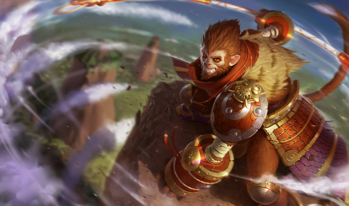
So I've seen a lot of comments regarding the new wukong splash art - I think we can all agree that a lot of people are unhappy with it. Personally my problem with the splash is it lacks contrast/looks flat and the color palette is too dull - my guess was the artist wanted to make it kind of chinese type colors and keep the lighting realistic??? dunno. Either way I'm not a big fan of the colors.

I think the actual art is really good, but it doesn't really match the style of a lot of the other splash arts. So I took it to photoshop, added contrast, tweaked the colors a bit, I think it doesn't stick out as much from the rest now.

Edit As many of you pointed out it was too dark, I had a layer that was unnecessary so I took it out. edit 2 Some people liked the tweaked version and as some others pointed out the new one the red was too bright so I lowered the saturation.

Updated 2 - reduced the red and sharpened the smile http://i.imgur.com/1dxXT0P.jpg

Updated, reduced darkness, further color tweaks. http://i.imgur.com/0AYeWh5.jpg

Tweaked http://i.imgur.com/me27DMO.jpg

Original http://2.bp.blogspot.com/-CsZppjBWNoY/VDwpOpV0UvI/AAAAAAAAbKQ/qLtrV0zPHmY/s1600/MonkeyKing_Splash_0.jpg

29 Comments

Poldy Scarecrow10/15/2014, 3:02:28 PM5 votes

The red scarf and greener, brighter background especially look awesome

Lumus Avatar10/15/2014, 11:02:30 AM5 votes

I like the look of the red as opposed to the orange they have now.

ButtersBBG10/15/2014, 6:24:32 PM3 votes

The tweaked one is too dark, lighten it up a bit and it'll look better.

kitcat30010/15/2014, 6:22:16 PM2 votes

I was content with the new one, but I agree that your tweaked version looks better.

Zan Vorez10/17/2014, 12:25:57 AM2 votes

Hey OP, could you try doing THIS as well? The problem with Wukong isn't so much his coloring, but that Monkey faces don't have cutesy little clefts underneath an adorable triangular nose like cats and bunnies.

https://i.imgur.com/Thv79Hn.png

Aria Storm10/15/2014, 12:27:09 PM2 votes

I feel like the fur blends in too much with the rest of him in several places (like his leg) and the shading is a bit too dark in some places 9this might be my monitor though.)

Otherwise, I really like your choice of colour - feels a bit more alive. :)

TwoD10/15/2014, 4:45:11 PM2 votes

looks way better than original one lol

Gunpoint10/15/2014, 11:59:38 PM2 votes

Way better

Zendrô10/16/2014, 12:54:28 AM2 votes

Hope they see this

Tenant10/16/2014, 4:47:40 AM2 votes

The latest update you have is nice, but the armor's red (specifically his arm-gauntlet thing) feels a bit too bright for me. It was the first thing that came to mind when I saw it anyway.

I generally like the new splash he got, but comparing the original with your tweaks, his fur is really what makes the original feel off; whatever you did with his fur immediately improved it I think.

ColinFly10/16/2014, 5:14:32 AM2 votes

The newest one that you made, I personally feel is the exact route that Riot should take with this new splash.

I appreciate all the work the art team has done on all these new great splashes, and while I find Kongs face and his stance to be a little off-putting compared to his original artwork, I think it's a great visual update to an older champion splash.

I just can't stand the fact that his fur looks so orange compared to his in-game model and live splash. So yeah, great work OP, I hope somebody from the artwork division of Riot see's this and can swallow a little bit of pride and take a look at maybe rearranging somethings about our favorite Monkey Kings splash.

KairosCrow10/15/2014, 8:47:43 PM2 votes

Like the tweaks! Looks quite a bit better. Certainly resembles in-game Wukong more than the default one does.

MrRado10/15/2014, 9:06:13 PM2 votes

I like it!

Onegarion10/15/2014, 7:44:50 PM1 votes

I find more wrong with the pose overall compared to the color. While I think your recoloring looks MUCH better. I still find issue with the pose. He looks to arrogant and thats not really wukong. He is looking to always improve and challenge new people. Not thinking he is the best. I guess they changed Ezreal from being the overconfident arrogant champ and gave that persona to wukong.

Lemons2210/15/2014, 7:57:41 PM1 votes

All you really did was darken the entire image, but even with that rudimentary level of adjustment it looks leagues (not pun intended) better than the original.

LordTobiothan10/16/2014, 5:18:26 AM1 votes

I just don't like that he looks like one of the chimps in the remake of planet of the apes.

MrSexyHobo10/15/2014, 3:08:58 PM1 votes

you made him darker and he looks more like a cartoon... gj