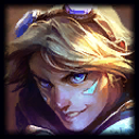
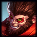
Ezreal & Rumble icon fix - removing dramatic lighting/glows in character icons
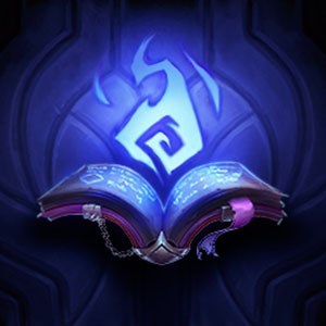
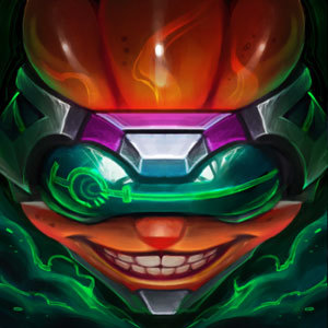
I'm not the first to bring this up. The new Ezreal splash is awesome, and has some really cool lighting. But when you look at just the icon, without the rest of the picture, there's no reason for his face to look blue. I think it's fine for the splashes to take certain artistic liberties, but with regards to the icon the lighting looks weird, doesn't look like his model, and it reduces in-game clarity. The most important thing about the character icons is to be able to quickly recognize who it is from just a quick glance at the mini-map.
Without blue glow + slightly more blonde http://i.imgur.com/QnklDjB.png
Current version http://i.imgur.com/yy6vPvP.png
Also at the end of the game in the results screen the icons are especially small, and details are lost, so it's especially important for the colors to be representative.
http://i.imgur.com/oLmNfUo.jpg
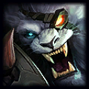
Same thing with Rumble - badass splash, and because he's surrounded by fire he has some red hue on his lower face and his fur color is more purplish, which is fine, but in his character icon it's distracting and he doesn't look like Rumble like in the old character icon.
Without red glow + more cyan/blue http://i.imgur.com/mE35yJG.png
Current version http://i.imgur.com/Z0Xu1ER.png
With the cyan coloring you can easily tell it's Rumble even with a smaller image. http://i.imgur.com/gwFAfP0.png
So I hope Riot considers fixing these icons, and hopefully in the future doesn't just create a badass splash and then crop out the face for the icon - but also makes the necessary changes to make sure the icon as a standalone looks greater/more representative than the old one.
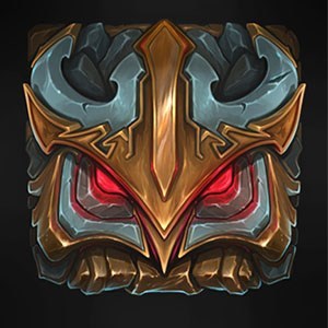




 looks way too much like
 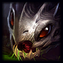 at a glance to me