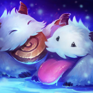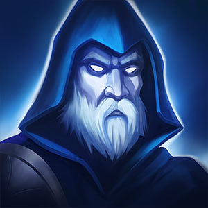
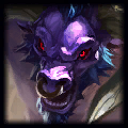
New Alistar icon

Hopeslayer··7 votes·2,762 views

Can't even tell WTF it is, it was bad enough when Rengars icon changed to a damn cotton ball. (before they fixed it Rengar now it just looks like glowing dots on a cotton ball with a random thorn)
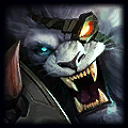
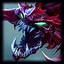
Alistar looks like a different shade of Cho'gaths icon, but less visible Chogath Alistar
all these "art / icon updates" are just plain terrible, and the color schemes make it hard to see what champ it is.

its not a matter of "unable to handle change" its the fact that these changes are pointless, and the icons are just a mix of 3 colors thrown on a canvas.

adding too much detail in a picture, doesn't translate well when the image is shrunk for icons in these situations. looking at the art for champs that haven't been touched for awhile, you can actually tell who the champ is when its shrunk as an icon

p.s. good job changing Tristana's art/icon. then remaking her in-game to look nothing like it. #WasteOfTime

7 Comments

BLU Medic2 votes

I play a LOT of Cho'Gath, and I STILL mix up the new icon. It doesn't even look like him. Cho'Gath's model has massive green eyes and a mixture of red and purple, but the icon is mostly red with little slit eyes.

And you're right, Alistar's one DOES look too similar.

Dreamspitter2 votes

[{quoted}](name=Lord Vocu,realm=NA,application-id=6kFXY1kR,discussion-id=kBKEFssp,comment-id=,timestamp=2015-01-16T04:08:49.923+0000)

Can't even tell WTF it is, it was bad enough when Rengars icon changed to a damn cotton ball. (before they fixed it Rengar now it just looks like glowing dots on a cotton ball with a random thorn)

Alistar looks like a different shade of Cho'gaths icon, but less visible Chogath Alistar
all these "art / icon updates" are just plain terrible, and the color schemes make it hard to see what champ it is.

its not a matter of "unable to handle change" its the fact that these changes are pointless, and the icons are just a mix of 3 colors thrown on a canvas.

adding too much detail in a picture, doesn't translate well when the image is shrunk for icons in these situations. looking at the art for champs that haven't been touched for awhile, you can actually tell who the champ is when its shrunk as an icon

p.s. good job changing Tristana's art/icon. then remaking her in-game to look nothing like it. #WasteOfTime

Trist getting new splash anyway

Hopeslayer1 votes

{quoted}

Trist getting new splash anyway

if thats the case then wtf was the point of the current one, just to change it again in less then 5 months. seriously

is my money from RP going to the art guy wasting his time re-doing sht instead of putting that money toward fixing the servers

Vortex IV1 votes

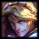
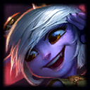
Ezreal, Tristana, and Cho with honorable mentions for worst icons.Alistar Ezreal Tristana Chogath

4nth0l0gy2 votes

Yeah, Ezreal especially is just way too blue. Like, I don't mind the art. They just need to adjust it to make the icons readable.

Sukishoo1 votes

Yeah they could do something about his icon. I love the new splash but that icon made from it was really hard to tell what it is. When I first noticed it in the game today I was just like "who is tha-oh it's Alistar"

Hilltop Sunset1 votes

I agree. These icons they've been putting out just look like dark shadowy shapes that don't resemble anything sensible. I have been saying this for a while now, but meh. The new splash arts look REALLY nice (usually [I'm looking at you, Janna]) but the faces of the champs are ALWAYS in a friggin' shadow (Lee Sin, Kog'Maw, Alistar, etc) so when you 1) crop just the face and 2) shrink it down, it ends up losing all recognition.

More from Story, Art, & Sound

More by Hopeslayer