I've loved Vandal Vladimir's splash for a very long time.
Desiderium··4 votes·2,292 views

https://1.bp.blogspot.com/-dBbXsveUCVo/VwQKH9IoqrI/AAAAAAAANBY/ycnvxGPDG18omfkNp_pSCCx3HEt8SjToA/s1600/Vladimir_Splash_4.jpg

And this is not a suitable replacement.

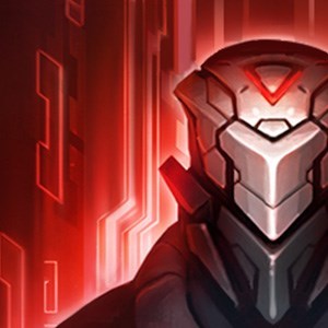
Vandal Vlad's splash art, in its current state, does exactly what it needs to do: show Vladimir looking like a sexy, emo, vampire biker. The Chinese art (pictured above) makes him look like a generic anime character, makes his face less attractive, and does a terrible job of showing his hair style. Half of it is shaved and you can only see a very tiny portion of that in the Chinese art.

I didn't say anything regarding the Nightraven Fiora fiasco. I did mention I preferred the Chinese version, although I didn't throw a fit that it ended up not being replaced. However, this right here is my cue. Please don't change Vandal Vladimir's splash to this.

For reference, here is the current splash:

http://vignette1.wikia.nocookie.net/leagueoflegends/images/9/96/Vladimir_VandalSkin.jpg/revision/latest?cb=20110118204229


Side note: I also believe the Count Vladimir Chinese art is not an objective upgrade either. However, I don't care as much since I never wanted to buy that skin because the American splash shows him with straight, long hair; whereas ingame he still has onion hair but it's just recolored to black instead. American Count Vladimir's art and lighting are just objectively higher quality overall too. In fact, American Count Vladimir's full splash art was one of the first splashes I've ever used as a wallpaper.


9 Comments

Arakadia4 votes

To be honest, I like the new one more as It has vandal brand, which I own, and shows him in motion. Your reasons seem to be more nostalgic which I cannot relate to.

Desiderium2 votes

What do you mean "nostalgic"? It doesn't show his hair style as well as the American version. He has blond hair instead of white like he should have. And due to the position of his head and his left arm, the loading screen card would be too thin to show both his face and his muscular arm.

These are all objective facts. How is it nostalgic at all? And why are people upvoting you?

Arakadia1 votes

Ok sure, his hair is different. But he would fit fine in the loading screen. What I mean by nostalgic is, as you pointed out, you notice all these small details such as hair color, hair style, etc. You proved a good point, and this splash could be updated. I mean nostalgic as in you have owned this skin for a while and thus while automatically like it more. It's like moving into a new house, your going to like the old one more because of memories and connection. Even if these houses function exactly the same, aesthetic wise you are likely to like your old house more.

Blood Magicks3 votes

In my opinion what they did with the rest of Vlad's splashes is way worse. They're not very well drawn and the poses are crap.

I'll sit in my corner and cry until my darkly handsome husbando gets a VU at least as outrageous as Taric's.

Malicious Metal4 votes

We'll be here a while.

Blood Magicks3 votes

Group hug for Vlad, Riot's unwanted son.

Malicious Metal3 votes

pats back He'll be a bit more wanted after his rework though.

At least he and Morde got the monopoly over the entire Spellvamp stat.

GreenLore2 votes

I actually think that this is the best chinese splash art out of the new wave.

XIII Vanitas2 votes

The Chinese splash art lacks elegance, the American one lacks movement. Between elegance and movement, Vlad would choose elegance, because he's a refined esthete, even while being a Vandal.

More from Story, Art, & Sound

More by Desiderium