Not a Fan of Kassadin's Visual Update
Arkkenshield··32 votes·16,868 views

T4R. Out of all the amazing things RITO's champion update team has done, I'm frankly surprised that Kassadin's VU is really...lack luster.

http://demaciaesp.adngamer.es/wp-content/uploads/2014/03/KASSADIN.jpg

https://www.youtube.com/watch?v=qrShhV8_qM0

When I found out Kassadin was getting a rework I was hoping to see the team go crazy with new ideas on how to improve both his looks and his personality. There were a lot of ways they could have turned "Darth Vader in a Diving Suit" into a well thought out design. Take this piece of fan art for example:

http://media-cache-ec0.pinimg.com/736x/28/34/a5/2834a516c50ef9cc1c6b59c0be4c7e13.jpg

I feel like given more time, Kassadin's VU could be a lot better. RITO's champion update team could add better animations, a new voice (or more dialogue), and (most importantly) a great visual design that makes people actually interested in playing/buying him when he receives said update.

74 Comments

Thanotos Omega14 votes

This is the first time i have seen one that actually looks more like a step backwards, he just seems so unpolished and meek compared to his current look, it's looks more like a fan model made for an older game like Warcraft 3, but with an HD texture pasted on it, he just looks incomplete, i really do feel the Redesign team needs to be told to scrap it and start from scratch, otherwise this is a waste of resources,

Major Sparkles1 votes

I think the updated version is a huge improvement. The contrast in colors is very nice and the hard bold lines on his suit are cool too. I always thought Kassadin was a very unique looking champion, why drastically deviate from that?

Reynard the ƒox9 votes

Is it a whole VU? I thought it was just a texture rebalance

Arkkenshield2 votes

https://support.riotgames.com/hc/en-us/articles/202294884

right here it says he's marked for a visual update

Reynard the ƒox8 votes

dang thats disappointing

gsai1 votes

{quoted}

https://support.riotgames.com/hc/en-us/articles/202294884

right here it says he's marked for a visual update

I'd wager this isn't that if that's the case.

junglerboy161 votes

nope, this is actually it, it is a new model and rig, with new animations and everything. Check it out on Surrender@20, there is a full video skin display for each of his new ones.

libraryseraph 1 votes

lolking's model viewer shows all the new skins and animation too

junglerboy161 votes

Wasn't sure if they were up yet since it usually takes a couple days before they get updated there.

Narog8 votes

i think this looks a little better purple instead of blue http://imgur.com/uBybslE

NayNays4 votes

Upvoted, this is an improvement.

Narog2 votes

Riot could try making him dark blue or ppurple but not bright blue is not a smurf

Archenz2 votes

Wow, that actually looks really good, it actually matches with his sword.

Conncept5 votes

Really that is all they are doing to him? I was expecting some serious work, his original design wasn't particularly well thought out, they just took a humanoid character and added junk to him until he looked interesting, same story with a lot of the early champs.

He still just looks like a dude in a nonsensically spiked breathing apparatus.

They need to look over his lore, flesh out his story, then make changes based on that. I can't remember what author said it, but the basic just was that you should know 1000 things about your character for every one thing that actually appears in the story. Riot appears to be putting in no effort to knowing their characters these days.

What culture is he from, what is the typical style of that culture? How did he look and dress before? What was his profession, his hobbies? What environment did he live in, how did he grow up, did he travel or was he settled in? Was he wealthy, average, or poor? Did he have family (we know of one) or any pets and close friends? And in the end, how did going in to and escaping from the void affect all that?

Yulen Xoshxius3 votes

Good! I was worried I was losing my mind thinking the VU looks like a step backwards... He looks more like a gummy and less awe inspiring.

The Ecdysiast3 votes

They're too stuck on making sure we know he does crunches. Rito, we don't care if Kass has abs, give the dude a shirt.

Magus KamiSama3 votes

I dont like the VU :( who is the new VO ?

Oleandervine3 votes

I personally think Kassadin needs to lose the dress and the 80s movie quantity of spikes he has cover ing his body. To be appealing to players in this time period, he needs to look imposing and not goofy and cheesy. I mean, his design is the equivalent of a kid saying "I'll add more spikes to make him EVILER!"

Maestro803 votes

They probably figured nobody's gonna play him after gutting his teleport range, so they didn't want to waste too much time on his VU.

ArkenStorm3 votes

I completely agree. Its kind of lame. Btw love your username.

Arkkenshield2 votes

Came up with it when I played GW2. Sounded pretty catchy so I stuck with it :]

ArkenStorm1 votes

The difference is I use one k. :D

BinkyBarnes3 votes

I Like the suggested one better, (except the helmet) What do you think about this? I'm no MS Paint master, so this is my best attempt

Arkkenshield1 votes

Imo, the helmet on both models aren't good. The fan art doesn't really go well with the rest of the body, while the original just doesn't look good

BinkyBarnes1 votes

Thats true, but that blade looks really cool.

Ironclad Dragon2 votes

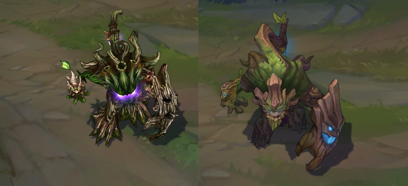
Some VUs aren't that comprehensive. Maokai had his VU recently, and that wasn't gamechanging.

Arkkenshield11 votes

No, but couldn't one argue that Maokai looked considerably different after his VU? I see almost no visual difference with Kassadin besides a few more spikes and some blue tint.

http://4.bp.blogspot.com/-7jF71c3dNlo/VG0DdLq_63I/AAAAAAAAdpg/42FI0mpf3iY/s1600/mao12.jpg

Ironclad Dragon6 votes

You are correct. I was wrong to use Maokai as an example.

junglerboy162 votes

You are absolutely right. I'm still mad about that one, because he looks like a goofy bouncy buffoon now instead of a menacing stomping tree (the derpy blue lighting doesn't help either).

I don't play one of my all time favorite champions anymore because it looks so weird.

Kassasdin's new model is better than the old one by a long shot, and while there is some missed opportunity in it, be glad they didn't ruin his appearance with a new model that lost his identity.

Conncept2 votes

The lighting change may look less threatening than the old, but it makes sense they were changed, the color of purple he had before is strongly associated with the death magic of the shadow isles, and he is not a shadow isles champion, but is in fact an enemy of such champions.

Still, they could have chosen a better color, like green or golden for example? It is supposed to represent nature magic, blue is actually the color that appears the least of any in the natural world, not to mention psychologically the least active and threatening color.

junglerboy163 votes

The whole point of Maokai is that he was changed by that evil death magic which is why he hates the "foolish humans" who destroyed his realm. He is a being of extreme wrath, and the purple (which does have a more ominous/evil feel to it) captured that much better than blue or green or gold could.

Conncept1 votes

He was changed by it, not overtaken. His lore states that he succeeded in keeping the original uncorrupted spirit of the shadow isles in him, in spite of the fact that doing so infused him with both natural and necromantic magic.

But you do have a point, having particle affects that look fully 'natural' and 'druidic' does not fit, but neither did his old particle affects that looked fully necromantic.

Major Sparkles1 votes

I think Alistar is a better example.

bumbertyr2 votes

Wait that's a visual update? i thought that was his champion kit reveal!

Jaxx2 votes

To be fair, Vu are not suppose to make huge differences to the champions original looks, like look at the past vu like nasus, nid, janna, soraka, annie and pretty much every other champ who got a vu don't look drastically different to there past model, I mean.. Kassadin looks a walking triangle and those colors.. ew, So I don't see how It can be that bad, they made him look way better... I mean, its just a Visual update, not a remodel or anything.

Thanotos Omega5 votes

I think the issue was that they made it seem like it was a real project, like Heim was, not a simplification and clean up, you don't sketch and work on removing two tubes and a sash,

notice that no one was mad about Ali, cuz they didn't act like it was a big deal, this sounded like a middle ground project, and this is all we got, it makes all the hype feel wasted, is this all that we will get with Taric or Caitlyn? because if so don't bother, it's a waste of time,

DynamiteGazelle2 votes

I actually find myself really missing the horns on his waist. They were really unique.

Audiomancy2 votes

The only difference I'm seeing is that he's blue and shirtless.

Bryanthelion2 votes

Yeah, they definitely need to redo this. His skirt doesn't read mobile to me.

junglerboy162 votes

Yes it could be better, but it is already FAR better than it used to be.

BubbaDuke2 votes

I was hoping Kassadin would get something more akin to Karthus's VU.

Mostly I just think his legs should be visible.

BerserkInferno2 votes

It looks bad. I thought it was just a texture update initially. Heck, they didn't even fix the sword binding point, that's just lazy.

inmUGco2 votes

the sword terrible!i think 3D dynamic laser sword ! Strike Action feel Strange!

Random Task2 votes

This is a model update. Visual update is what Karthus, Sion, Twitch, etc received.

Arkkenshield2 votes

Says on this page that it's a visual update

https://support.riotgames.com/hc/en-us/articles/202294884

nachocheeseeeee2 votes

He needs a new visual rework, like karthus and sivir. His design is so outdated. Not to mention a new splash art.

Panth, Taric, Malph, Cho all need one too.

Arkkenshield2 votes

Amen to that

Byrnes1 votes

I actually thought at first it was a texture rebalance. But maybe we are all using the wrong terms here, is this actually a VU or is it a TU? Either way, he does in fact look more defined - maybe we're all just too used to the huge updates xD

Arkkenshield1 votes

I believe it is a VU, it was stated on the riot support page anyways.

https://support.riotgames.com/hc/en-us/articles/202294884

shepi131 votes

The timing of the update is kind of funny too.

Rito: "We nerfed kassadin too hard, how do we get people to play him again?" "Well, we could buff him, but we hate him too much. Let's just give him a visual update, people love those"

Rito plz.

More from Concepts & Creations

More by Arkkenshield