@Riot Inquisitor Nautilus- first impressions and community responses

So let me make this clear, I am not here to complain. I personally am very excited for this skin as Naut is one of my favorite champions but none of his other skins really stood out for me until now. I would like to purchase Inquisitor Nautilus, and have the RP to do so when it comes out, but would like to voice some opinions as well as my own on the current state of the skin.
I know this is PBE content we're talking about so I'm aware things are subject to change. That's why I'm here.
http://2.bp.blogspot.com/-Lub2JgAYxPw/VMgi4Y_2T-I/AAAAAAAAiiQ/Fc2HSW4hBvA/s1600/nautfront.jpg
So first and foremost the biggest thing I want to point out is what looks like flat out empty space under his visor. It doesn't look like it's meant to be like that and just seems very flat and undone. On standard Nautilus this looks fine because of the overall design of his face but with this skin it doesn't look right. It's like he's trying to lift his visor but only ends up exposing this weird and flatly shaded void. That's my biggest gripe but let me know what you guys think; moving on.
EDIT: Looks like they fixed it on the newest PBE cycle. Awesome :D
https://www.youtube.com/watch?v=AAjz_ZFZsJ4
So the biggest think I've seen strung in the youtube comments is his skills being the same (e and r mostly) but I understand this is a 750RP skin. I find the green blue colours still work with this skin but I thought I should say something about it since I've seen lots of other people noticing this.
http://2.bp.blogspot.com/-YOKJVBugdKE/VMgo282WOnI/AAAAAAAAikA/pN7pRo4zAig/s1600/nautw.jpg
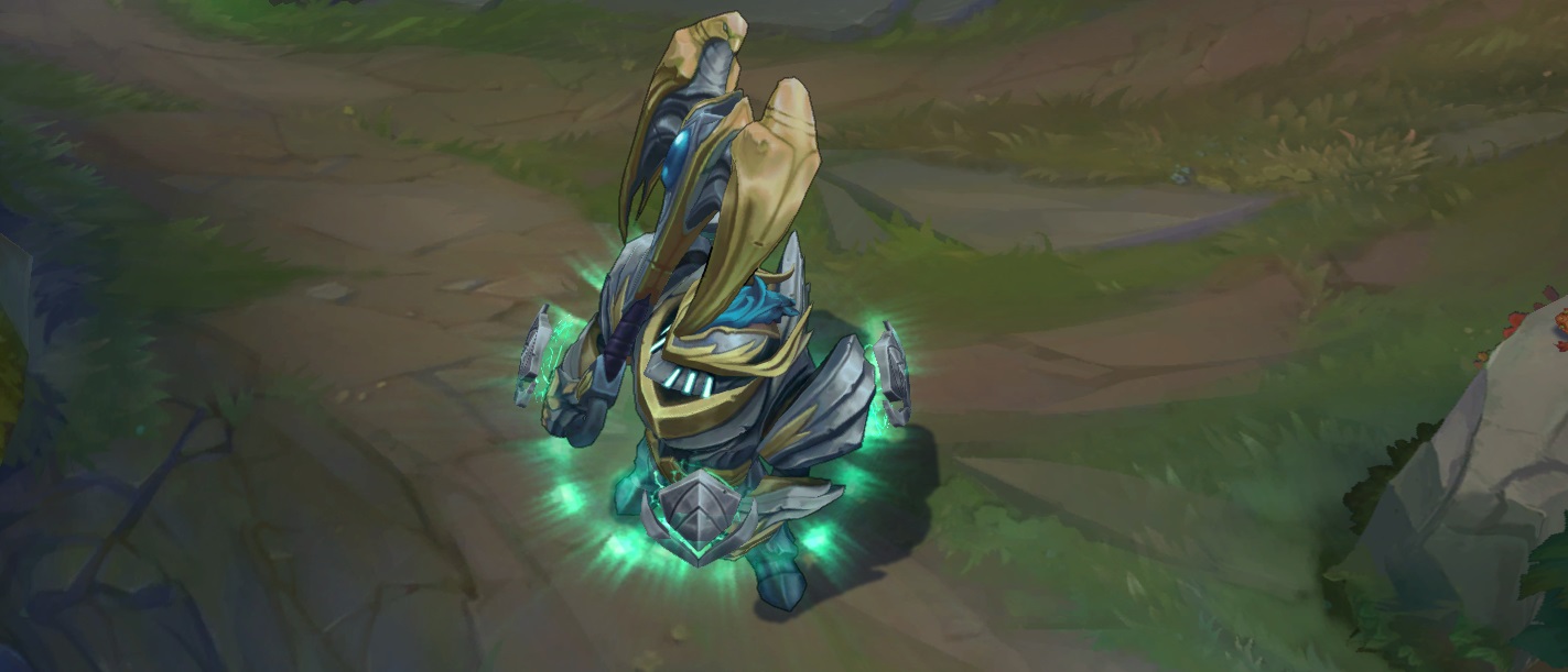
On the topic of skills though I think the current w is worth mentioning. Like inside Naut's mask the shield's look plain and uninspired which a bit of texturing would fix easily. I'm talking specifically about the little floating shields, as personally I think the eye glow effect is so freaking cool and the shield also shows how naut's original colours work with the skin (I think the shields spell effects aren't different).
TL;DR: The skin seems rough around the edges in a few places and even if this boosted the skin's price I've seen that lots of people seem they would be fine with this. The potential for the skin line seems so amazing and I think the backlash is just because of people hoping for a little more before the skin leaves PBE. Lots of people like myself already love the skin, and those that don't seem only to not like the rough edges I described above. Short story shorter; please polish it up Riot, only a little where it's deserved (The mask issue and shields mainly). Naut fans will love you for it :)
NEW EDIT: So the biggest thing was the empty space in the helmet which is fixed on the PBE now http://2.bp.blogspot.com/-Zukxl8Gg0bU/VMlB-fVQK1I/AAAAAAAAizk/L6diOjl0CfM/s1600/naut%2Bcompare.jpg I'm for sure getting it now, but if the other things everyone else seems worried about get updated I'll be even happier :P
EDIT AGAIN: They also gave the shields textures. Awesome :) http://3.bp.blogspot.com/-na3qn6xzi4A/VMlKmvJgMwI/AAAAAAAAi1Q/JF3DvvgPHmM/s1600/bbbbbbb.jpg