Totemic Maokai VU complaint/suggestion.
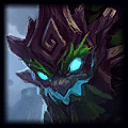
First, I'm sorry if this is the wrong forum to post this on but I think Champion skins are art and the new Totemic Maokai is misrepresented. In British Columbia, Canada, totem poles are a part of the culture here and while the old skin fit the bill this new one is a little offensive in my eyes. Totemic Maokai is now Tiki Maokai the way I see it and I believe something should be done to either change the name or work on the model and colors. There is a vast difference in the cultural designs and it's disappointing to see 'totemic' chalked up as carved, exaggerated faces on wood. The only thing still representing an actual totem pole is the sapling now, still representing a thunder bird (a common figure on totem poles). I'd like something to be done as I just feel it's offensive in a way, and I don't mean to be the cultural kill joy but the subject bothers me. Maybe my own knowledge on the difference between the two isn't as deep as some of Riot's designers and if this is the case please inform me where the inspiration came from but otherwise it's upsetting to see such a difference glazed over.
If anyone knows a way to let Riot know this directly I'd appreciate it. I feel it's something that should be brought to their attention.
EDIT: I guess I can see the whole totem mash up they might have been going for now that I can see a few more angles of things. Ya, the old one was more representative of a totem pole as evident by the ones in the splash art and I liked it but this new one makes enough sense. It's got a whole bunch of totems, not just a totem pole, and while I would love some work on the color palette to better match the original I guess the model is okay. The face still seems kinda big and a touch goofy though.
TLDR: I think the colors would look better if they matched the original better, and the face looks a little to big and goofy but I suppose the change is alright. Just very different from the original concept.