11 Comments
 Sunfield1 votes
Good move :). As I said, try putting some more light on it, it will look even neater
 333lom1 votes
Thanks! In fact, I do have a problem with shading and light - I have to work on that, because now it's like I'm afraid of adding bolder shadows and effects to it. I'm looking forward to seeing your art too!
 MAZZ1M01 votes
Critique alert: Don't read if you can't handle blunt.
It feels bland and done. It doesn't really seem to say anything and it isn't memorable because it's not attention-getting. You need to design something that resonates or has a feel about it that viewers can attach to it to remember it or connect to it.
Take Justicar Syndra for example, Justicar has the gold, black, white, and red color palette which is interesting enough to look at, but then the helm which covers the eyes and the feather tassel and the sheer elegance of it make it memorable. It grows on you even if you don't like it initially. Your idea suffers (partly) from what Atlantean Syndra suffers from -uninspired or lacking in vision. Riot's idea of Atlantean was ultra blue. As a result, the skin is super boring and doesn't do anything for her. Yours is mega-grey, without unique features like feathers or the blind helm (though I suppose you did give her footwear.)
Refer to some other sources and try a draft sheet coming up with various ideas and sketch them first. Like take inspiration from this: http://www.deviantart.com/art/Dark-Fantasy-381846741 and take the essence or capture the ideas you like and combine them with something else like this http://www.deviantart.com/art/Syndra-The-Dark-Sovereign-Ideation-Thumbnails-342605666 (which is essentially what your idea sheet should look like) and make it fit your vision -well, search for things initially that fit your vision; don't force it.
You'll come out with a much better product with more influences because at the end, no matter how many references you use, you'll still decide what you think looks best. Your idea can work, it just needs to tackled differently.
333lom1 votesWell, okay, I get that you don't find the design interesting. But I think it's really because the lack of contrast, nothing else. In the first image you've shown, I see nothing worth remembering when it comes to the design, it just has deep shadows and lighting. In fact, I've done a lot of sketches and plans for this skin, going through many designs. I made a mistake colouring her more gray than dark green, but that can be changed. I had in mind a palette of green, gold and purple, but it just ended up with not enough vibrancy. And the lack of purple.
MAZZ1M01 votesThere's more to it than just color and contrast though. Don't fall into that trap.
The first image shown actually has several colors in it, mostly charcoal and gold, but it has others less pronounced. Because of the style, the deep shadows mask a lot of it which comes out with an effect I rather like -that aside though, what makes it most memorable isn't necessarily the color palette. It's the design and feel of the picture as a whole. The world-is-my-plaything vibe it has is very cool and attention-getting. Even if you don't like the image initially, you remember it for awhile (I didn't like it all that much the first time I saw it.) Then there's just the badass design.
The color doesn't pop, but it's not meant to and that fine, what does work in its favor is the design of her outfit -particularly the gauntlets and breastplate. The helm looks a little weird to me, but you can't miss that either. Its not a question of "Oh I didn't do this one thing right" its the whole package.
A good question to ask yourself is this "If I took the crystal balls out of the picture, would people still think 'crystal Syndra'?"
333lom1 votesA simple "I don't like the design" could have been enough. Because I can't use anything from your feedback, you just didn't provide any constructive criticism.
I have to disagree on the design of the first image you've shown, because I didn't find anything interesting, nor memorable on it - and that's because of my taste. It's simply because of your personal taste that you don't like the one I drew, or don't think it leaves an impression, while I like it - that's why I posted it in the first place. I designed the helmet to be that strange on purpose, to add a twist to her repeating look in all of her skins.
There's no point in arguing about taste, you either like it or not. See you in some other thread!
MAZZ1M01 votesNo point in posting just to say "I don't like it." It's fine if our tastes are different, I'm just offering criticism. It's going to be biased. :P
 gPichu1 votes
i think a ice skin for 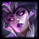 would be and fit better.
More from Concepts & Creations
A completely serious, totally legit question for Riot.
Concepts & Creations183 comments
2,280
votes
[Champion Concept] DhaMa, The Force of Balance
Concepts & Creations931 comments
1,424
votes
Elderwood Kindred
Concepts & Creations176 comments
1,062
votes
Bring Urgot's Nipple Back!
Concepts & Creations94 comments
985
votes
Petition To Have An Old Lady Champion
Concepts & Creations481 comments
947
votes
When Tahm Kench eats Lulu, he should say that it tasted purple!
Concepts & Creations109 comments
826
votes
More by 333lom
Here are my edits for Kayle's base visuals
Story, Art, & Sound54 comments
136
votes
Please Riot, did you not understand Viktor's character at all?
Story, Art, & Sound169 comments
133
votes
Aristocrat Viktor skin concepts
Concepts & Creations29 comments
121
votes
Designing a champion - Braum's Momma!
Concepts & Creations66 comments
110
votes
Additional Arcade skins! @Riot Skins team!
Story, Art, & Sound87 comments
101
votes
Ivern has some sick replies to taunts
Memes & Games18 comments
100
votes