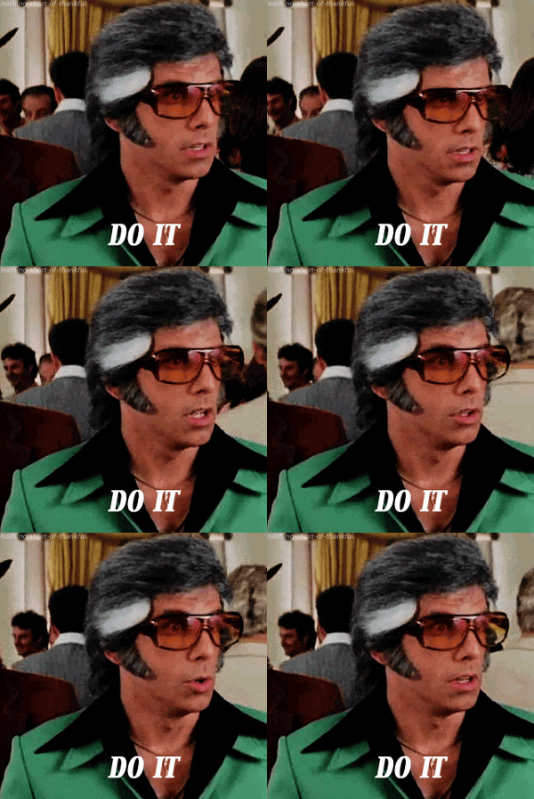
The new HUD with the old setup.

Ataraxas·7/24/2015, 6:29:07 PM·203 votes·9,056 views

http://i.imgur.com/dgZFGLj.jpg Alright guys so i just found this. This looks much more amazing, much more spread out, and much easier to read in the heats of battle. P.S. I take no credit for this for i didn't make it. @Riot please change back to this.

124 Comments

Vistha Kai7/24/2015, 7:34:52 PM38 votes

Do this and all problems with the new HUD gets fucken solved, Riot.

http://media.giphy.com/media/wi8Ez1mwRcKGI/giphy.gif

FOOKING Prawns7/24/2015, 7:06:17 PM20 votes

Too bad they'll never do this because they don't give a FUCK about the community's best interests.

Let me remind you that they're slowly tearing the community of these boards apart, a common meeting ground for players all over the North American continent.

Meanwhile, they refuse to give East Coast players a fucking functioning server so that we don't have to suffer with constant 100ms latencies. It's hard to even be competitive when the other side of the country doesn't have any delay.

Don't get your hopes up, because Riot has not only proven their incompetence in player relations but they have proven their general incompetence in the video gaming industry.

This game could be a triple-A title, but they'd rather dump all of their money into LC$ and useless fucking All-Chat videos instead of dealing with real issues that the community have been asking for solutions to. And the sad part? They will continue to do this until another company makes an enjoyable alternative (right now, Dota 2 and HotS feel too different to be considred "alternatives" to League, Infinite Crisis and Dawngate tried to accomplish this but ayy shut down because they can't get funding as Riot has completely monopolized on the genre and starved all indie developers striving to push out their MOBA games)

Riot has continually gone downhill with their policies and management since Season 1, and will continue to do so. I'll be happy when this company chokes itself, maybe then other developers will be able to actually promote and sell their games.

This is what happens when you sell your soul to the communist Chinese profit-mongers.
ModAttysu The Poro7/24/2015, 6:35:47 PM15 votes

Yes please.

Trídent7/24/2015, 6:37:58 PM9 votes

Jas pls

Silents4297/24/2015, 11:16:29 PM5 votes

Except the issue of having to look all over the screen for information would come back. This not looking very good in the first place either.

JPlayah7/25/2015, 8:55:49 AM5 votes

Riot, I NEED the option to have my items on the left side. Having played with that setup for over 4 years, I am now being completely screwed over by the new HUD. This goes way beyond me being able to just "get used to it" because in the meantime, I can feel my skill level deteriorating as a ton of critical information is now absent from the location I expect to see it in. PLEASE give us the option to control where the item block appears in the HUD.

arcinex7/25/2015, 1:25:46 AM5 votes

YES PLEASE

DildoSlayer7/24/2015, 11:34:47 PM4 votes

I want my green text back.

Remus Wins7/25/2015, 11:26:30 AM3 votes

I take credit for this though! =)

Alaskan Legend7/25/2015, 12:29:25 AM3 votes

I still wish the font was a bit better, but this is definitely much better!

TheRealMondo7/25/2015, 12:35:29 AM3 votes

YES YES YES YES WHERE DO I GET IT. TELL ME NOWDrMundo

67169943_DEL7/25/2015, 1:26:28 AM3 votes

this is exactly what i was imagining :D

Cipse7/25/2015, 4:13:45 AM3 votes

I like the individual designs of the new HUD but the layout of the old. Having this would be amazing, if you ask me.

PieOfReckoning7/25/2015, 11:06:54 AM3 votes

Logged in just to upvote this

OJ1917/25/2015, 6:56:57 AM2 votes

"but muh clean corners"

damnit riot

S2C2Xd9KOy7/25/2015, 7:04:20 AM2 votes

That looks so much fucking better. Can everyone repost this please lol.

Loken Stoneheart7/24/2015, 11:14:42 PM2 votes

Give me a slider to make the champion portraits on the left bigger and I'm quite content with it.

Dr Poro7/24/2015, 10:46:51 PM2 votes

The old HUD being spread out is actually the reason why they changed it. You're supposed to see all the stats without having to scan through the whole screen. If you need to look at your cooldowns, you had to look at the bottom and then to the left for your active items. Now, you just need to look at the bottom. If you want to know about anything game-related, you had to look at the minimap, but also to the top right and to the left. Now you just look at the bottom right (and Tab).

Just give it time, you'll learn to see everything all at once. You're currently just overwhelmed by all the information at one spot, but it's really better this way. It's easier to process clustered information than when it's spread out.

The only thing that could be improved is the fact that allied summoners and allied ult timers shown on 2 seperate places. This is because with the initial version of the new HUD these things didn't exist yet, but they added it based on feedback in the places where they could easily add them: AKA where the symbols already were.

Ansem7/25/2015, 1:26:41 AM2 votes

Yeah, this is pretty much exactly what I had in mind. I'm okay with the new designs, I'm not okay with the placement of them, though. If it was truly like that with the new design but in the old format, I would be 100% okay with it.

iainB857/24/2015, 10:00:04 PM1 votes

It's good, except I liked my stats window coming out of my character pane (made more sense, and centralized it more), and I like my team mates being over the mini map instead of way out left field where nothing else is.