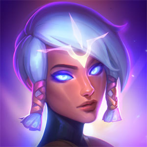
Why can't the new Katarina splash take some tips from her Warring Kingdoms splash?

When I first saw Warring kingdom Kat's splash art, I was left breathless. It is deadly, elegant, and all too beautiful. It is simple in that it shows her in a set yet dynamic pose.
New Kat splash art looks warped and distorted. Her proportions are atrocious, there is no focus anywhere in the picture, her eyes look like she is either an alcoholic or just rolled out of bed at 2 AM, the list goes on.
Why can't we have the sophisticated simplicity of the old splash or the warring kingdoms splash? We don't need every champion splash art to look like they're trying to jump through our screen, it makes them look much less believable, less natural, and downright ugly.
Please Riot, how can you let one Artist make such an amazing splash, and then make the base look so bad?