Holy shit those icons
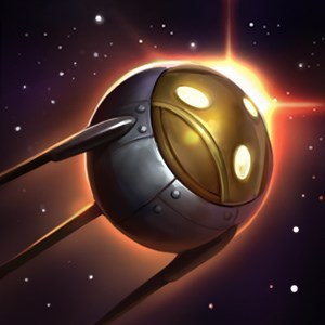
http://www.surrenderat20.net/2016/02/22-pbe-update.html
That shaco R especially
http://www.surrenderat20.net/2016/02/22-pbe-update.html
That shaco R especially
 Solerian3 votes
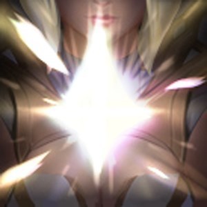
They're all great, but I'm especially in love with the Lux icons.
I hope the artist they had make these makes the future icons.
 Moonboy652 votes
still waits for Janna and Anivia icons
 Maple Crusader1 votes
still waits for Janna and Anivia icons
Here are custom Janna icons: http://img3.leaguecraft.com/skins/asset/skin_1442683555_760px_66033_1.jpg%22 http://leaguecraft.com/skins/66033-janna-new-spell-ability-icons.xhtml
Moonboy652 votesthose aren't custom, it's concept art that was made by Aquatic Moon, who also made the Rammus and Tryndamere icons that are currently being used
 RiotReav32 votes
I'm glad you like these.
We are looking to take the "mid-year" mage roster project as a oppurtunity update the icons for some of the older mages we are working on, most likely using the same artists.
 La Bello5 votes
I'm glad you like these.
We are looking to take the "mid-year" mage roster project as a oppurtunity update the icons for some of the older mages we are working on, most likely using the same artists.
I enjoy the work the team is doing here but.... Can you please politely ask them to not make all the icons so homogenized?
Ive noticed a certain growing trend with these Icon updates. I would prefer the Icons to be somewhat unique and interesting.
RiotReav32 votesCool, I will pass that feedback along to the artists.
 Guardman1 votes
Cool, I will pass that feedback along to the artists.
I would like to second that as well.
Another point is that some of the new icons for a champ are all the same color, which doesn't look as nice. Each of Lux's new icons have an unique color combination. But Gragas's new ones are all magenta outside of his passive and his Q and E especially look the same when they are small or out of the corner of one's eye.
The art itself looks wonderful, the icons for a champ just need to be more diverse in color.
 Tendrian2 votes
Please stress especially that icons should NOT all have the same color.
It's been done with quite a few of the updated icons, Ashe and Poppy are prime example, and not only makes it look them rather bland (seriously look at Ashes icons, it's just 4 times a white arrow with a blue background from different angles), it also makes it difficult to tell them apart at a glance. When I can only look at them for a split second in a teamfight I have actualy problems to quickly tell if my if it's my W or my E that's on CD on Poppy because all her icons boil down to
ORANGE STUFF1, ORANGE STUFF2, ORANGE STUFF3, ORANGE STUFF4.
 Decrit1 votes
...actually that is intended, it is nice to see the icons more synchronized within themselves rather having a patchwork of messy colours.
Probably some are a bit bland icon wise... but honestly, we can' t complain about some champs. Ashe is all about arrows :P
 DeathBurst1 votes
"not the same color" is probably a bit too specific, but your ultimate point that "icons should be distinguishable at first glance" is a very good one. Take my +1
But there can be other ways than color to distinguish 2 icons.
Moonboy652 votesGragas E tho, it doesn't look like his in-game animation
 LOL Spammer1 votes
Ye these are pretty dope.

