Kudos to the artists! All but ONE of the new splash arts look fantastic! Let's talk about THE ONE

5G8Nri0B54·10/14/2014, 1:13:27 AM·10 votes·4,487 views

I mean, Tristana's finger counts are wrong, and Ahri's face lost her iconic distinctiveness that Riot literally uses for the "select champion icon" button (her ball shrunk two sizes too). But...they're still improvements overall.

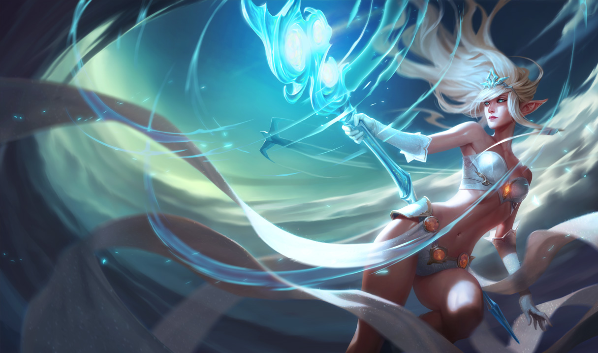
But our flighty air-headed heads in the cloud wind-mage, Janna...............got an overall downgrade compared to the original.

http://3.bp.blogspot.com/-kAVW8jWV44E/VDwpOHJdPFI/AAAAAAAAbKE/xCjp3PlRVmE/s1600/Janna_Splash_0.jpg

In contrast to the original

http://img2.leaguecraft.com/lol-splash-art/asset/wallpaper_760px_1522.jpg

Overall it's both that empty zombie-like expression in her face and that boring pose of hers.

The old one had Janna display a more emotional and playful face fitting of someone who can just fly wherever she wants and blow pursuers away. The old one also had a great pose that no other champions had in their splash-art. But the new one looks...kinda mummified if you get what I mean. Overall I guess you can say they took a bit of her femininity away.

If I know anything about the LoL community, it's that they can and will take every little thing I say the wrong way. But, the old splash art makes her a woman. The new one kinda took that away...and turned her into a blank-faced zombie or someone under hypnosis?

On a completely neutral side-note. Why'd you make her less blonde?

But asides from Janna and a few really minor hiccups with the other splashes, kudos on pretty much all of them! I don't know why Tristana is capable of producing such a gigantic explosion since nothing in her kit is capable of doing that kind of destruction and she's more of a machine-gunny marksmen, but it still looks cool! And Kayle has by far the GREATEST improvement of all, thanks to the artist's amazing depiction of her choosing to use R on herself.

(now update Kayle's model so she isn't a winged midget in-game!)

16 Comments

Gapybo10/14/2014, 8:35:40 AM5 votes

You people are going overboard with this. If that's how 60 years old look like where you live than there is something horribly wrong there. What the new splash emphasizes is Jannas unnatural elven beauty, they took away her immediate sexual appeal and instead focused on her serene, distant beauty. What you describe as old art making her a "woman" is basically her being a blond bimbo in slutty outfit. The new splash takes that away and gives her dignity.

Duke Anax10/14/2014, 1:54:50 AM4 votes

That face... I mean ok maybe you could call that look elven, eternal or whatever, but she litteraly looks like my grandma.

Vortex IV10/14/2014, 4:23:38 AM4 votes

I made a thread about the face too, looks like a 60 year old constipated woman.

They really dropped the ball there.

Valaran Nara10/14/2014, 5:20:25 AM4 votes

I like how, when I see this, it seems identical on many things while having changes.

Yes, her facial features are changed. Yes, her hair color got changed Yes, her splash is now super shiny.

Her expression looks similar to me. I don't see all that much "playfulness" in the first splash. If anything, I say the expression may look different purely because her facial features got changed to be more angular, but she still doesn't shout playful. She seems more "calm before the storm" I mean, she generates hurricanes, and in the eye of the storm, all is still.

Her pose, if you think about it, is the same or very similar. What did the change in the pose? She no longer has one leg crossed over the other. if anything, their positions look reversed. And she's holding her scepter in the opposite hand.

Think about it. It's almost like that artist meme challenge when they draw a picture they did a few years ago. "Then : Now"

Ixidox10/14/2014, 9:46:29 AM3 votes

I agree that most of the new splash arts look dynamic and exciting, but I think Ginga said it best in saying Janna looks like a zombie now. Her neck is so thin, and the paleness of her face is just creepy. Makes me sad as a Janna main :{ Its not terrible, just really strange.

Zkaiser10/14/2014, 6:03:49 AM3 votes

New Janna splash looks like a lady flying around in panties. It has this feel of looking at a Superman in the tights IRL. Like something that looks good in an imaginary land but nowhere else, which is odd of course. The expression is also dull/bored looking. That's the last thing I think of when I think of Janna. Sona maybe, but not Janna.

Solidair310/14/2014, 2:41:11 PM2 votes

"There is something untouchable about Janna, however, and her affections can change as quickly as the wind.

'Do not be captivated by Janna's beauty. Like the wind, she is one gust away from terrible destruction.'"

I think this new splash is more appropriate for her lore.

The Chin10/14/2014, 9:27:33 PM2 votes

Keep the original splash rito it's already really good!

2000boxes10/14/2014, 4:06:18 AM1 votes

shen's splash art looks good too imo

cshakes10/14/2014, 1:06:27 PM1 votes

Janna went from being sort of distant and ethereal in expression to just being bored, with a touch of impossible anatomy (wtf that back). Riot, why must you go after the champions I like? First Shyvana gets an ugly splash, now Janna and Wukong... Who next, Leona?

inmUGco10/14/2014, 6:38:41 PM1 votes

the Body so nice

Album Orna10/14/2014, 7:39:57 PM1 votes

I actually like the art style, like the smooth, almost cartoonish/gorillaz look like in Jinx's music video but instead of gritty its smoother. Maybe that's why I like it so much but admittedly the face could use a little bit of emotion.