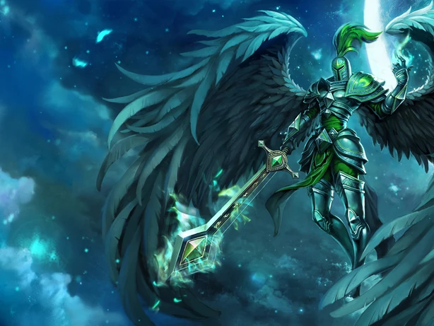
Apparently whoever was in charge of Viridian Kayle's re-balance was color blind.

Derpy Mike·3/12/2015, 4:43:34 AM·45 votes·9,877 views

http://1.bp.blogspot.com/-GkLSBGLfHns/VQETtmWXwwI/AAAAAAAAl0M/btW8OWht93Q/s1600/kayle2compare.jpg

Last time I checked light blue and aqua were not the same as black and silver.

Edit.

Okay, using my expert deduction skills I've (maybe) worked out why they've done it. I'm gonna assume that Veridian Kayle was one of the many many skins that got an updated splash borrowed from a different server (in this case Chinese). Now I don't own the skin so I cant be certain, but but my guess would be that the're retextureing the in-game model to look like this.... http://img3.wikia.nocookie.net/__cb20110626223653/leagueoflegends/images/thumb/d/d0/Kayle_ViridianSkin_Ch.jpg/614x461x2-Kayle_ViridianSkin_Ch.png Instead of this.... http://forums.na.leagueoflegends.com/board/attachment.php?attachmentid=1018990&d=1405664170

And it's a damn shame too because I really don't think Kayle needs to look this way. A) Let's be real, the colors look like throw-up, no avoiding that. B) All of her current skins are on the blue-green side of the color spectrum I'm sure she can live without one more. C) This is the closest thing she has to an edgy skin and now it's gonna get taken away sadface

RIP Edgy Angel

56 Comments

OJ1913/12/2015, 5:14:38 AM29 votes

wow this is terrible...

DG Ashabel3/12/2015, 5:41:22 AM22 votes

To play devil's advocate, this texture recolor actually makes her viridian. As in, the color. Google search if you don't believe me, but her new armor and wings are viridian now.

I do agree that this skin is a huge shift from its old appearance and likely disappointing to someone who liked to play black-winged Kayle, but the old skin was a misnomer because nothing about it was actually viridian.

Eyrgos3/12/2015, 4:50:27 AM12 votes

Yeah, this' bad. Also Full Metal Pantheon & most of Ryze.

YuGiHo3/12/2015, 5:44:32 AM10 votes

RIOT please dont take away my black winged kayle, tits the only reason i got the skin back in 2013

Wtch3/12/2015, 7:19:34 AM6 votes

I bought this skin for the awesome black wings and silver/green theme. Even if the new texture is more fitting to the name "viridian," it's not what I was going for when I bought it, knowing it was silver/green/black and not viridian. I could get over it perhaps if the armor was a little bit lighter like in the splash art, which looks pretty cool admittedly. As is it the color feels too intense and looks bad with the green accents. I hope this re-texture is worked on heavily before put to live.

Edit: I don't mean to sound nit picky but I main Kayle and use Viridian skin almost exclusively and I would stop using my favorite skin if it looked like this. :(

Lady Luck3/12/2015, 7:38:54 AM6 votes

As soon as I saw her skin on S@20 I screamed "noooo!" (in my head, as people are asleep in my house).

I very often state on these forums that the most important aspect of a skin for me is color scheme. I get irked every time Riot changes a color scheme with a texture update. Sometimes I'll post about it, but generally I figure I'm in the minority and other than color changes it's generally a nice update.

But this... this makes me wanna grab somebody by the shoulders and scream why? It looks like they took her current, beautiful, black and silver armor and put a blue filter over it. I love the black wings, I love the silver armor.

Viridian Kayle is easily my favorite skin for her. And this... Looks like mush.

Viridian Kayle's current scheme utilizes the black shadows in her armor, and general neutral colors, to make the green really pop in the skin. As a result, despite the fairly small amount of actual green, her name makes sense. Not to mention the contrast of her dark shoulders compared to her head and torso, makes her body shape easily read. This washed out look in her "update" actually make her look more of a blue rather than a green. The low contrast in her armor makes it feel flat, and the blue of the wings actually feels like it brings out additional blue in the "green" of her armor. As a result, despite having MORE green in this version, green does not feel like the dominant color tone. She feels blue And her body is hard to read at a glance.

Edit - I also notice that Battleborn Kayle now has a lot more blue as well... Is blue the favorite color of whoever worked on this texture update?

Edit2 - As somebody has pointed out, "viridian" is more of a blue-green color... While this makes sense as to why they added some blue to her green... The new texture feels more blue than green or even "viridian". And they could have easily utilized the proper viridian color as an accent that pops out of a neutral base, as her green currently is.

SpecterVonBaren3/12/2015, 5:56:05 AM3 votes

Ooo, I like this new texture actually.

Athenes Lulu3/12/2015, 8:28:18 AM3 votes

The newer one looks like she was freshly picked from a vegetable garden.

Chaotic Reks3/12/2015, 10:50:21 AM3 votes

that's white and gold...

TheSlappySlap3/13/2015, 1:59:03 AM2 votes

It's like someone took the eyedropper tool in Photoshop and matched the colors directly to the splash art without accounting for the extreme amount of blue light in the splash art.

Yuki Akuma3/12/2015, 8:21:35 AM2 votes

They need to give Judgement Kayle the bright blue wings, her current ones are ugly as hell and don't match her art whatsoever.

kDrakari3/12/2015, 10:25:07 AM2 votes

I like the way it looks, though I can understand the desire for a black-winged Kayle. I think it could use some very minor tweaks to look even more like the first splash there (which looks incredible to me).

Sukishoo3/12/2015, 7:02:51 PM2 votes

http://ddragon.leagueoflegends.com/cdn/img/champion/splash/Kayle_2.jpg http://1.bp.blogspot.com/-GkLSBGLfHns/VQETtmWXwwI/AAAAAAAAl0M/btW8OWht93Q/s1600/kayle2compare.jpg http://forums.na.leagueoflegends.com/board/attachment.php?attachmentid=1018990&d=1405664170

Just look at those and compare them, these re-balances aren't just to make them flow better on the new rift but in fact they are to help them identify more with their splash art. Before this, she had a very washed out look, that didn't even match up nearly as much with the splash. I honestly loved this skin because of the splash, though the original splash itself did leave some to be desired. Then the in-game actually didn't match up nearly as well with that original splash. The changed splash is a much better look at what I feel the skin should be and I'm much happier to have it.

Before the armor was the same tint as the sword, where in the splash art the armor is darker and the sword stands out (you can even see that in the original splash, they were meant to be different tints). Now that is much better displayed in the re-balance. The wings, are more so a dark green with a black shadow on them in the original, making them appear pretty much as a black mesh. Where they are much more of a blueish green in the re-balance and that is much closer to how they appear in the splash. The symbols on her shoulders are brighter now rather then darker, along with the hair piece being darkened. So these overall changes actually bring out what the splash art was trying to display.

I didn't actually feel that the old splash reflected the skin the way it should have. In the old splash her wings are more of a Yellow-green, and the model is that dark green with the heavy black shadow. The one that it was changed too is a much better representation of the skin and now the changes they made to it suit it far better. Viridian, is a blue-green pigment afterall, so the skin should embrace that.

Aziriously3/12/2015, 8:07:05 PM2 votes

I really like it tbh. :c

Celio Hogane HD3/12/2015, 8:32:16 PM2 votes

Because old version looks good...

4nth0l0gy3/12/2015, 6:04:13 AM2 votes

Aw...this makes me sad...

FakeXero3/12/2015, 10:26:54 AM2 votes

I just read the news over at surrender@20 and it boggles my mind that they actually did this. The only skin to have black angel's wings and they change it. What "viridian" actually means is not the point. The point is many, many people like me bought this skin because of the black wings. I dont understand why they would do this.

Cynicatt3/12/2015, 10:30:48 AM2 votes

The colors on this just look godawful. People who bought this skin weren't trying to get some vomit green and aqua disaster. I sincerely hope that they start offering refunds for skins if stuff like this goes through, because it's not the same skin. It's hideous, and I don't know why anyone would want to own something that looks like that anyway.

Paige3/14/2015, 3:40:17 PM1 votes

it just makes her look like a blob, honestly. all the colors are too similar and blend into each other, giving her no definition or contrast. i don't know where to look because there's nothing to focus on; this model reads poorly...

and besides that, changing the wings from black to blue is a risky move by them.

oh yeah, and if it's meant to match that Chinese splash art, that's a very amateur take on it. it's so obvious the splash is in a blue lighting, making her appear that color all over. if you put the kayle from that splash into the more neutral lighting of the rift, then she wouldn't just be that blue color anymore. i think they could achieve a similar feel if they used the blue for shading on the armor, but not running what looks akin to just a color action over the whole skin...

DJ Hatsune Miku3/12/2015, 11:12:13 AM1 votes

Yeah Viridian Kayle was probably one of the better if not the best 'palette swap' in the game. The green/silver scheme with the dark wings was really pleasing to look at and honestly I considered getting that over Battleborn before Aetherwing came out. The retexture makes me kinda happy I didn't buy it because I'd never use it looking like that.

Hard Penetrator3/12/2015, 12:43:33 PM1 votes

I am getting seasick looking at her.

patmax173/12/2015, 1:39:23 PM1 votes

I had the same feelings, I'd prefered something like Redeemed Riven, with clear green tones, but still a silver armor to make contrast with the green

Ironclad Dragon3/12/2015, 1:52:10 PM1 votes

I prefer my Viridian to be green.

X8ViEhkPS03/12/2015, 2:16:59 PM1 votes

My poor Swen Chaos Orianna. I liked the old in game model so much more.

Sirin Gioro3/12/2015, 2:35:57 PM1 votes

They're trying too hard. I doubt they would even revert the changes if this comes out in patch 5.6 though. If you want reference, look at this shit lmao (◡‿◡✿) ->>>Tristana

Prismatic3/12/2015, 3:50:41 PM1 votes

Unfortunately, I own the skin, and I am already really disliking the change to viridian kayle. The green on her is less vibrant, more washed out, and almost completely unnoticeable when it is thrown in with a sea of bland green. The reason I bought the original Viridian kayle was because of how sharp the green popped out, and how unique the wings looked. Now? I'd rather just get a skin refund token and buy a different kayle skin. I'm unhappy with this change, riot.

Lucifer3/12/2015, 3:57:54 PM1 votes

I know I'm probably in the minority, and that I'm going to get downvoted to hell for saying this, but I REALLY prefer the new one.

Auryiel3/12/2015, 4:23:52 PM1 votes

Some of those texture changes are just so terrible...

They don't even look like what they are replacing

VmixD3/12/2015, 6:54:56 PM1 votes

She was still Viridian in the orig skin, that was the green part. They didn't need to texturise everything green though... I miss the silver

Kasumi3/13/2015, 4:24:47 AM1 votes

Wow that re-balance is just ugly af... From a distance it looks like the entire model is the same color.