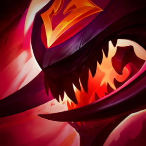
What the hell have you done to Cho'Gath?!

Derpy Mike·2/27/2015, 11:06:09 PM·2 votes·5,350 views
http://2.bp.blogspot.com/-tL1eM7YQig0/VPDu4lBVmHI/AAAAAAAAB2s/D_OOQ3yOZxM/s1600/basecompare.jpg

Ahem I am concerned with the chosen direction for the Cho'Gath texture rebalance. You have stripped him of his signature bright red color pallet in favor of a washed out maroon color. In my opinion his bright reddienss(yes, its a word now) was one of his core identities, alongside his size gimmick and kaiju-esque appearance. I would very much appreciate some clarification as to why you have chosen to go with this new pallet in favor of his old one and why his eyes are so much smaller now.

https://www.youtube.com/watch?v=NlpRBLkgcBo Please

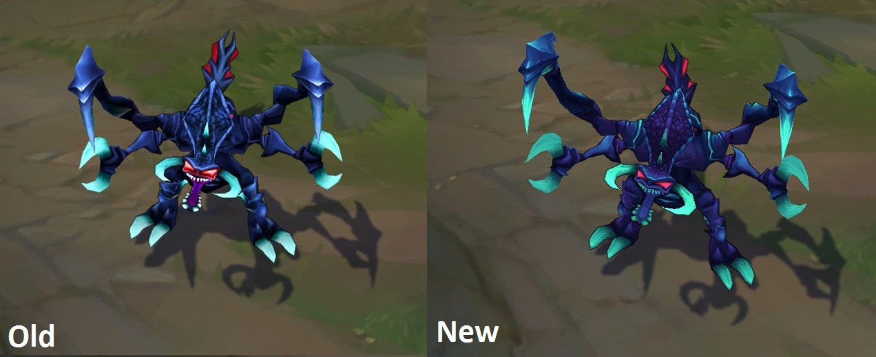
http://4.bp.blogspot.com/-Xo8hZEFR2os/VPDu4pY6z9I/AAAAAAAAB2k/d23lPt33FVE/s1600/nightmarecompare.jpg Additionally, is there any particular reason you chose not to apply these changes on his Nightmare skin?

12 Comments

GanksLikeGast0n2/27/2015, 11:08:56 PM15 votes

Oh hey, he finally doesn't look as cartoony. I approve of this change, it's a step in the right direction for the nightmare of the void.

Jeddy0172/28/2015, 3:57:02 AM4 votes
DWT123452/27/2015, 11:31:17 PM3 votes

i think that it looks fantastic

Hardcore Shampoo2/28/2015, 4:12:48 PM2 votes

have u seen the new chogath splash art....?

Big Lincoln2/27/2015, 11:27:05 PM2 votes

I think his classic skin looks great. It's Nightmare that I'm disappointed in. I'd be much happier with just a blue version of Cho's texture update.

Thresh Outta Fux2/27/2015, 11:32:16 PM2 votes

I'd have to see him in game. But honestly, I think the old colors fit him better. The new colors are all... dull.

Zahz2/28/2015, 5:51:16 AM1 votes

yea i definitely prefer the new look

Sukishoo2/28/2015, 6:06:10 AM1 votes

Being the the Terror of the Void, Cho'gath definitely needed this. He's much less bright and happy and now has that dark terror feeling to go with that title. Before, It looks like there was maybe 6-7 different tones in the skin and it just began to clash all over the place. This update re-balanced that into just a few simple colors that work much better together.

I always loved him the way he was but something about him always felt off, and this now brings him back to what he should be. So I am very happy to see this change, as it not only goes with the title but he now matches his splash as well. So it's good that they are trying to bring things up to the same quality and have them less contrasting to one an other.

The Nightmare skin though, eh... it had subtle changes I can see. I think it looks alright, it and the base are now more distinct from one an other and no longer just look like a recolor.

Toa of Death2/28/2015, 1:25:24 AM1 votes

I never liked how Cho'Gath looked kind of silly and bright. Don't get me wrong, I've always loved Cho'Gath and his whole design but he's called the "Terror of the Void" for a reason. Cho is a highly intelligent monster that enjoys watching others suffer. This update really makes him look and feel like the voidborn monster that he is. Though I do agree that Nightmare Cho should've gotten a better update.