Viktor: Blue or Red Cape?

WitchQueen Annie··1 votes·752 views

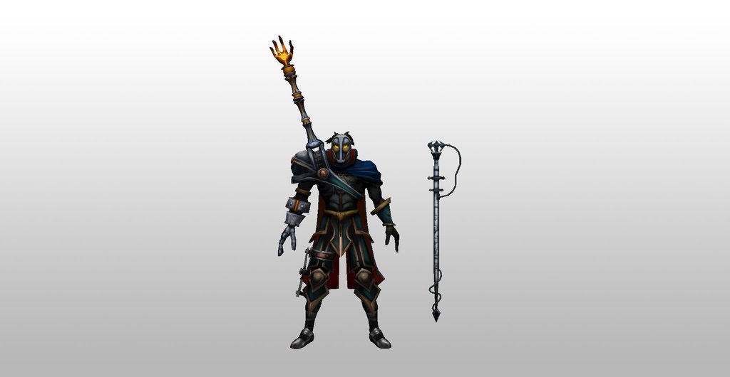
I've noticed Viktor looks very different in game and in the splash art.

In the splash art he looks VERY machine and he has a red cape that's almost all burned up.

Bu in the game he's clad in blue (instead of red) and seems to have a more human form. His legs are also less mechanical looking. He looks more like a Phantom of the Opera type villain with gadgets except with a Jason mask.

Is he supposed to be in blue or red?

Why does he look so different in game?

5 Comments

Fondling Gems2 votes

It is red on the inside and blue on the outside

This kinda shows it: http://3.bp.blogspot.com/-kE6UtCELkCM/TudS-vGC-uI/AAAAAAAABkM/xrSdAxobI9E/w1200-h630-p-nu/vik1.jpg

WitchQueen Annie1 votes

OH!

WOW!

After you pointing this out, I zoomed in on the character in game notice the red inside the blue... oh wow...

But I dunno. I still think he looks so much more badass in game than in the splash.

In the game he looks like some kind of a super villain with a Jason Voorhees type mask clad in blue with high tech weapons (and its ambiguous how machine he is, its up to your imagination).

But in the splash he looks COMPLETELY machine and his mask for some reason, looks less like a boss. Also, I don't know why but his legs in the splash art look really strange.

In the game it looks like normal legs with a dictatorship type boot.

333lom1 votes

Yep, the new splash has a few more problems than just not following the in-game model. It's not anatomically correct, because his torso is at a wrong angle compared to the lower body.

I stick with the old splash and model texture for his references. Especially for the mask, old mask rules. The cape around his neck isn't tattered like in the new splash, and his hair is black with a white streak, not brown like in the new texture.

WitchQueen Annie1 votes

what did the old splash look like?

333lom1 votes

You can google it, old files are stored on the LoL Wiki:

http://vignette1.wikia.nocookie.net/leagueoflegends/images/2/23/Viktor_OriginalSkin_old.jpg/revision/latest?cb=20140909163919

My impression is that the old one has less textures, slightly better anatomy, but much better pose and fantasy delivery. Although it's simpler, much less realistic, lighting in the old one is better as well in my opinion, and the composition creates focus on his glowing eyes.

More from Story, Art, & Sound

More by WitchQueen Annie