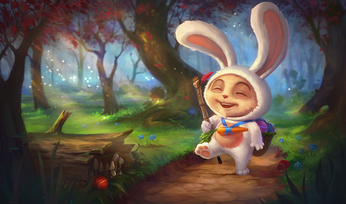
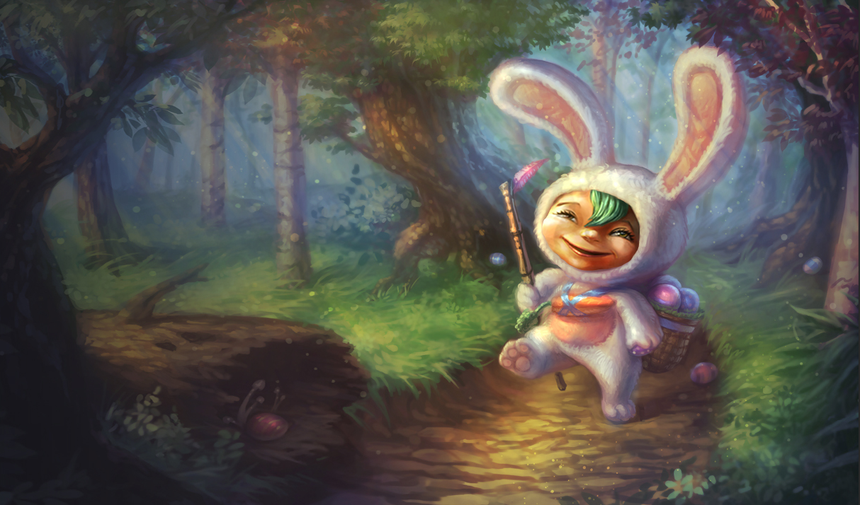
What the hell is this Riot?

Shroom Junkie·4/6/2016, 9:47:09 PM·245 votes·15,454 views

https://1.bp.blogspot.com/-R7FhG4W7_D4/VwVgPFxqmnI/AAAAAAAANJU/3-BZhOMB5ekB8OJ0q93S4fZPVyhXV15mA/s1600/Teemo_Splash_5.jpg

He looks retarded. I'm not even just saying that, he looks freaking mentally challenged. Its not even cute its freaky and disgusting and looks nothing like his in-game model.

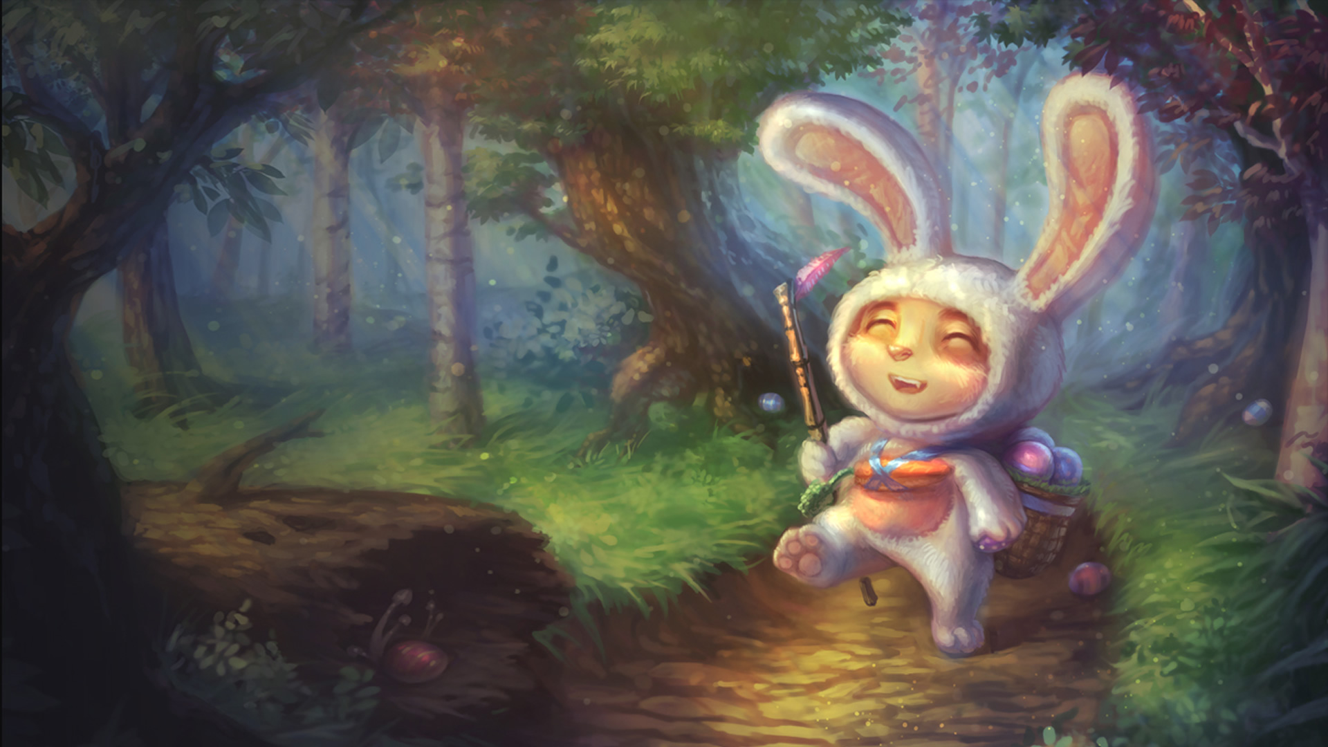
Tell me this http://livedoor.blogimg.jp/lollll/imgs/f/b/fb5f522e.jpg isn't better looking and cuter than that?

I swear that art is going to become the new old Lolipoppy. The old looks more realistic too, and not just the lighting but the costume. The new art is like its fused with his skin but the old looked like an actual costume. And his basket for mushrooms is just floating there, nothing to tie it down to him, and the carrot is just hanging there because carrot instead of to be a strap.

Side note: The old one is also wayyyy more detailed.

EDIT: There's a red tennis ball in the tree instead of a mushroom. rito? ???

EDIT 2: Now that I think about it, this splash reminds me of Meet the Pyro. https://www.youtube.com/watch?v=WUhOnX8qt3I
136 Comments

Deftones4/6/2016, 10:08:21 PM56 votes

It was my favorite skin :( http://replygif.net/i/759.gif

Snake Town4/6/2016, 11:20:18 PM35 votes

He looks stoned off his ass lol

rito why

UomoAfide4/6/2016, 9:54:05 PM25 votes

This is what happens when Teemo stacks too much shrooms

Maratsune4/7/2016, 5:01:58 AM17 votes

No fucking no fucking no. NO. NO NO NO NO NO. FUCKING NO. MY JIMMIES ARE OFFICIALLY RUSTLED. The splash art for this skin has always been my favourite, and I guarantee that if the splash was always in that iteration I would never have bought it. The old one has a very pastelly, very pristine feel that was unique. The style as well always stood out to me. But no, let's take away that uniqueness in favour of.... that bright and vivid eyecatcher. They're just going with whatever has brighter colours, flashier images, pristiner quality, without stopping to decide whether the change is needed. This is a shame and I sincererly hope that they don't go through with this change.

(Also, Musketeer TF- what the everloving shit is that?"

Ebonmaw Dragon4/6/2016, 10:40:04 PM16 votes
t0ad54/6/2016, 11:47:43 PM15 votes

Looks worth about 10 cents

ArlanKels4/6/2016, 10:16:07 PM8 votes

I think he looks more chinesey.

disregardable4/6/2016, 9:54:18 PM7 votes

http://img1.leaguecraft.com/lol-splash-art/asset/wallpaper_760px_9612.jpg You know they're putting this into the game right?

Zamaje4/7/2016, 12:52:49 AM5 votes

I wish they'd keep the old one rather than changing it. The ears in the new splash look like they're made of that cheep shiny fabric that comes on really cheap costumes.

Rico Nasty4/7/2016, 12:10:42 PM5 votes

i fucking hate these splash updates.

Supreme Senpai694/7/2016, 6:40:59 AM5 votes

I REALLY like the new background. I just...

why did they change the face? Now I'm glad I got the panda skin instead of the bunny one, even though I really wanted the bunny one at the time.

Serge THE GREAT4/7/2016, 2:18:27 AM4 votes

He looks high. And I usually don't say that about a character's face. He actually does look high.

Sassmast3r4/7/2016, 12:58:32 AM4 votes

The red mushroom could resemble drugs which could resemble death which theoretically resembles Satan which perhaps offends 10% of the population of China, so we changed the mushroom to a tennis ball.

Ang4/7/2016, 4:21:36 AM4 votes

I like how more defined the background is, and the colors are popping much more clearly and its overall cute.... EXCEPT THE FACE why the face rito why

I think the definition in his face is crossing some uncanny valley. He looks way too human to be a hamster or whatever the hell teeto is Teemo should be cute!!! Not visually terrifying

Maybe if his eyes were open? Im like staring at these images trying to figure out WHY he looks so weird, I think it might be the cheeks I dont know, his bunny suit looks tighter on him, did he gain weight?

Tyermaillin4/7/2016, 8:25:40 PM4 votes

I agree, but don't you think there are better words to describe the splash other than retarded and mentally challenged? A little disrespectful imo.

CodyBear 4/7/2016, 8:23:04 PM3 votes

China is offended with Teemo being cute.

JayHog19924/6/2016, 10:05:04 PM3 votes

You're being silly. The new splash art looks even cuter! :D

LithiumWednesday4/7/2016, 7:46:55 AM3 votes

The splash changes were nice when they were updating splashes that actually needed updating... most of this most recent group has been absolutely ridiculous.

Chaos Ascent4/7/2016, 9:34:42 AM2 votes

I actually love the touch ups to the background, the new background is absolutely gorgeous. But yea Teemo himself looks high as a fucking kite.

The Pale Woman4/28/2016, 9:37:35 PM2 votes

THE OLD ONE WAS SO CUTE!

The new once needs to be burned at the stake for public indecency.

Senor Crouch4/11/2016, 11:25:20 PM2 votes

I posted this in another Cotton Tail Teemo thread:

There are three main problems with the new splash art for Cotton Tail Teemo.

  • First is that there is a serious counterbalance issue, it is super subtle but it is there. The angle at which Teemo's head is facing as well as its position appear as though Teemo is straining his neck to lean forward...which isn't natural, giving him a sort of "I'm totally high, dudes!" look.

  • Second is his head is shaped like a football. There's too much width and not enough height. While it is true Teemo's head oval shaped and not round, this rendition goes over the mark just by a tiny amount.

  • Third is his mouth. The mouth is much, much too wide. It needs to be reigned in by a lot.

To give you an illustration at what the above three corrections look like, I present you with the following image:

http://i247.photobucket.com/albums/gg132/SenorCrouch/Other%20Game%20Pics/Teemo%20Splash%20Edit_zpspmwczul2.jpg

TroyTheUnconquer4/7/2016, 4:51:34 PM2 votes

He looks stoned af