139 Comments

John Berserk75 votes

I love her new design. It's easily one of my favorites now.

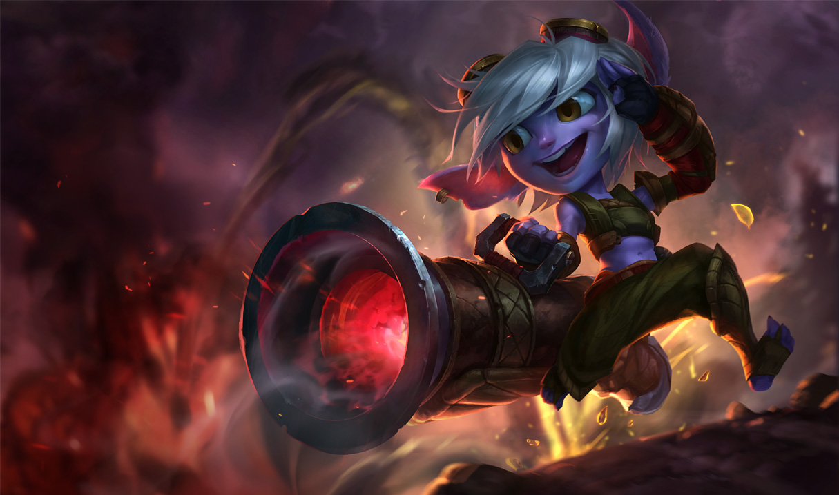
The splash though... it's not all bad, it's mostly the face/expression that was lost from the pre-updated version. She went from looking like a cute and happy Yordle girl with a giant gun and a love for explosions to some kind of goofy Looney Tunes yordle thing. :(

Slushi Simcambi25 votes

I would agree with the Looney Toons sentiment.

Make her less... cartoony? Her mouth and eyes are freaking huge and I was a big fan of the old one (the new old one not the old old one) but I kinda like it.

Please make a few adjustments to her face Rito!

Nagirah4 votes

If this current looney tunes splash goes live, I'll just take this concept art and replace the actual splash with it in the game files. I love the VU and I will start playing Tristana because of it, but that splash art... there's NO WAY I could stand to look at it in the game. 100% serious.

MrBuffington20 votes

Kind of mixed for me; I really love her VU, and this splash is definitely closer to it, but I think the old-new splash (and the concept art for her VU) captured her personality a bit better; it's by no means bad, I just prefer the other art she's had recently.

EDIT: Also, I didn't notice it in the VU concept art, but she's lost a finger between her old-new splash and her VU; anyone know anything about this? What's the current stance on Yordle finger count?

EDIT2: We did it boys, thanks Riot for listening, glad Tristana's splash is getting more work before a full release

From S@20: [1/23 Update - Tristana Splash Reverted] A small patch went out on 1/23, reverting the new Tristana art added in 1/22's update as it will not be coming alongside her champion update in 5.2.

Here's Ququroon with more info:

[1] "Hey all, due to the unfinished state of Tristana's new splash, we'll be pulling it from her release to further iterate and polish on it."

[2] "We still plan to ship Tristana in 5.2, so you can still look forward to that. We'll update the splash later. Thank you for understanding."

[3] "If I wasn't clear, we want to get the new splash out as soon as possible, but when it's in a completed state.

John Berserk3 votes

Current stance is that Yordles are supposed to have 3 fingers and 1 thumb.

pre-updated splash Trist had 4 fingers 1 thumb because old Tristana design had such, while new Tristana design does not.

Roaranor3 votes

{quoted}

Kind of mixed for me; I really love her VU, and this splash is definitely closer to it, but I think the old-new splash (and the concept art for her VU) captured her personality a bit better; it's by no means bad, I just prefer the other art she's had recently.

EDIT: Also, I didn't notice it in the VU concept art, but she's lost a finger between her old-new splash and her VU; anyone know anything about this? What's the current stance on Yordle finger count?

3 fingers and a thumb, I believe. Heimer VU set the basis.

Krizalid18 votes

I.. uh.. Wow. I really lover her VU, but this splash.. I can imagine a silly boy from Dreamworks cartoons looking like that, but Tristana. Uh. Well. Not really.

Colgate Gator15 votes

Looney toons called, they want their character back.

2yordles1cupcake14 votes

So much for being part of the special forces. That thing has no shoes, it looks like a hippy with a cannon running around.

JJ H0G11 votes

That's one MAXED out oxymoron right there :^)

junglerboy1611 votes

It actually doesn't look like the new model. Her face has no depth, the shading looks off, and her ears are out of place. She looks more girly than the old splash, even though her new model doesn't look girly at all. It lost everything about her appearance from that one concept art Ironstylus showed that made me really think "This looks stunning". I'm pretty disappointed actually.

Hilltop Sunset3 votes

Couldn't agree more. I feel exactly the same.

Colgate Minuette10 votes

I do LOVE her in game model, but I hate the splash.

BeatzBoyFTW8 votes

Look like she was on meth. When Riot said they would propose a change on Trist's splash art, I thought they would just change her clothing.

GeekyPickles7 votes

To be fair, the splash itself isn't inherently bad, but like most other people who have commented on this post, I agree that she looks too cartoony. Although I like it, I prefer the old one.

WolfBV7 votes

Eww, the fuck did they do to Trist? D:

aaronconlin6 votes

It just looks kind of... Weird.

WhiteGato5 votes

The VU caught my heart, then the "new" splash sunk it.

The brand new in-game model is so different from her old one, making them almost incomparable.

Breaking the old image of a champ is already a risky move, but the risk will be paid off if you could do a good job in promoting the new image.

Then what's the point of making her new splash based on the old one?

It will inevitably remind people of the old splash art, which is perfectly designed for the OLD TRISTANA.

Now this so-called "new" splash art which adapted the design from the old one look just so awkward:

**Neither does it look like the old Tristana, nor does it fit the new Tristana. **

I'm serious Riot, please do something about it.

Xanderman565 votes

Looks like Jinx as a yordle.

Nagirah5 votes

It was tweeted by a rioter that they will pull this splash art off the coming patch to polish it a bit. Thank goodness... that better be a good polishing.

DrCyanide2 votes

That's great news. Do you happen to have a link to that?

Jeddy0174 votes

https://twitter.com/Ququroon/status/558751082566782976

Some extra detail here:http://www.surrenderat20.net/2015/01/122-pbe-update.html

I'm just happy that the splash art was unfinished because if that was the finished product........

Phife4 votes

she looks like she just left sesame street.

Conus254 votes

Sorry, but I like the old one much better.

Soleka4 votes

hmm there is nothing bad with the new art. I do like that she's no longer a potato carrying around a sack of potatoes. Her ears are expressive and do tell you quite about about her mood (other than the smile). BUT It does remind me a lot of a Parakeet running from an explosion.

I can live with this splash, but I think an opportunity was missed. That being said I'm still excited about the VU.

gubigubi4 votes

They did an alright job on it. But the other one was so perfect. The facial expression on it was so good. Please just put the new ears on the one she has now or something please.

EverTokki3 votes

True. I personally want Trist to be blue again. Just change her color back to blue.

EverTokki4 votes

I think she needs some more heavier armor.

Soleka2 votes

{quoted}

I think she needs some more heavier armor.

She's not Poppy. I think her lack of heavy armor makes her different looking from the iron ambassador. As for Riot changing her color back to blue. No thanks... was never much into the smurf vibe from before.

DrCyanide3 votes

{quoted}

She's not Poppy. I think her lack of heavy armor makes her different looking from the iron ambassador. As for Riot changing her color back to blue. No thanks... was never much into the smurf vibe from before.

She shouldn't be Poppy (covered head to toe in armor), but she shouldn't be Teemo either (with barely anything on, having the high mobility scout visuals).

I think they removed too much of her armor/clothing, and as a result it makes the Yordle military feel more bland, despite having rocket jumping Yordles.

Annapii4 votes

:c The face is kind of creepy. Rito pls, don't turn Yordles into the Furbies of League.

jv21blU7oD4 votes

face looks really bad

AkitaSaito4 votes

Her original classic art and second classic art was excellent, but what is this prepubescent white kid from an old cartoon doing, trying to cosplay as Trist... All this art is missing to make it even worse is pimples.

I loved playing Trist since the beginning of post-beta and there's a reason it took so long until her first splash art change which is because she didn't need it and it was fine.

Pvt Yong Tai3 votes

I think the off-look lies mostly in the mouth, nose, and feet right now. Usually the eyes and eyebrows are one of the most important features in creating a "look" but here the eyes look fairly similar to the character design art (posted somewhere in the comments) and the eyebrows are hidden by the hair.

The feet is pretty simple. She looks likes she's from the boonies without shoes, not some elite Megling Yordle special forces character.

Her nose is too pointy, round, and shiny. It looks akin to some nose stereotypically drawn on goofy nerdy type characters. I know there are way way better examples out there somewhere, but this is the closest representation I could find.
http://fc04.deviantart.net/fs71/i/2010/088/0/0/Dopey_Dwarfs_by_HiddenEden.jpg

And finally, the mouth. The flow of the teeth almost looks like she's missing a tooth at first glance, giving it that final nail in the whatever to give off that very unusual goofy aura, unlike the Tristana we know at all. Don't get me wrong, Tristana is a playful little yordle in my eyes, but she isn't goofy like this.

In the character design art piece (again, somewhere in the comments, look for Rew711's post), she gives off a badass smirk. In this splash art, she is smiling with here teeth really wide as if laughing like "ughuk-ughuk-ughuk~". Perhaps showing more teeth would remedy the current problem. Or making her smile not as wide (vertically, I mean. Making the smile narrower horizontally would only exacerbate the situation).
https://s-media-cache-ak0.pinimg.com/736x/15/e2/df/15e2df67681e1ef9c6864cf3431791f8.jpg


Nagirah3 votes

I don't know what to say... I'm always the person who loves the new splash arts and hates when people whine about them, but now I know how they feel. This is horrible. Literally horrible. First time I say this about their new splashes. Kinda proves how bad this is...

DrCyanide2 votes

Usually I'm OK with splash art changes. I'm the last one to say "here, I know better" and try a million photo shop changes that don't fix anything*. This one just need the attention, because it doesn't feel like a good fit for Trist or League.

* there was one post on Challenger/Dauntless Ahri that had five or six different hair styles and head piece setups that was really cool. Most of the posts are generally unhelpful.

Flemman3 votes

she is too "tall" in the splash, make her look more like a midget and the thing will be smoother

inmUGco3 votes

3D model trist style better splash!

Hilltop Sunset3 votes

I think this post was mostly made to comment on the splash art, not the new design itself, so comments about her clothes and her shoes don't really belong in this particular thread; it's not saying anything about her design one way or the other, it's just saying the splash art doesn't really fit the VU/doesn't look right for one reason or another. And I agree; I feel it's far too cartoony/Loony-Toons.

EDIT: It's not bad art, per say, it just doesn't fit with what we've come to know as League's art style. I'd also look at Janna 's latest splash art. I thought the previous one fit much better with League's art style.
Ashes Arise3 votes

Kill it with fire.... all of it

TonyTonyMordecai2 votes

I love her VU... But Tristana's new new splash art is kind of weird, maybe I'm not used to it yet? But I feel like the concept art would've been the better choice for the pose, as oppose as using the old new splash art as a base.

Flintfall2 votes

Where's the, "splash is almost certainly not finished yet" option? Looking at some of the other splashes on pbe, I'm inclined to think this is a earlier version that got pushed out, with the artists touching it up behind the scenes. Something about the shading, but it just doesn't seem complete yet. I'm holding my opinion until it gets released.

DeceitfulFish2 votes

Tristana looks like something out of a cheap computer-animated advertisement in this splash. The aesthetic in the concept art is much more fitting.

Vesarixx2 votes

The splash looks too cartoonish

Migrañaboy2 votes

Tristana's mouth reminds me of Penny Arcade drawing style...

Edit: Hope they make her less cartoonish, or fix her mouth at least. And i thought that riot would stick to the chinese concpet of tristana's splash art.

Lucifer2 votes

I'm sorry, but it looks really bad... It almost looks like a looney toon? It's not fitting for the yordle style at all.

I'd rather they just use the chinese splash art and recolor it purple than this >_>; http://lolwp.com/wp-content/uploads/tristana2.jpg

N3rdcor32 votes

Visual update looks amazing. New splash looks fucking awful. CHANGE IT BACK RIOT.

More from Story, Art, & Sound

More by DrCyanide