That other thread about splash art history got me wondering
Totalis·12/2/2015, 6:57:47 PM·15 votes·4,844 views

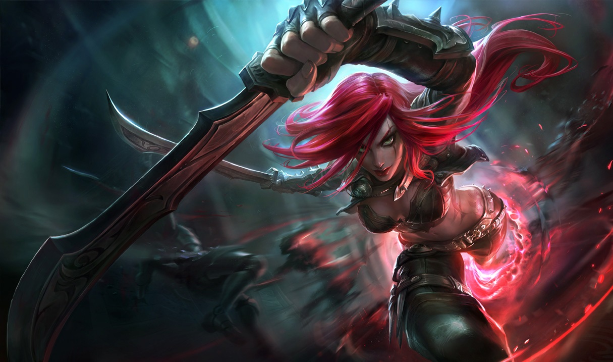
The VAST majority of these were HUGE improvements. Seriously, Riot's art team, omega good job http://i.imgur.com/YHw1yW5.gif. I know some people don't really care about the splashes, but to me, they make the game come so much more alive when a character gets a modern revitalization in their design. It just makes me wonder how they can redo so many splashes into something amazing, but at the same time ruined ahri's, janna's, fiora's, and katarina's splashes.

Check out Shyvana's AMAZING transformation old: http://i.ytimg.com/vi/Z66n3UYfPE4/hqdefault.jpg new: http://ddragon.leagueoflegends.com/cdn/img/champion/splash/Shyvana_0.jpg

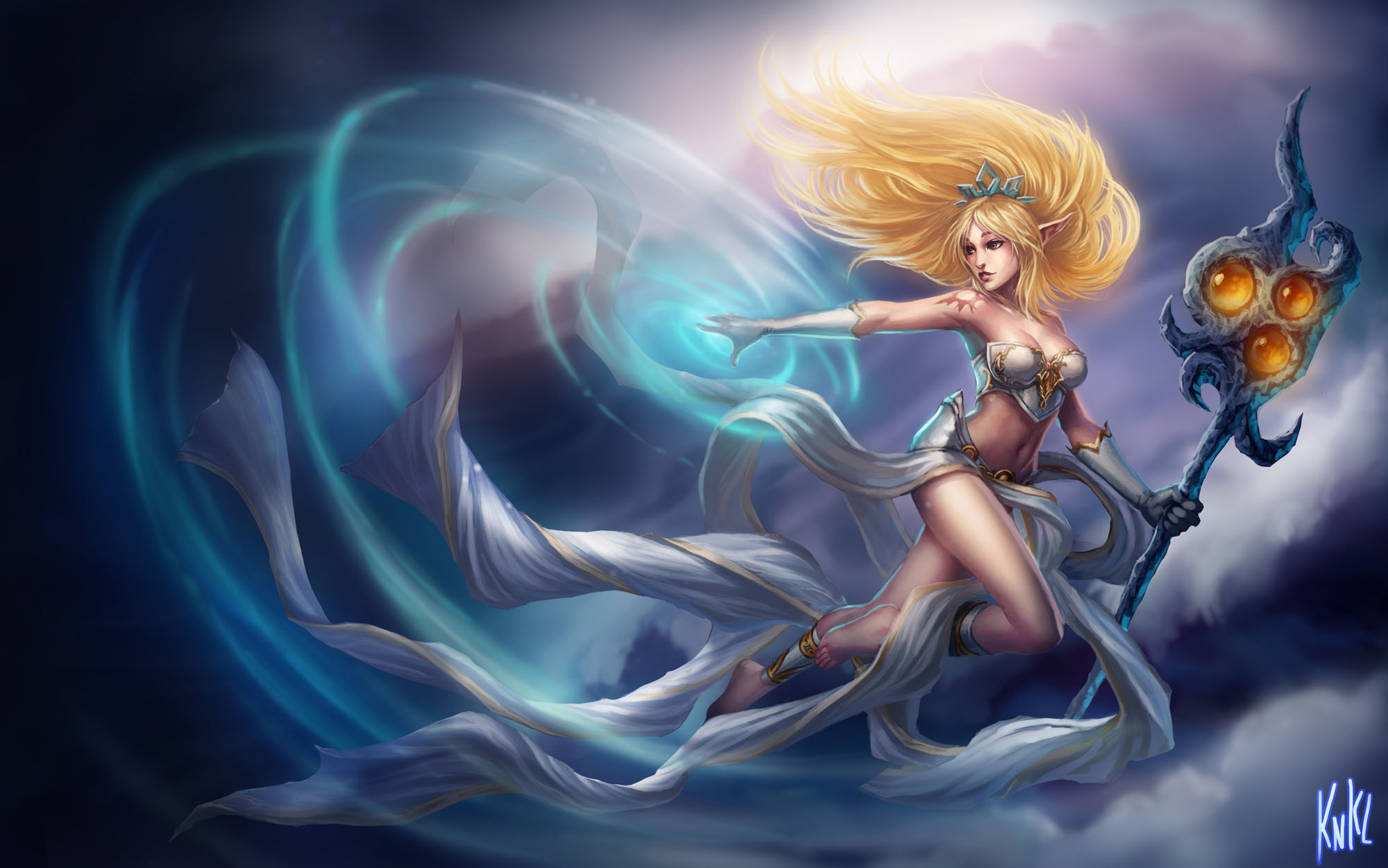
and then janna's: http://www.game-art-hq.com/wp-content/uploads/2015/02/Janna-LoL-Classic-Skin-Splash-Art-2.jpg http://cdn.staticneo.com/w/leagueoflegends/2/2f/JannaIcon.png

to: http://static.lolskill.net/img/skins/1215/janna_0.jpg http://ddragon.leagueoflegends.com/cdn/5.4.1/img/champion/Janna.png

It went from "oh, that looks nice" to "OMG WHAT IS THAT KILL IT WITH FIR-"

Katarina easily got the worst of it from looking downright sexy: http://i.imgur.com/hG0lVuy.jpg, http://images6.fanpop.com/image/photos/37300000/Classic-Katarina-katarina-37356267-75-75.png

to this abomination: http://img2.wikia.nocookie.net/__cb20150219221522/leagueoflegends/images/9/97/Katarina_OriginalSkin.jpg

it looks like something went horribly wrong in a plastic surgery operation: https://encrypted-tbn2.gstatic.com/images?q=tbn:ANd9GcS-VZXYwB5DaURUTJDxwV-LznUBaH3MluQwdBcwkWvFug5rHFsM9w

Like how were these let threw when they are clearly NOT up to the standard of the other splashes, at least in term's of their faces, which are the single MOST important part of a splash? The biggest defining trait of any person, real or imaginary, is their face, and to butcher it is just so sad to see.

55 Comments

Ionian12/2/2015, 8:02:53 PM8 votes

http://i.imgur.com/gtzzgpr.jpg

Nice, elegant, simple, extremely appealing.

http://5pots.com/img/upload/ahri.jpg

Evil? Possessed? Uncaring? Doesn't fit her lore at all, what happened here?

Weiner the Pooh12/2/2015, 7:34:44 PM7 votes

Kats splash art is fine, and that's not even her actual icon. They fixed it. Sorry they gave her features that make her look different and not the rest of the female champs and an actual background

Count Zubat12/2/2015, 10:42:06 PM6 votes

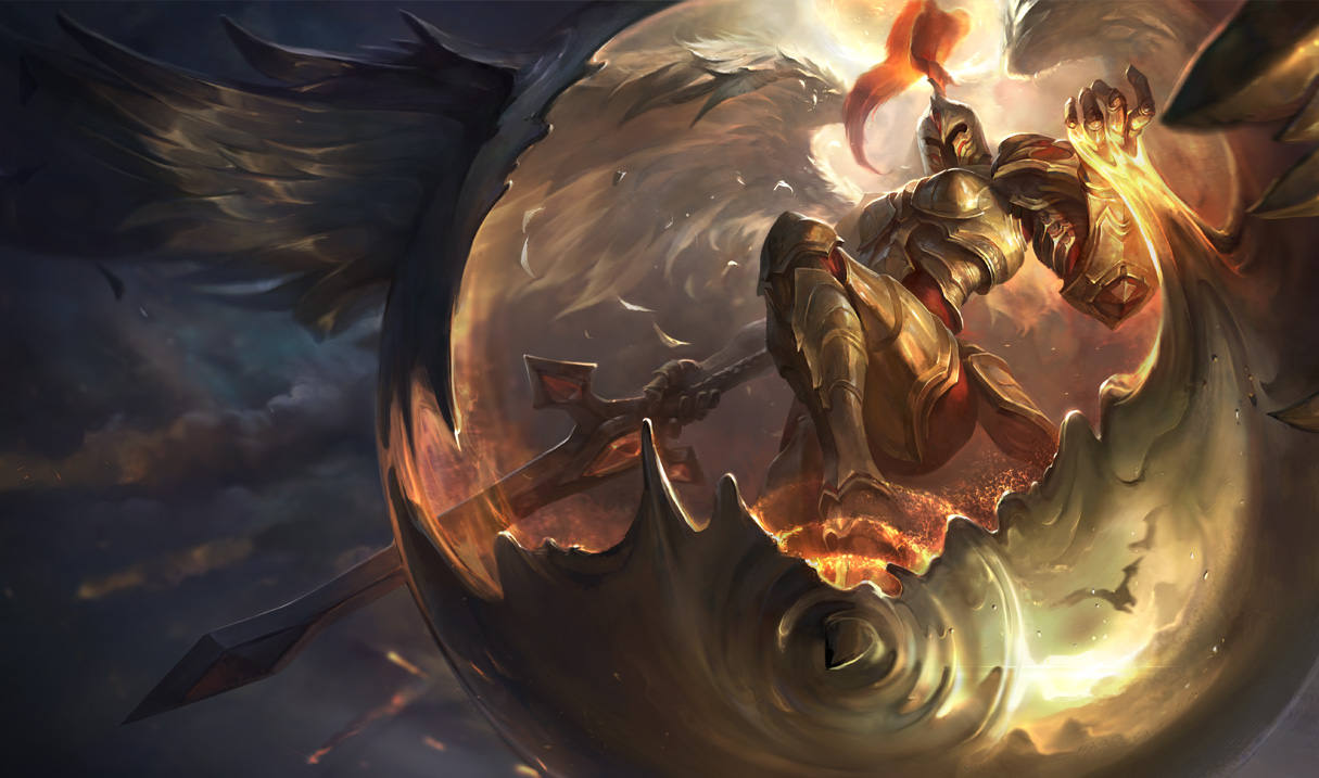
While I can agree that most of the new splashes are just beautiful, some changes were mistakes. Like, why did they change Kayle's splash art. This one:

http://img1.leaguecraft.com/lol-splash-art/asset/wallpaper_760px_7592.jpg

was just perfect. But then it was changed to this:

http://2.bp.blogspot.com/-TA9OyOPfy1I/VDwpOe6TikI/AAAAAAAAbJ8/a5CY8Pd7f4o/s1600/Kayle_Splash_0.jpg

Why? In the old one, Kayle looked so majestic, with her sword pointing down to the ground, looking like it was ready to fall and deliver judgement to the mortals. But new one? It's just so out of place. I don't even know from which angle I should look at it. And what's up with her wings? They are formed like she is going to fall like some goddamn meteor. Why did they change such a fine splash art into this? Imo, this new one is just bad.

Yatsufuså12/2/2015, 7:00:26 PM5 votes

Yeah I mean at least in kat's old splash she had believable limbs and she isn't all contorted

Melledoneus12/3/2015, 5:20:49 AM4 votes

I'm happy Shen's new splash makes him look like such a BEAST.

We went from this: http://www.kostenlose-mmorpgs.de/wp-content/uploads/2011/01/Shen_Splash.jpg

To this: http://ddragon.leagueoflegends.com/cdn/img/champion/splash/Shen_0.jpg

AND IT IS THE MOST AMAZING THING EVER!

Doctor Jarvis12/2/2015, 6:59:30 PM4 votes

I actually like all the second splashes more than the originals (although I do at least understand why people don't like the new Janna splash)

Biffolo12/3/2015, 8:30:48 AM3 votes

I got downvoted in the updated splash thread for claiming that kat and ahri had better old ones.

Dangerous Man12/3/2015, 3:26:12 AM2 votes

Kat's face looks like a mans face. :( But I do like the new Anivia https://encrypted-tbn0.gstatic.com/images?q=tbn:ANd9GcRBNY-37Ykv7PN-8xVf1onEXyDueiv1mzv9ed-MLBWBeNFZMBe_LA Old ones kinda weird :( Very chicken-y

Blainezy12/2/2015, 8:47:44 PM2 votes

Upvoted just because of Shiro from No Game No Life!!

ElGranMamut9812/3/2015, 1:16:36 AM2 votes

can u not post ur stupid anime shit thanks

Catastrop12/3/2015, 2:46:21 PM2 votes

I honestly like the those splashes. They actually look like the character. Janna looks like the otherwordly being she is rather than, some chick with elf ears. Katarina actually looks well, like Katarina. She even got a background that suits her perfectly because you can see her doing what she's supposed to; assassinating. Not jumping from what looks like a lightnining storm for some reason.

Teslablade12/3/2015, 4:55:05 AM1 votes

you mean Rengar arina

SpecterVonBaren12/6/2015, 9:52:16 PM1 votes

I miss Veigar's old splash

http://static.mnium.org/images/contenu/actus/LOL/Veigar/lol_champion_vaigar_skin_base_hd.jpg

I understand that it needed an update but I miss how this one showed Veigar as being someone that is trying to be grand and evil but he's still small and somewhat ineffectual.

http://www.noobabble.com/wp-content/uploads/2015/01/Veigar1.png

The new one just doesn't have anything interesting about it. While is certainly gets across how Veigar wants people to view him and shows that he can indeed be dangerous, it also doesn't really tell you anything about Veigar other than he's a dangerous wizard.

CoTheSlow12/3/2015, 7:59:22 AM1 votes

When it comes to the Ahri on I liked it a lot more before the community got outraged and got it changed into what it is now, I mean I get that she didn't look terribly Korean like the myth she is based on but it was just more appealing as an art to me. She looked innocent but also like she could accidently suck your soul out at any time, now it just looks like the photo was taken when she wasn't ready.

As for the other two people like to make a lot of excuses but I usually find it is just because they think the champs look ugly (unnatractive). In terms of pure art the new ones are much better. Janna's clothes actually fit now which is a bonus though I still detest a woman that can summon tornadoes wears and outfit practically designed to get caught and sucked in to said tornado.

There are only really two splash arts I have an actual issue with in game and those belong to Caitlyn and Morgana the faces are fine but Caitlyn's pose and Morgana's skirt really annoy me. As far as Morgan is concerned if you walked behind her you would see serious buttcrack, I mean that skirt is riding so low when it should be sitting on her pelvic bones instead of going down far enough that her privates are on display. Caitlyn's problem is similar in the way her whole splash is almost like 'Hey look at her crotch which we barely covered!'. If it was angled a little higher then there would be no issue but the angle of the splash is just a direct crotch tease and has always rubbed me the wrong way. Art wise the splashes are both beautiful, just those few things that are creepy to me.