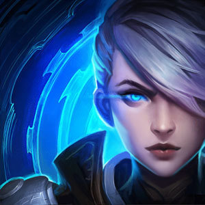
Pixel PROJECT: Fiora Portrait
The new PROJECT skins are pretty badass and Fiora has for a long time been one of my favorite champions so I decided to make a pixel art portrait of her. If I have the time I might do the other ones, too.
I like it!
I do think that it's one of those images that rewards careful and prolonged examination - which is both a great thing, and exposes a minor weakness. For example, when I first glanced at it, it was a little difficult to resolve what was going on. I think when I hear artists talking about such things, they talk about 'first reads' and trying to make the initial shape language clearer.
Of course, now that I've looked at it longer, I can't even NOT see it as Project: Fiora, so it's really hard to describe the difficulties I was having. Like looking at one of those rabbit/duck optical illusions :D
Apart from that, I think it's great - you've done such a great job conveying the character despite such a limited palette and resolution. The thumbnail in particular shows just how nice it looks!
I agree; it took me a moment to parse the image. After that, though, it looks great.
I like it!
I do think that it's one of those images that rewards careful and prolonged examination - which is both a great thing, and exposes a minor weakness. For example, when I first glanced at it, it was a little difficult to resolve what was going on. I think when I hear artists talking about such things, they talk about 'first reads' and trying to make the initial shape language clearer.
Of course, now that I've looked at it longer, I can't even NOT see it as Project: Fiora, so it's really hard to describe the difficulties I was having. Like looking at one of those rabbit/duck optical illusions :D
Apart from that, I think it's great - you've done such a great job conveying the character despite such a limited palette and resolution. The thumbnail in particular shows just how nice it looks!
Thank you very much! =D And yeah it's funny I've been looking at it again and again and noticing very minor things I could have changed or cleaned up a bit (like probably a better background color) but it is interesting how it does seem to become more "clear" after looking at it a while.
I like the gray colors, though the reds are a bit oversatured imo. Nicely done.
The more I look at it, the more I like it. I dabble in pixel art from time to time, and I admire the shading and detail that shows through in the thumbnail.
Thanks! Haha yeah I've been trying to get better at doing shading and I think probably the hardest part about it is making it look "natural" if that makes any sense.
It makes perfect sense to me. I'm still stuck in the "everything looks like an 8bit cartoon" stage of pixeling haha. I can't make great natural looking characters (or anything really), but I can make some adorable neon colored cupcakes!
I mean hey you gotta start somewhere lol. And everyone loves cupcakes!