Skip to content

Blood Moon Akali Changes and my Personal Complaints

Aegis Dae Adaria··27 votes·14,623 views

This is my own opinion. I'm disgruntled over the personality changes in Akali as they make her the stock assassin character, but I'm not here to talk about that. The Blood Moon Akali skin... That in game model is just so... Why?

[sg-janna]

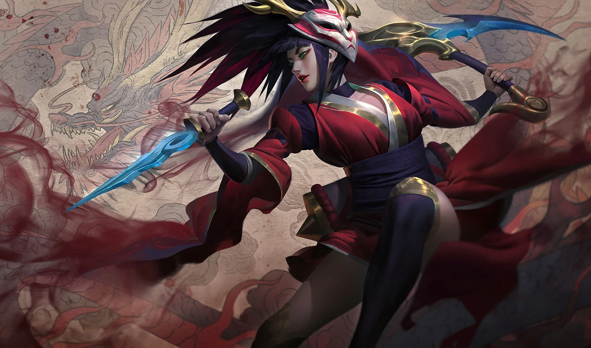
The original splash art of the Blood Moon Akali is very "flowy," mask in middle, and very smooth hair. The splash art has an elegant atmosphere about it and as well emits a sort of balance and harmony that Akali was all about. https://www.leagueofpapers.com/sites/default/files/styles/boxed/public/Blood-Moon-Akali-Splash-Art-league_of_papers.jpg?itok=7lrmw2XN (Google Images)

The in game model has cuts to it due to the necessity of smoothness when it comes to gameplay, but it still keeps enough of each nuance to keep the elegance of what is shown in the splash art. https://4.bp.blogspot.com/-13wRitTR-3I/V0MPNdI0YrI/AAAAAAAAPW4/Cu2xl87mV3AEkOxKt2NKfVJ3qoftxpQ2QCLcB/s1600/akaliturn.jpg (Google Images)

The new splash art for Blood Moon Akali is very elegant and carries a sharp undertone that screams "I'll kill you no matter what." The art itself explodes with what Akali can be and I can't help but become enamored with what I see here. This is an amazing overhaul on the splash art and I really enjoy seeing this. However, as stated before, the issue is the in game model. https://vignette.wikia.nocookie.net/leagueoflegends/images/6/6e/Akali_BloodMoonSkin.jpg/revision/latest?cb=20180716190317 (Google images)

The skin overall has amazing effects and particles and Riot did well with all the animations, but the in game model for this particular skin lacks the elegance of the "True Blood Moon Akali" that resides in the new artwork and the previous Blood Moon Akali. To me, with the in game model changes to the Blood Moon Akali skin, she just turned into the plain and generic heartless assassin that I remember always seeing in tv shows long ago. Additionally, the extremely bright colored red is not doing the model any justice and I also think the mask in game is on a different side than on the splash. https://cdn.discordapp.com/attachments/241729264741777409/468960181703671811/4d9dbcfd5d4692231dcd0c384120c226.png (Taken from the Skin Spotlights Youtube channel)

I'm not an expert at design and I do realize that ninjas and assassins need easy-to-move-in attire, however, the in game design of the reworked Blood Moon Akali does not sit well with me. I really love the current one too and it's pretty much the only reason why I felt compelled to write this. If you read the whole thing, thank you for listening to my selfish complaints that are probably wrong? I haven't put too much thought into this so I'm sure that many of my points are easily countered.

As an end note, I implore everyone that sees this post to offer their own input. I want to see what everyone thinks about this or about the new changes in general.


27 Comments

Shirvallah18 votes

Am I the only one that prefers the old kamas in her Blood Moon skin? They're supposed to resemble ancient Ionian weapons that the legendary warrior Reina carried. The ones she has now just look like pretty ice blades with no real meaning behind them.

I fully agree with every word you said, btw.

Aegis Dae Adaria6 votes

I was completely engrossed with the base model that I completely forgot about the weapons. [sg-zephyr] You have a great point!

Vastayan Grace2 votes

i dooooo like omfg this whole skin is garbage now, the model doesn't have enough asian vibe to it, not gonna talk abt abilities....they're just not feeling asian like blood moon skins should feel

Snowdrift9 votes

I’m sad to see the weapon change and the splash change for blood moon. The art style of the original had a simple yet elegant feel to it.

As for the in game model, that red is an eye sore, I hope they mute it and give her outfit darker tones like the rest of the skin line

My other issue with the update is how close the all star and nurse skins are from a glance; I’m sad they turned her soccer uniform from pink to white

Aegis Dae Adaria4 votes

Now that I think about it, I really liked the old splash for BM too. The pass over to the new splash art is going to be bittersweet as the old one is leaving but I still like the new one.

Donyorii7 votes

Judging from her new voice lines, she's supposed to be that edgy solo ninja type of person. In my own opinion, I think Riot had trouble distinguishing her between a cold hearted assassin and a fun / elegant chick and created a badly compounded version of that.

Sexy Jack Rabbit1 votes

She's not so much Edgy as she is a LITERAL Punk.

She's going against THE MAN Shen and leading her own path.

She's a rebellious teen punk who doesn't want her teachers telling her what to do.

DonatellaVersace7 votes

I hate the fact the Blood Moon skin doesn't have a unique recall animation. Its a disservice to Akali and the rest of the Blood Moon line. And I totally agree about the brightness and lack of elegance with the ingame model.

GreenLore2 votes

Its not uncommon for recall animations to be added later in the pbe cycle(frostblade irelia didn't have a unique recall when she was initially released on the PBE),so there is still hope that she'll get a new recall before release.

Vastayan Grace1 votes

i would like her to do some sort of a dance and then u can hear some gong sounds and then she does some rly cool pose while red light comes from the skies and red petals start falling down. (light like in star guardian recalls kinda)

xXCassieXx2 votes

I agree with you. Thought they would make it something nice due to the fact its the first of its line. Really awesome splash art but i really believe it needs something more.

bbQsauçe5 votes

[deleted]

Vastayan Grace1 votes

imo her mask should be put to another side and maybe made a little smaller as it looks bigger than her whole face and it doesn't look as great on that side, I would like the weapons to be golden and to look like the old ones cuz old ones had a meaning these are some silverish/blue and they're just random imo they would fit silverfang way better and in general the new blood moon akali doesn't have enough of the asian vibe... her shoes could've been flip-flops with long socks, her outfit could've been u know more loose and comfy and mby more unique, her hair imo would've been better if it was just a regular short ponytail and if her hair was white, and not this tufted emo girl looking one..... idk this whole skin is garbage, even her skin tone is kinda LITERALLY yellow.. [sg-soraka]

Meritas4 votes

Yeah, she looked like a reaper of Death before, a balanced agent of destruction bringing no unnecessary emotion to her task, but still showing human determination in achieving it.

Now she's just a cold b**ch.

Washed up Nami4 votes

Yeah, I've always liked blood moon akali, it was discrete and serene, but now it's just become... A weird mix between edgy and a bit too revealing, at least for my taste, but w/e, to each their own. What I can't stand at all is the way the clothes look in the model. The bright and almost completely plain shining red makes it look like some sort of fake silk, or plastic-y clothing, it just pops out way too much. Also, the sleeves in the old model were somehow better than in the new one for my taste. New ones are just glued to her arm and go all the way up to the wrist, even if in the splash art they are shorter than they were in the old model.

If they could convey the colours and texture feel of the clothing in the splash art the skin would be simply amazing. However, in it's current state it has gone from one of my most liked skins in the game (bought it in 2011 and even though I own several other akali skins, I've always used that one) to an eye sore, at least for me.

I love the particles and, while I miss the wooden kamas, the new ones look very good too, but I just can't stand the clothing. If they don't end up updating it I'll probably just move to stinger or silverfang

Duwang3 votes

I just want the big sleeves !!!!

Ahris3 votes

I also liked the older splash art for bloodmoon akali than this new one. This mew splasj art is pretty trash.

mrmeddyman2 votes

Funny I thought the old one was garbage and the new one is one of her best. Opinions I guess...

Häxel1 votes

The original splash art of the Blood Moon Akali is very "flowy," mask in middle, and very smooth hair. The splash art has an elegant atmosphere about it and as well emits a sort of balance and harmony that Akali was all about.

i have a few problems with this. First, as i understand, balance is what shens father and shen himself teaches accoridng to the lore i knew. But Akali while beeing in the order always wanted to do morre, to be actual good and not just hold the balance, not sure how to conect the word harmony with that.

Second, Skisn ahve their own Lore. And the Bloodmoon Theme should definetly not focus as hard on harmony as the Bloodmooncult comes down to
sacrificing people to invoke demons during the Bloodmoon. Not the most peacufl theme i would say.

So the new artwork i would say fits better the new bloodmoon lore theme.

Aegis Dae Adaria2 votes

I love the new artwork, it's just the in game model that I'm a bit uncomfortable with~

Saberfang1 votes

I think OP may have a point. Mostly the splash art shows huge sleeves and some movement in the skirt area which aren't really translated in game making the model look a bit bland. Still I understand that working on those means modify the model which may not be what Riot have in mind even if that may improve the skin (its not sure because you may not be able to appreciate those details with a champion with so much mobility)

I really love the work they have done on the mask. I think its what define the blood moon skins the most and its really detailed. I would love a small tweak though. It would be nice if, like some others skin as Kai'sa ones or project ashe, she has a little animation where she reach the mask with the hand and put it on her face when close to enemies. I think that would match the skin and champion lore well since we are talking about assassination and conceling you face only would only make sense. Also it would be a nice touch to make the skin more interesting.

Vastayan Grace1 votes

In my opinion her weapons should be given to Silverfang and she should get the new weapons simular to old ones, cuz old ones were just so cool man. I also would like her hair to be changed cuz her hairstyle is hella annoying and the black-red hair isn't doing it for me, imo I would personally like it to be white but it is impossible so atleast the light brown one that we are used to. When it comes to outfit, I wish it was less bright, more unique and I wish her shoes weren't like that but the traditional flip-flops. When it comes to abilities.. I wish her W was actual red smoke with maybe some purple/blue spirits floating around (iconic ones) and ofc I would like her to get her own unique recall. In my opinion her recall could be doing some traditional dance and then having rose petals fall down or smth or maybe even call the blood moon dragon which gives me a great idea of a new sol skin.

black sock1 votes

My only problem with the skin is that it's too bright. Otherwise it's pretty nice skin

Toxicmute991 votes

I feel like the crooked mask is meant to fall in like with the new personality she has, as her personality is no longer "harmony, balance" more "restless and impulsive" but i definitely agree on the red kimono?(i have no idea what it is but i'm about a hundred percent sure it's not western) if they darken the shade to closer to maroon or even something like a ruby or cherry red that it would look much better than it does now, and it seems that her skin goes from pale in the splash art to a more tanned shade in-game It's to early to tell but we can always try a petition to get riot to change these things, have a wonderful day

Meilandt1 votes

I totally agree i think they should've kept the red/white combination as well and i don't know what i feel about the energy colour (particles and weapons) i think a dark blood red would have been better. overall i absolutely hate her ridiculous anime hair. they should've kept the ponytail. i feel like they strayed too far away from what akali was and is. Akali [zombie-brand-mindblown]

Żügżwäng1 votes

I like the new cloak. For me the problem is it's bright almost pink/purplish colour. Like some sort of odd neon. Rather than the blood red of before. Yes blood has different colours but this new hue isn't either

Yukiis1 votes

I think that reworking Akali was overall bad idea. Maybe I would have handle it if when Riot don't rework Akali skin Blood Moon. This skin is now really ugly, I can't play Akali any more, because this skin is really ugly. I can't see it. Why they did it? Riot destroyed whole beautiful atmosphere around Akali.

More from Story, Art, & Sound

More by Aegis Dae Adaria