her are my thoughts on these splashes from a graphic design students point of view.
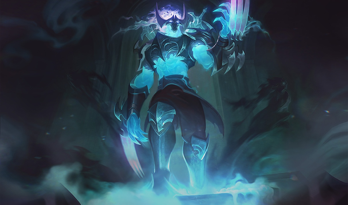
Zed: His claw is cut off creating a tangent, He is centered in the frame with no discernible fore, middle or background.
all this creates an awkward uncomfortable picture.
4/10 stars
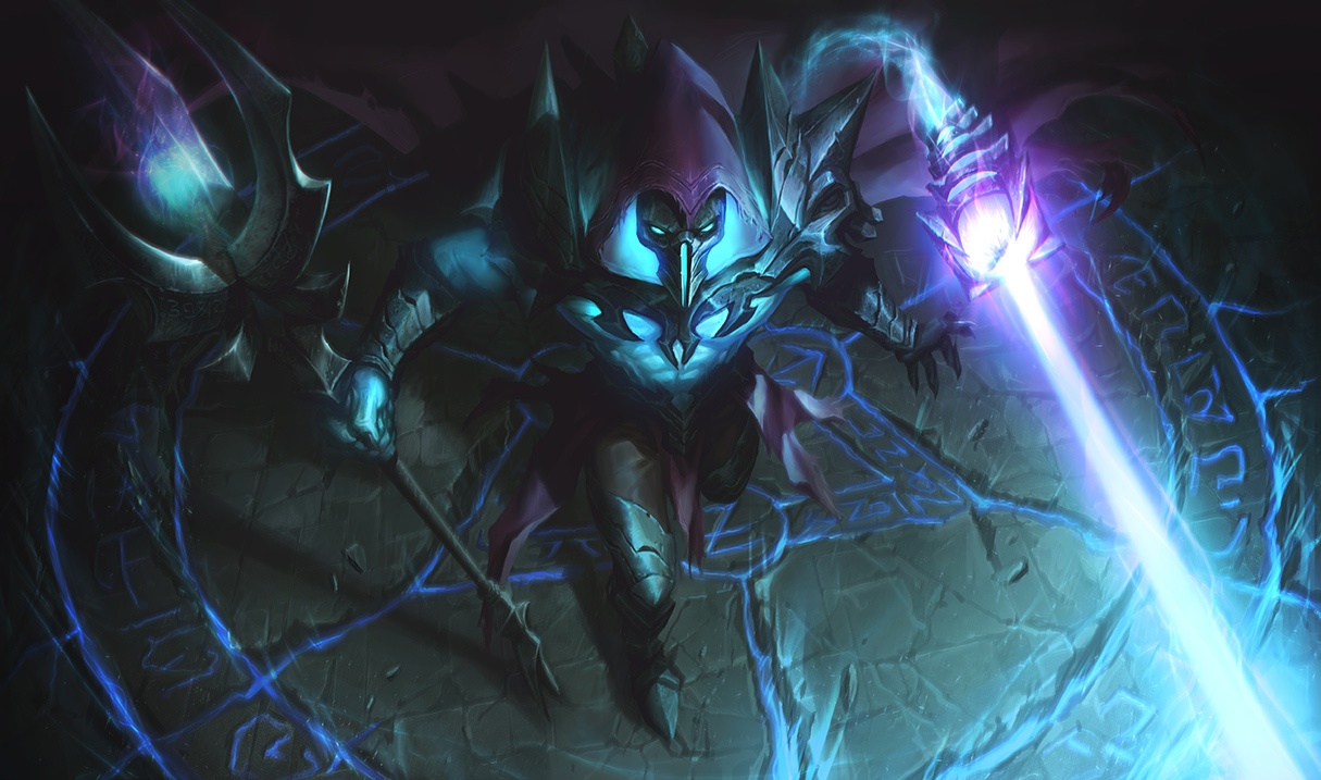
Viktor: Props on the exaggerated angle. however the staff keeps its diameter as its receding from the viewer, which implies that it is parallel to the viewer, Big no no. His pose has no weight and dose not convey power or intimidation. finally the staff and death ray both carry the eye out of the picture.
5/10 stars
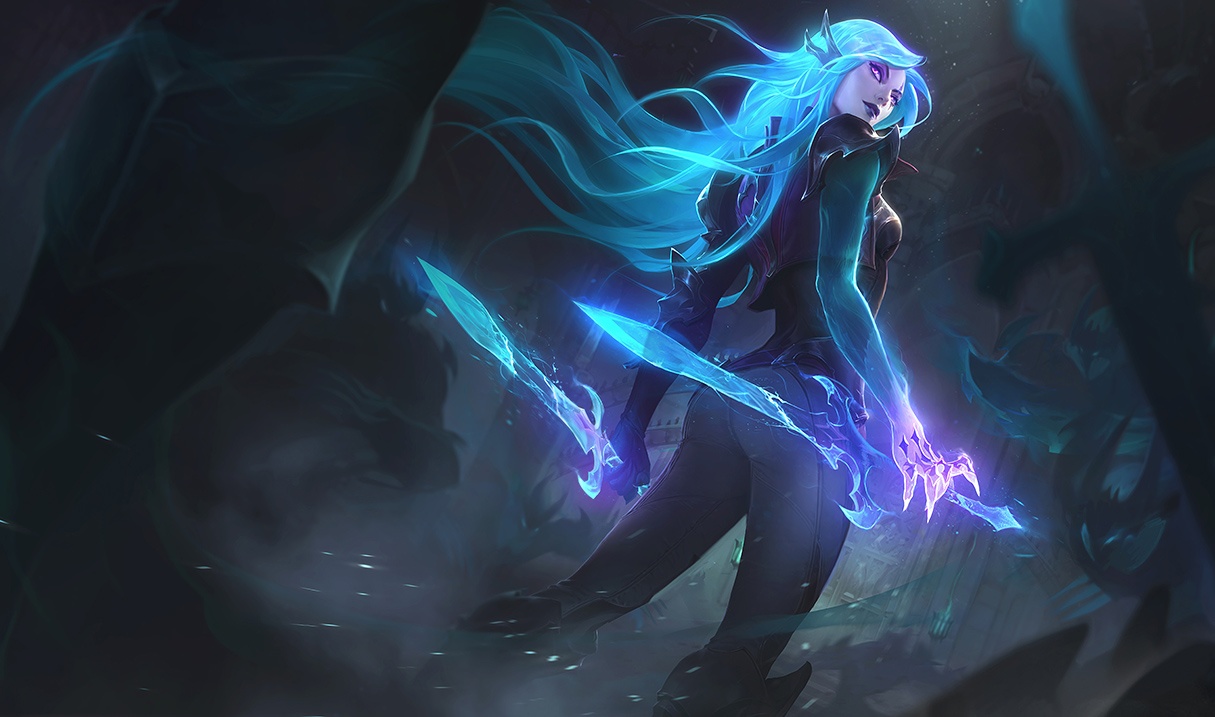
Kat: This is the best out of the three. It follows the rule of thirds has a fore ground which keeps Kat from floating away, and interesting action pose. head is to close to the top of the frame for my taste, wish there was a dark element overlapping her leg just a little, Is she wearing my sisters yoga pants?
8/10 stars
[slayer-jinx-catface]