117 Comments
 Abyssphere39 votes
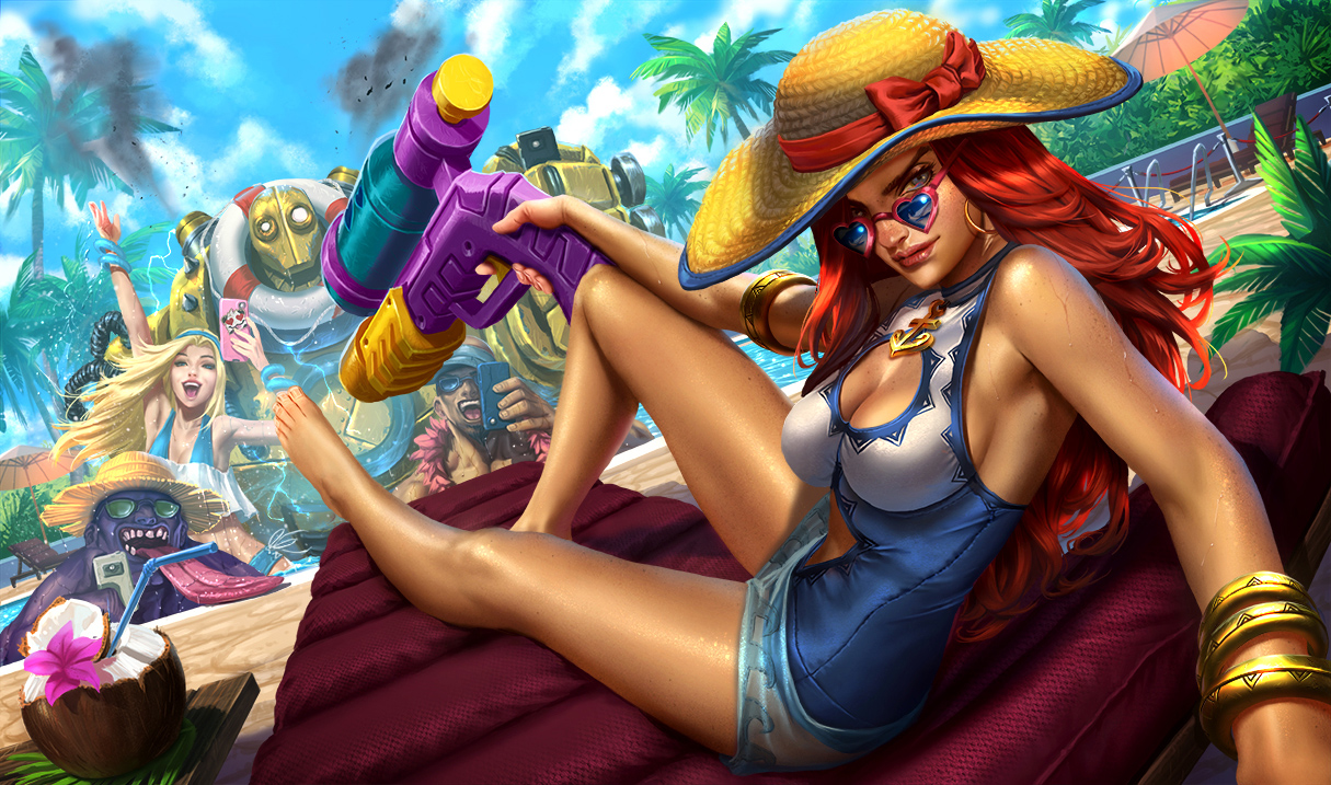
Most splashes I don't like just lower my enthusiasm for the skin a little bit. I still get the skin, I'm just sad that I won't enjoy looking at the loading screen splash. However, this splash is bad enough that it actually kind of ruins the fantasy of the skin for me a bit. Having played with the skin on the PBE, it's supposed to be a tongue in cheek skin of MF having fun at the pool. The selfie recall defines the skin to me, with MF being cool and relaxed, confident in how sexy she looks.
This splash though... Why does she almost look angry? She looks like she's stressed about taking the picture more than anything else. And this might sound odd but I just think her facial features are so masculine. I have a fair amount of exposure to drag culture and all I can see in her face is a man in drag rather than an actual woman. The eyes and eyebrows just have it.
I don't like just how enthusiastic everyone is in the background either. MF doesn't look excited or like she's trying to take a fun picture, so why are Lux and Lee so excitable by comparison? It's like they couldn't decide between a 'sexy' splash (MF, supposedly) or a fun one (everyone else) and as a result it just looks messy when looked at together.
I loved Fiora's (some oddly drawn faces but otherwise fine) and respected Taric's (don't like the art style but it's well-made) but I'm really disappointed by MF's, which is a huge pity because it's the skin I like the most in-game. There's nothing we can even do to get it changed now though, given they put it up at the very end of the cycle.
 Only Play Darius17 votes
Thank god I thought I was the only one who thinks her face looks screwed up.
 Mogarl8 votes
With you 100% on the masculine face sentiment. It really doesn't help that the shade of red used just doesn't look real, because that really makes it hard to see anything besides a guy in a wig. I imagine this is actually a picture of Miss Fortune's stunt double trying to look sexy.
However when viewing the splash at full size it's not quite as bad. The things that need to be fixed are her eye on the right side of her head (it's a little too wide and makes her head look strange), and her mouth/jawline area (her mouth is a little too big and the backside of her jaw is a little low/rounded). Unfortunately the sizes on her face combine with the angle to make it look strange.
 Bellopia3 votes
Honestly my biggest issue with her face is the placement of the arch in her eyebrows.
 Gehco24 votes
The quality of this is terrible compared to the one Fiora got. I guess they were the work of different artists?
 Solari Fortune4 votes
Ya more than likely, I feel it would be a lot of work for one person to do all of them
 Vistha Kai4 votes
Back in the day, when they were doing Art Showcases of doing splash arts, the time required for one could go as low as 8 hours.
 RiotReav36 votes
When was that? These days they usually take 4-6 weeks.
 Cubíx5 votes
Really? I mean I'm no artist believe me but 4-6 weeks seems like a long ass time for a splash art.
 DwarvenGiant4 votes
It's not just drawing a picture. It's a team effort- The process of creating a splash for League is more complicated than you think. An illustration like this will usually start as a bunch of thumbnails, one (or two) of which the team will settle on and build the final splash off. It's also a lot of iteration- The main artist/s will usually come and ask for feedback from the team, from time to time between taking a breaks from working on the splash. And sometimes something could go wrong and only when it's finished would the team realize that it could be better, so they'd have to take it back to the drawing board for a few more days.
I probably missed a lot of other general things that happen during the collaborative creation of splash art in League though, so forgive me for this. ;P
RiotReav317 votesYou are right that if one were to actually just paint a splash from the beginning to end it would take much less time. We usually go through many thumbnails, then many color comps, then many, many iteration and feedback loops on every splash. That's why I say 4-6 weeks as it varies depending on feedback/iteration.
Abyssphere14 votesAre you guys paying attention to the community feedback on this? Because I don't remember a splash that was more poorly received than this.
As someone who wants to buy the skin but won't be able to bring himself to do so if this is attached to it, I really want to hear you'll consider changing it.
EDIT: To clarify, I meant to talk about skin splashes -_- Obviously the reaction to this is nothing like the reaction to stuff like Fiora's updated splash.
 MrBuffington9 votes
Because I don't remember a splash that was more poorly received than this.
I take it you don't remember the first update to Ahri's base splash? Or Fiora's rework splash? Or Katarina's updated splash? Or Tristana's first post-rework splash? Or like, nearly all of the splash arts in the unification process?
I get that you're disappointed in the splash, and that's fine, but you're being a little dramatic. If those past examples are anything to go off of, they'll change it. Just keep things constructive.
 Keevalroy4 votes
I'm still extremely salty about Ahri's splash. Every single time I see the new one, I desperately want the old one back.
MrBuffington1 votesThe old one is still meh, especially in comparison to the recent art, but I'm still disappointed because there is so much amazing ahri fan art out there (even ones done by rioters in their spare time), and the current one just doesn't seem up to that standard.
Keevalroy3 votesStill meh, but still better than the current. At least the fan arts still look like her.
 SpecterVonBaren4 votes
It would be so easy too...
Abyssphere1 votesSorry, I meant skin splashes. It's understandable that people get angry about champion splash updates because if you don't like it, but you liked the old one, it's a huge downgrade that you don't want. But people rarely get up in arms about skin splashes because nothing came before them. Katarina turning into a drug addict was terrible, and Fiora being pretty ugly naturally got a big reaction, but poor skin splashes very rarely get harsh criticism.
I'm not trying to be dramatic, it's mostly just poor wording on my part and the fact that skin splashes rarely get a big response unless they're updates like the splash art unification or things like the Nidalee/Trundle splash updates. Hopefully I sound a bit less like I'm losing my head now.
MrBuffington1 votesOh, I completely understand disappointment regarding splash art, I mostly singled your comment out since it seemed uncharacteristically hyperbolic (you usually have pretty balanced opinions). Basically my "Here, have a Snickers," though I could have probably come off less confrontational. I've just been so sassy lately, maybe I need one as well, lol.
Abyssphere3 votesNa, your post was completely fine :) You were right to call me out on what I seemed to be saying. Still, might as well have the Snickers while you're talking about it.
 Oleandervine5 votes
You are right that if one were to actually just paint a splash from the beginning to end it would take much less time. We usually go through many thumbnails, then many color comps, then many, many iteration and feedback loops on every splash. That's why I say 4-6 weeks as it varies depending on feedback/iteration.
This piece should not have been launched in its current iteration. It feels so far removed from the typical quality and style of other League splashes that it comes across as overdone in some places and flat out bad in others. This is especially the case when comparing it to Pool Party Taric and Pool Party Fiora who perfectly capture the feel and style of League splashes, as well as the charm and cheekiness of all the other Pool Party skins.
 Chaosneobreakage2 votes
You are right that if one were to actually just paint a splash from the beginning to end it would take much less time. We usually go through many thumbnails, then many color comps, then many, many iteration and feedback loops on every splash. That's why I say 4-6 weeks as it varies depending on feedback/iteration.
Hmm, so you all looked at the MF splash art and then at the other ones and thought "Yeah, that's good."? Maybe you all thought it was a Katarina skin.
 redfeenix2 votes
Holy crap a splash art takes 6 weeks ?? Later your gonna have to share exactly what that entails, seems way too long for a single piece of art. But I don't know jack shit about art production eirther lmao
 ThâtTastedPurple20 votes
In my opinion, this is probably the most terrible Splash Art I've seen in months. The angle and pose is awkward, the lighting makes her skin look kind of grey and her face is....really, what is this? She does not look like MF anymore, she looks like a 40-year-old lady. Her face is way to sharp in its features and not as round as it used to be. Maybe this is what MF will look like in 20 years if she does not wear sunblocker?
(Note: I am not at all against various depictions of age groups and body types for all genders, but this artwork is terrible as it does not represent her character AT ALL!)
 Verxint12 votes
I don't see how you think she looks Anorexic
The pose is weird though, and the angle of the drawing doesn't help.
ThâtTastedPurple3 votes[{quoted}](name=gank me pls,realm=NA,application-id=6kFXY1kR,discussion-id=Za6vzq2K,comment-id=00030000,timestamp=2016-07-06T19:24:23.974+0000)
I don't see how you think she looks Anorexic
The pose is weird though, and the angle of the drawing doesn't help.
Just her face does. It looks so sharp and skinny to me, very much unlike her other splash arts. But I guess Riot's got a thing for these types of faces, I've had the same feeling about the new Kata splash.
Verxint7 votesHave you ever actually seen an anorexic person?
Their face isn't sharp, it's flat and the bones can be seen. Their breasts are shriveled up. Her hipbones would be sticking out from her sides. Her ribs would be visible through her swimsuit. Her collarbone would be visible. Her body wouldn't be curved, it would be thin and rigid. Her legs would be cylinders with visible bone. Her hair would probably be thin and look horrible because of the lack of nourishment.
Anorexia is a serious condition that leads to obvious symptoms if it continues, it is not just "someone looks thin" or "someone doesn't look attractive to me". You using it in this manner is basically turning it into a buzzword - "If I say this, I sound more serious and important"
ThâtTastedPurple8 votes[{quoted}](name=gank me pls,realm=NA,application-id=6kFXY1kR,discussion-id=Za6vzq2K,comment-id=0003000000000000,timestamp=2016-07-06T19:58:19.375+0000)
Have you ever actually seen an anorexic person?
Their face isn't sharp, it's flat and the bones can be seen. Their breasts are shriveled up. Her hipbones would be sticking out from her sides. Her ribs would be visible through her swimsuit. Her collarbone would be visible. Her body wouldn't be curved, it would be thin and rigid. Her legs would be cylinders with visible bone. Her hair would probably be thin and look horrible because of the lack of nourishment.
Anorexia is a serious condition that leads to obvious symptoms if it continues, it is not just "someone looks thin" or "someone doesn't look attractive to me". You using it in this manner is basically turning it into a buzzword - "If I say this, I sound more serious and important"
I'm sorry, a serious illness should not be used as an exaggeration of any kind. I am sorry if my comment hurt someone's feelings or played this illness down, I was not quite aware of the effects this comment could cause. I will ofc edit it out asap and think twice about what I am comparing. It just was like the first term that came to my mind (which is kind of troublesome, I guess), I am not a native speaker of English.
Verxint3 votesI didn't make the comment out of concern for hurt feelings, though I appreciate your willingness to realize how it could be that way. I just don't like serious words with specific meanings being used for bad comparisons, and I have a bit of a peeve about anorexia because I've seen it misused this way a number of times. A lot of people seem to use it as synonymous with "body type thinner than my personal preference"
All of this said I have to agree the splash is pretty bad, especially when Fiora's is godlike.
Gehco2 votesIn my opinion, this is probably the most terrible Splash Art I've seen in months. The angle and pose is awkward, the lighting makes her skin look kind of grey and her face is....really, what is this? She does not look like MF anymore, she looks like an anorexic 40-year-old lady. Maybe this is what MF will look like in 20 years if she does not wear sunblocker? Petition: Rename the skin to "Aged Miss Fortune" :D
(Note: I am not at all against various depictions of age groups and body types for all genders, but this artwork is terrible as it does not represent her character AT ALL!)
MF's feet are so damn ugly...
Vistha Kai5 votesI guess the artist played too much of Skyrim/Oblivion without mods.
 Automatis14 votes
MF looks bad but the background characters are fine imo, but they're not the ones forced into that weird angle.
Also I like how Blitzcrank is sparking in the pool, he's going to fry them.
 Sinlaire5 votes
Would anyone like to also point out that Lee is holding his phone upside down?
I know there are some funky phones out there but im pretty sure there arent any with the flash on the bottom like that.


 Athenes Lulu9 votes
The artist seems too humor-focused. It's not the front that it matters, it's the background that's more interesting to work on.
Though if MF actually smiled and do her classic ";*" face then it would've been better.
 Aeszarck8 votes
I don't feel that this splash hit the mark. It's high quality, but the background is too comical and Miss Fortune is too serious. She also just doesn't look that attractive, which is an important feature for Miss Fortune.
EDIT: I feel bad for the artist though. Some serious work went into this piece and we're all telling the artist(s), the supervisor, and whoever else "ok'd" the piece that the work wasn't enough or was in the wrong direction. Not that the complaints aren't justified, but it feels bad.
 Burn Hazard7 votes
It's a good effort, but man did they screw up on a lot of details.
Blitz looks like he has an eye infection going Lux looks like she has brain damage MF's perspective is all kind of fucked up MF's chest is too small MF's ass is too small
The overall quality on the image is just really poor. I'm sure some of you are going to downvote me for talking about her curves, but keeping to her canon proportions (you know, the ones in her classic splash and the ones in her model) is crucial for selling that this is Miss Fortune and not Katarina with a squirt gun.
 Death by Glamour6 votes
Is lee holding his phone upside down?
Solari Fortune2 voteshe's trying at least
Death by Glamour1 votesStill wondering why i noticed it
 underscores2221 votes
I'd be more worried about lee having his phone in the pool. What if he dropped it (and it wasn't one of those water resistant ones)
 Sukishoo6 votes
He's blind he can't tell what he doin XD
 Stars Shaper7 votes
He is just pretending to.
http://weknowmemes.com/wp-content/uploads/2013/09/day-1354-they-still-think-im-blind.jpg

 Vistha Kai6 votes
Two things, beyond overall quality of the picture.
First of all her swimsuits needs the midsection covered, because it looks awful and misleading with that pose. Secondly... maybe a picture will describe it for me. http://i42.tinypic.com/mlkcw.jpg?noredirect
 SlashStriker6 votes
MF Pool Party i don't like it. Feels like old woman is watching at me
while Fiora is total babe
 Nazzadan5 votes
Oof, looks pretty bad tbh
 Vertu5 votes
She really does look more like kat than mf
Abyssphere4 votesSomeone mentioned that the champions in the background look really uncanny valley and now I can't really see it. The champions in the pool just don't look real, beyond being cartoons. I don't believe that the people obviously supposed to be Lux and Lee Sin actually are them.
More from Story, Art, & Sound
Petition to keep the Bilgewater ARAM map in circulation
Story, Art, & Sound154 comments
1,161
votes
[SUPER IMPORTANT PETITION] Change Sion's ban quote...
Story, Art, & Sound54 comments
597
votes
Can we get an Honor animation?! 4 ways to insult an opponent but none to congratulate them.
Story, Art, & Sound202 comments
578
votes
Petition to make Rengar wiggle his butt when there's a pounce-able target near his bush
Story, Art, & Sound140 comments
476
votes
About this years harrowing...
Story, Art, & Sound357 comments
459
votes
RIOT, please postpone Blood Moon Diana and make it into a Legendary skin.
Story, Art, & Sound236 comments
423
votes
More by Solari Fortune
I figured it out, this plan is entirely fool proof
Memes & Games57 comments
227
votes
Just because Faker picks Olaf mid
Gameplay128 comments
181
votes
ITS NOT A PHASE MOM
Memes & Games152 comments
181
votes
Kayn has no sense of privacy
Memes & Games31 comments
164
votes
I feel Match Making has a sense of humor sometimes
Memes & Games16 comments
157
votes
Pyke is a Support Assassin Hybrid
Gameplay94 comments
146
votes