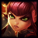
About positioning in the recent splash squares.

This may see nitpicky to some but y'know.
http://i.imgur.com/guelAbH.jpg Kat's positioning in her splash square is very nice. These squares with this type of positioning alway look really nice in the loading screens.
http://i.imgur.com/O92UMRu.jpg Firecracker Jinx. Can we zoom in on her a little? Make her fill the space like in Kats?
http://i.imgur.com/6cJUTHH.jpg Sweetheart Annie. She's kinda too far in the lower area of the square, can we center her and make her fill the space a bit, again, like Kats?







 I disliked so very much Jinx splash. It's soooo in line with all that's wrong with that awful Tristana splash. This Jinx one is excessively badly cartoony :/