58 Comments
 Canastus19 votes
Two things that need to be said:
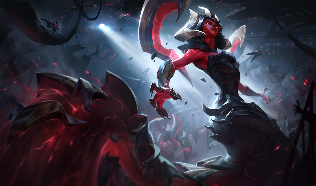
- The angle isn't very good, her face appears far too manly like that. Maybe make her turn her head so we get a better and more suited look on her face? The chin is the issue here.
- The loading screen version has far too much unused space, either zoom out to show more of her or turn the thing a bit around like they did for Lee Sin's portrait ingame.
 Ralanr4 votes
I'm getting a very African woman face honestly.
 Hexs Fortune3 votes
I'm getting a very African woman face honestly.
I don't see that and i'm squinting. The face looks like it belongs on a pokemon tbh
Ralanr3 votesIdk. The jawline I guess.
 Oleandervine3 votes
It would be the jawline, the wide nose, and the large lips that combine to give that effect. While I wouldn't mind it at all, this is Cassiopeia, who is not an African woman.
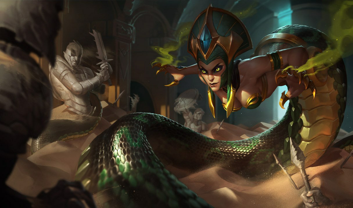
Cassiopeia DOES NOT HAVE THESE FEATURES. She distinctly has a slender nose, larger eyes, and thin lips. http://ddragon.leagueoflegends.com/cdn/img/champion/splash/Cassiopeia_0.jpg
This Cassiopeia is not the same one that is pictured in the Eternum splash art.
 TheHappyReaperz1 votes
Makes sense, as it is a skin.
 Valaran Nara2 votes
I'm getting a very African woman face honestly.
I mean, with the complaints I'm reading, the problem is that she doesn't have the typical Anglo-Saxon facial structure because I'm not reading too much irregularity with how she's looking right now.
 Jeddy01712 votes
You know, I really don't know what the Eternum theme is suppose to be anyway. The only thing I could take from it is that it's about armored creatures/monsters with some sort of red power. They're clearly not machines, I imagine that's their "natural" look.
I read comments saying the skin doesn't fit Cass or vice versa & I'm just sitting here wondering what the freak is this skinline is.
 Sancre4 votes
Biological machinery aliens I think
 Hollandiae5 votes
http://www.surrenderat20.net/2017/08/822-pbe-update.html?m=1 Eternum Cassiopeia is the brilliant conqueror Queen of the the Eternum, a ruthless and high-tech alien race. She will stop at nothing to get what she wants.
https://i.imgur.com/lLxCoWM_d.jpg?maxwidth=640&shape=thumb&fidelity=high
 Variks the Loyal2 votes
They're monstrous bio-machines that can move through dreams and assimilate other organisms. It began with Eternum Nocturne.
 Furor Nexis10 votes
They're monstrous bio-machines that can move through dreams and assimilate other organisms. It began with Eternum Nocturne.
I disagree. I see them more as a Bio-mechanical hive-mind, similar to Star Trek's Borg that invades other worlds. For example, Eternum Nocturne has voicelines that refer to a collective over a singular entity.
"Despair in our presence" "Long have we waited"
Also in Eternum Cass' recall she literally turns a small creature into a bio-mechanical variant of itself, which seems to imply that the Eternum is a collective that adds to itself through forced conversion. The Borg of Star-Trek are similar in this fashion, adding entire races to their collective and it's technology.
 EROTIC RAID BOSS2 votes
They're reapers from mass effect
 Hyperiön1 votes
You know, I really don't know what the Eternum theme is suppose to be anyway. The only thing I could take from it is that it's about armored creatures/monsters with some sort of red power. They're clearly not machines, I imagine that's their "natural" look.
I read comments saying the skin doesn't fit Cass or vice versa & I'm just sitting here wondering what the freak is this skinline is.
Death.
 Glîtchy10 votes
waits for ingrate Cass mains to start bitching
 Colgate Gator3 votes
waits for ingrate Cass mains to start bitching
I lol'd
 ScarletSurgeon7 votes
It looks very weird from that angle. Her face is way too distorted, also thanks to the shading her waist looks super thin :/
 Forbidden Siren7 votes
Disappointing. It seems they did a quickie on this one and be done with it.
Canastus2 votesYeah, that's pretty much the impression it left on me. They probably didn't have enough time to reflect on it, otherwise they would have realized the issues with it. Seems a bit rushed.
Forbidden Siren5 votesI'm hoping they have time to fix the face, at least, if enough people voice their opinions. They did adjust Conqueror Karma's face in her splash art before so there's hope.
Solari Fortune2 votes3 weeks this cycle so I think they might make some changes to the face since that seems to be the biggest complaint
 Sexy Jack Rabbit1 votes
To be fair the main issue with Conqueror Karma is that they made a champion who people often seen as Black into a white person. It wasn't the angle or design that upset people.
 Poop Jelly3 votes
What? I feel like it looked like the artist put a lot of efforts into this one. You or I may not like it, but I can see the amount of works behind those details in her texture and in the background. It looks way more time-consuming than the new star guardians.
 AbiwonKenabi1 votes
I agree. I was some what disappointed by the Star Guardian splashes since the previous ones were so fantastic. The new ones feel a bit same-y. Eternum Cass looks unique and high quality, but I agree with others the face angle makes it look a bit odd. I know she's not necessarily supposed to be a looker, having been cursed and all, but still.
 OnanThaMan4 votes
Alright, gotta agree on this one, this splash sucks.
 Zyranium3 votes
Her face is very weird and ugly, I'm not buying it at all I like the skin as it is, and the effects, but EW that splash is awful, sorry to say
Im not ingrate or anything else, I just don't like it, she looks manly
Hexs Fortune3 votesNot enough detail on the face. Many recent splash arts are lacking detail on the face and it's led to this monstrosity lol
 ABlueQuaker3 votes
This is a pretty awful skin. They've scrapped skins in the past for less.
 The Pale King3 votes
I really don't like the angle or the pudgy face. I really like this skin. Just make her look a bit more feminine. I own all her skins and have played through all her game play changes since the beginning. Very hyped for this skin!
Snake Prince3 votesI was about to buy this skin , but the splash is too repulsive . Wont put any money for such low quality art , unless some work is done for her face
 Catastrop2 votes
Kind of a disappointing splash for such an awesome skin.
Tormentula2 votesI like it
proceeds to get downvoted
 Chromatic Eagle2 votes
Is it just me, or is that a really thin lower half?
 Killaburn2 votes
maybe its just the lighting
 ChuShoe2 votes
was it supposed to be T H I C C cass?
Chromatic Eagle1 votesI mean like a really thin waist line.
 RizHippoKhan2 votes
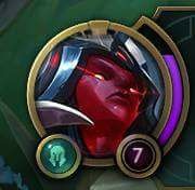
imagine the ingame hud face XD XD
Solari Fortune9 votes


 RizHippoKhan3 votes
well that's pretty traumatic.. ;-;
Aeszarck2 votesThanks for always posting Skin splash arts MrDerpMaster, it's really convenient.
Solari Fortune1 votesI am just a simple messenger the praise should go to Moobeat and Aznbeat who run Surrender@20 and actually show us the content. And also Uli at SkinSpotlights for giving us the preview videos
Aeszarck1 votesI am just a simple messenger the praise should go to Moobeat and Aznbeat who run Surrender@20 and actually show us the content. And also Uli at SkinSpotlights for giving us the preview videos
They're great but I don't check Surrender@20 often. I do however check the Boards often and you are generally the person that informs me of the newest Skins and shows me their splash arts, so I'm very grateful to you for that (as well as your other sensible posts around the Boards, you're quite reasonable in general).
 Silvarspark2 votes
The splash overall isnt bad, far from it. It's technically really well done.
That beeing said, the angle on the face is somewhat unfortunate and I miss some more red glow reffects as well and maybe some refelected red light on the metal parts.
 Evelyscerated2 votes
As someone who has wanted a new Cass skin for a couple years or more, I'm quite disappointed with this skin. First of all, Eternum skin-line is just one of those ambiguous concepts that doesn't really make sense and just looks gaudy and strange. We have this beautiful, organic life-form slithering through the lanes/jungles etc. and we're going to throw a bunch of compound-curved metal objects on her to weigh her down? Her face tells me she's getting photo-bombed and she's turning around to see who it is. It's not a dynamic pose at all, okay her fingers are sprawled out and you have her tail coming toward the audience, congrats.
She's not focused on anything and her face/helm is extremely flat looking. Painting techniques don't make up for a poor concept. It's been many years since she's received a new skin, her old ones have not been updated at all, and this is what she gets? Damn girl, I'm sorry.
Silvarspark1 voteshttps://orig10.deviantart.net/b1ed/f/2017/236/3/1/cass_splash_by_shockowaffel-dbl4oyi.jpg

I tried to do a paintover to see what can be done. I felt the face was rather stretched and flat. The eyes needed some tilt to go with the curve of the face. I also added reds in the shadows and more glow overall. Another thing is the backlighting. If you have such a strong light source behind you, some parts in the shadow needed to be darker.
At least these are my quick thoughts. Overall it still works of course, but I noticed that it actually looks quite different than the skin.
 GreenLore1 votes
Her face looks flat because that what she looks like ingame https://2.bp.blogspot.com/-qaQDSigiOcQ/WZyLiSeMDgI/AAAAAAAAslU/SXM6vq-x4bMj1Dosxsc5DGfxkZMv6YseQCLcBGAs/s1903/cass.png

In general it doesn't look like she is supposed to look sexy or even human.
Silvarspark3 votesHer face looks flat because that what she looks like ingame https://2.bp.blogspot.com/-qaQDSigiOcQ/WZyLiSeMDgI/AAAAAAAAslU/SXM6vq-x4bMj1Dosxsc5DGfxkZMv6YseQCLcBGAs/s1903/cass.png
In general it doesn't look like she is supposed to look sexy or even human.
By that logic, the splash needs a lot more work to look like the skin.
GreenLore1 votesWell splash arts look of course not always like the ingame skin,but your changes specifically target parts of her face that make it look even less like the ingamel model.
Silvarspark1 voteshttps://orig02.deviantart.net/14f7/f/2017/237/8/f/cass_splash2_by_shockowaffel-dbl8ky6.jpg

The splashart update is a lot better, but there are still two things that can be fixed to be more faithful to the skin. 1 These eyebrow extensions 2 The dark lips
Also I experimented with the skin a little. I feel like the gold parts on the head are somewhat distracting and the head is a bit too orange. Please, tell me what you think.
https://orig13.deviantart.net/4ec9/f/2017/237/e/2/cass_skin_by_shockowaffel-dbl8ky9.jpg

More from Story, Art, & Sound
Petition to keep the Bilgewater ARAM map in circulation
Story, Art, & Sound154 comments
1,161
votes
[SUPER IMPORTANT PETITION] Change Sion's ban quote...
Story, Art, & Sound54 comments
597
votes
Can we get an Honor animation?! 4 ways to insult an opponent but none to congratulate them.
Story, Art, & Sound202 comments
578
votes
Petition to make Rengar wiggle his butt when there's a pounce-able target near his bush
Story, Art, & Sound140 comments
476
votes
About this years harrowing...
Story, Art, & Sound357 comments
459
votes
RIOT, please postpone Blood Moon Diana and make it into a Legendary skin.
Story, Art, & Sound236 comments
423
votes
More by Solari Fortune
I figured it out, this plan is entirely fool proof
Memes & Games57 comments
227
votes
Just because Faker picks Olaf mid
Gameplay128 comments
181
votes
ITS NOT A PHASE MOM
Memes & Games152 comments
181
votes
Kayn has no sense of privacy
Memes & Games31 comments
164
votes
I feel Match Making has a sense of humor sometimes
Memes & Games16 comments
157
votes
Pyke is a Support Assassin Hybrid
Gameplay94 comments
146
votes