19 Comments

Sharjo7/9/2016, 1:23:06 AM5 votes

Her face is...boring.

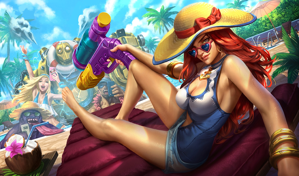
Honestly she looks so boring now. There's no personality or charm to her face for me now; it literally looks like a copy paste "generic sexy lady" face, the same face so many women in league have. I'm actually kinda aggravated by the face change now. Dammit. Looks more polished, but lost all the personality for me.

Moonboy657/9/2016, 1:01:25 AM5 votes

it's safe to say that the splash art looks MUCH better now

Abyssphere7/9/2016, 1:36:46 AM3 votes

Face is muuuuuuuuuuch better. Still hugely dislike the background characters but at least the loading screen slice will be tolerable now.

Wolfess7/9/2016, 9:24:21 AM2 votes

oh look some actual shading this time.

YuGiHo7/9/2016, 12:55:50 AM2 votes

omg her face looks so much closer to what i think of being miss fortune. what was going on with that other face.

Lilly May7/9/2016, 4:46:18 AM1 votes

Looks much much better now. Background characters could still use some work but overall I greatly appreciate these changes. Also her foot could use just a touch more tweaking, give her some nail Polish on her toes or something and give it a bit more definition to match the rest of her body. Overall it's really a good update to the splash.

Star Guardían7/9/2016, 12:09:17 PM1 votes

Looks great now. The only thing I take umbrage with is Blitzcrank. He just seems less polished. I do like that they lightened the puffs of smoke, but maybe they should try bubbles (idk that's just a thought). Mundo, Lee and Lux look alright though. Other than that, this splash is acceptable now and fits the aesthetic of the current League splash arts.

Sukishoo7/9/2016, 12:57:27 AM1 votes

I like the fact modification but nothing else.

Forbidden Siren7/9/2016, 3:56:09 AM1 votes

Definitely better but... can't she do a duck face or perch her lips more? Or at least a gap on the lips. That would be more of Miss Fortune's personality than just staring at whoever she's looking at.

Avarosan Bonnie7/9/2016, 4:32:20 AM1 votes

I actually didn't mind the splash TOO much at first, but when I compared these two side by side, yikes. It really does become apparent how many flaws the first version had. The background characters could still use some work, but you know what, they listened to us. MF looks better and I'm happy. No more complaints from me.

EWBS Mithilesh7/9/2016, 4:34:17 AM1 votes

your shadows from MF hat doesnt fit but good MF face touch ups. but you didnt touch the back ground and Lee Sin phone being upside-down