Skip to content

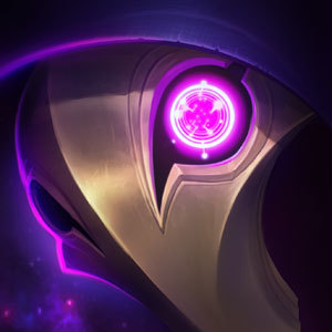
Dark Cosmic Jhin Fanmade Login Screen

LunaticSandwich··5 votes·3,125 views

I don't own any of the content posted, just wanted to get that out of the way.

But with that aside, this is piece is absolutely amazing. To no discredit for the Riot team for their creation of the skin, splash, and music, I honestly prefer the brighter highlighted version of the animated splash that was done here. I do really love the original animation and I love the music, but the way the background moves and especially the bright lights and how they highlight everything with a flare of color makes this fanmade version... better. This truly does sell to me that this is a skin of legendary proportions, where Jhin is at the center of his masterpiece, admiring it. While I kind of miss the eye at least glancing at us, nothing feels static, and everything AROUND Jhin seems important, arranged on purpose which is how this version of Jhin ought to be portrayed. I guess what I'm saying is I like the movement and sense of grandeur in this version because Jhin is actually interacting with his masterpiece.

Those are just my thoughts, I'd love to hear what the community thinks. Again, I own nothing, just wanted to get this out here and hopefully into some limelight.
5 Comments

4 Step Cadence2 votes

This is... Worse. A lot worse in a few ways.

  • That eye is just... Wow. I have no words for that besides terrible.
  • The parts of his cloak that dip into the "water" are just cut off. In the other version, they have ripples around them to make it look like they're actually in something.
  • His 4-point star is different, and not in a good way.
  • Why is something orbiting the black hole on his shoulder like its a planet?
  • Where's the other debris from the exploded planet?
  • He's somehow moving less than he is in the other one.

The only good thing about this is the movement in the background. Everything else is just unnecessary, awful changes. I'd rather have no login screen than this, honestly.

No disrespect to the artist, of course, but the other version is far superior to this in pretty much every way.

Whyskered Wyrm1 votes

[{quoted}](name=4 Step Cadence,realm=NA,application-id=6kFXY1kR,discussion-id=E5F3QwtN,comment-id=0000,timestamp=2019-06-10T00:19:02.735+0000)

This is... Worse. A lot worse in a few ways.

  • That eye is just... Wow. I have no words for that besides terrible.
  • The parts of his cloak that dip into the "water" are just cut off. In the other version, they have ripples around them to make it look like they're actually in something.
  • His 4-point star is different, and not in a good way.
  • Why is something orbiting the black hole on his shoulder like its a planet?
  • Where's the other debris from the exploded planet?
  • He's somehow moving less than he is in the other one.

The only good thing about this is the movement in the background. Everything else is just unnecessary, awful changes. I'd rather have no login screen than this, honestly.

No disrespect to the artist, of course, but the other version is far superior to this in pretty much every way.

Well at least hes not doing an LCS themed one. Would you rather have riot take over the next login screen?

4 Step Cadence1 votes

Least they don't completely butcher amazing work. This is terrible and an insult to the skin if I'm being totally honest.

Whyskered Wyrm4 votes

[{quoted}](name=4 Step Cadence,realm=NA,application-id=6kFXY1kR,discussion-id=E5F3QwtN,comment-id=000000000000,timestamp=2019-06-10T00:35:03.529+0000)

Least they don't completely butcher amazing work. This is terrible and an insult to the skin if I'm being totally honest.

Dude just stop trying to get responses from people and waste your time somewhere else. Downvoting this hard work because a few things don't meet your god-like standards is a pathetic thing to do.

Did you even watch how its made? Of course not, your the kind of guy who would rather be lazy and post low effort criticism. I would like to see you try and make this, just so i could comment on how shitty your editing was, or how you clipped over something. You wouldn't mind would you?

Ahri Baka6 votes

[{quoted}](name=4 Step Cadence,realm=NA,application-id=6kFXY1kR,discussion-id=E5F3QwtN,comment-id=0000,timestamp=2019-06-10T00:19:02.735+0000)

This is... Worse. A lot worse in a few ways.

  • That eye is just... Wow. I have no words for that besides terrible.
  • The parts of his cloak that dip into the "water" are just cut off. In the other version, they have ripples around them to make it look like they're actually in something.
  • His 4-point star is different, and not in a good way.
  • Why is something orbiting the black hole on his shoulder like its a planet?
  • Where's the other debris from the exploded planet?
  • He's somehow moving less than he is in the other one.

The only good thing about this is the movement in the background. Everything else is just unnecessary, awful changes. I'd rather have no login screen than this, honestly.

No disrespect to the artist, of course, but the other version is far superior to this in pretty much every way.

It's just a fan work dude .. Not some company a guy made it I know you worship Jhin and stuff but you should not hate on this as if it's some kind of official work

More from Story, Art, & Sound

More by LunaticSandwich