Another thread about the icons

rN0fu5nbur·1/15/2015, 10:01:47 PM·2 votes·1,117 views

I don't like the changes to the icons. I think most people agree with me. Here's a poll.

Look at Udyr man Udyr
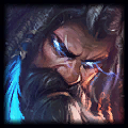
I almost ask myself if someone even actually did that on purpose or by accident. Can we just revert the icons? So many things about this patch were changed that were not needed and only decreased the quality of the aesthetics of the game.

For example even in the post game screen now my teammates names are red, and the enemy team's names are blue? Can we just revert this patch in general lol.

3 Comments

21496640_DEL1/15/2015, 10:28:05 PM3 votes

Yes, we have to complain a bit. The contrast of some new icons are somewhat intensed

Except Lee Sin, Ezreal and Kogmaw icons are better. But look at Rengar, a lion without mane, or Graves oily face (his right eye was blue, now I can barely see it) ...

rN0fu5nbur1/15/2015, 10:29:04 PM1 votes

I also want to add to this that it is an unnecessary change to make every champions face line up perpendicularly. Lee's splash art doesn't even match his icon anymore. For what purpose?

21496640_DEL1/15/2015, 11:04:06 PM1 votes

With ponytail in the new icon, Lee Sin icon doesn't look like a thumb like before.