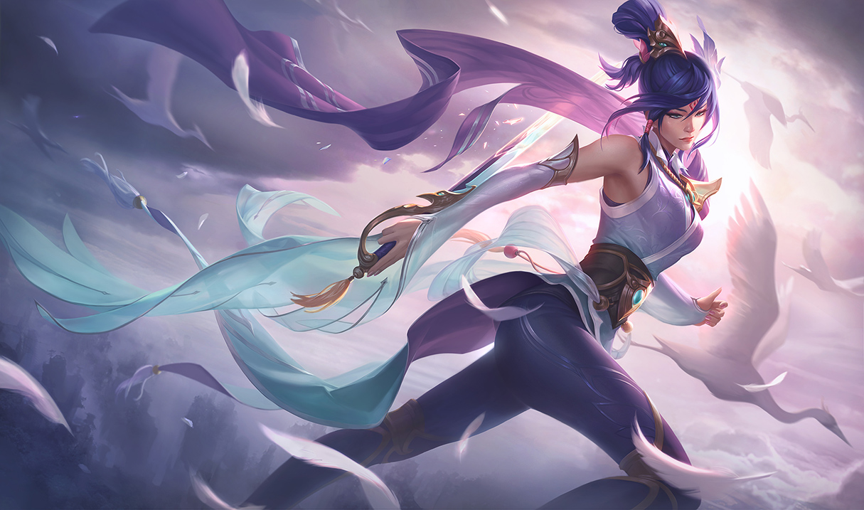
Splash Art Tweaks to the Janna Yi and Fiora skins

Solari Fortune·9/22/2017, 6:47:32 PM·11 votes·2,715 views

12 Comments

Witch of Babylon9/22/2017, 7:17:24 PM6 votes

Janna looks a lot better. A lil weird that she's looking at a sword like that tho

LunSeiSleidee9/22/2017, 8:43:49 PM5 votes

They kinda turned Yi from Asian-eyed to anime-eyed. Same with Janna. Whitewashed their faces so they no longer look Asian at all but they look anime enough.

sigh

Aushi9/23/2017, 5:47:29 AM2 votes

there's always gonna be two-sided feedback [sg-soraka]

Blades in Exile9/22/2017, 7:39:17 PM2 votes

I have to say I liked the old Fiora splash more than the new one.

CJ100020009/22/2017, 7:42:43 PM1 votes

Old Fiora is better in my opinion especially what you did to the hair i don't like.

ShadowGlaive2139/23/2017, 6:03:56 AM1 votes

Janna and Yi match their icons more now, but Fiora still doesn't match hers and I thought she needed it most.

I preferred Janna's splash before the changes. Stylistically I think it matched the rest of the splash more and her expression fit the soft, serene lightness the scene previously achieved. Her hair and face has been changed to match her icon in the name of consistency, but it's a disservice to this piece and it now feels a bit disjointed. IMO they should revert the Janna splash and change the icon to match it, her eyes in the icon were way to big relative to her mouth even with foreshortening.

I know the w/e you want to call them on the legs were probably added to match the in game model but the in game model looked like cloth while this looks closer to tattoos or something and I think the splash looked better without them. Just like Yi doesn't have his mask on Janna could go without this bit.

Digielf9/25/2017, 5:12:13 PM1 votes

Am i blind or something but the Janna and Fiora second splashes look exactly the same with their first to me

Catastrop9/25/2017, 6:19:41 PM1 votes

I'm not sure what's supposed to be different in Fiora's.

Yi looks amazing tho.