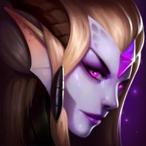
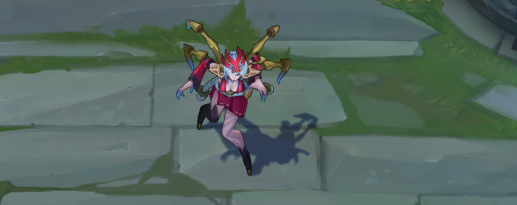
Red Elise don't fit her. Make it pink again, please.

xPolenta··11 votes·7,408 views

Pink elise is MUCH better. With the red one, i dont feel anything. Some people want it red just because the others Blood Moon are red and pink Elise look "Popstar" or "Heartseeker". NO, SHE DOESN'T. Did you stop to see her clothes? She doesnt look like a Heartseeker or popstar, with that excuse, you can put Elise on a red bikini and she can be a Blood Moon just because the color. Is OBVIOUS she look like a Blood Moon. Stop crying because she is pink, or have a skirt and for her mask and see Akali. We have so much red skins right now and we have a lot of "team skins" that are really different, in color, style and everything and nobody is crying for these (and they are all great skins). The Elise Blood Moon is PERFECT in pink, she look awesome and fit her style and i can told more about her skin in pink, because i loved it. In red...just look like someone else, and i dont feel the Blood Moon, i dont feel anything, the color doesnt mean anything. She is best in pink and look perfect for a Blood Moon and for her style. Please, change it back to pink. Is more the people that like pink one then red one. Change the name if you want, but not her, please riot, listen to ALL the people who want her skin in pink....

Sorry for my english...

33 Comments

Riotmoonstones16 votes

I'm sorry you're not a fan of the color scheme we chose for Blood Moon Elise.

The opinions of if she should be pink or red were actually split pretty 50/50. So, we decided on a pinkish reddish color - something that was more of a happy medium between the two, and something that fit into the thematic of the Blood Moon line.

Byrnes2 votes

Is it possible to release two versions? Can that happen? I mean, that would mean more money for you guys with basically no work right?

Riotmoonstones9 votes

Is it possible to release two versions? Can that happen? I mean, that would mean more money for you guys with basically no work right?

For this skin, unfortunately not.

Tourian1 votes

Is it possible to release two versions? Can that happen? I mean, that would mean more money for you guys with basically no work right?

For this skin, unfortunately not.

Good job everyone, now its going to be a 1350 skin rather than 975. I hate you all. :P

Cuix2 votes

Why not?

Tamur7 votes

there is just no way to please everyone I guess

Byrnes2 votes

Truer words have never been spoken about our League community, haha. :>

AntiSkillshot3 votes

I'm sorry you're not a fan of the color scheme we chose for Blood Moon Elise.

The opinions of if she should be pink or red were actually split pretty 50/50. So, we decided on a pinkish reddish color - something that was more of a happy medium between the two, and something that fit into the thematic of the Blood Moon line.

Then you have people like me, who has a pure hatred for the color pink. This is why I find Armor of the fifth age Taric skin as the worst skin around. It's also why I have a distaste for Popstar Ahri. At the moment, I see the second version of the skin as the best, the one that was nearly pure red. For the current version, while the spider form is light red (not pink enough for me to dislike it), human form seems... a little... too pinkish.

But, I'm one guy here. Though, I'll probably pick it up, regardless. Can't deny white hair...

If you're wondering why I hate the color pink. You can thank a dev from Artix Entertainment named "Beleen". She would always find a way to add a pink armor/cape/weapon/helmet for each release of something. And I eventually got sick of the color.

exe32 votes

I'm curious but why release the pink version first when you felt it didn't fit with the other skins? If you had launched red in the first place none of this would have happened. Was it intentional just to see what kind of reaction a pink version would get?

Riotmoonstones7 votes

I'm curious but why release the pink version first when you felt it didn't fit with the other skins? If you had launched red in the first place none of this would have happened. Was it intentional just to see what kind of reaction a pink version would get?

Not intentional in the least. We stayed away from the reds at first, since she's got some of that in her base skin. Enough players spoke out, saying they were unhappy with the pink, especially when it came to her fitting cohesively with the Blood Moon skin line. That's when we started taking feedback into discussions, and working to find a color that made sense for the skin line, as well as compromising with what players were saying about the skin.

Cuix2 votes

Seriously? Just make this one red, then promise to work on a skin which incorporates the softer pink/blue/gold palette present in the original concept, without giving any actual release (date) promise. Then, if and when that palette lends itself well to another idea, release that skin. Why go with a middle-ground magenta which will most likely just leave everyone disappointed?

Riotmoonstones8 votes

Seriously? Just make this one red, then promise to work on a skin which incorporates the softer pink/blue/gold palette present in the original concept, without giving any actual release (date) promise. Then, if and when that palette lends itself well to another idea, release that skin. Why go with a middle-ground magenta which will most likely just leave everyone disappointed?

Making promises is never a good idea, even without a solid release date.

One of the biggest discussion points with her being really red (from both a player perspective and our own) was that her particles clashed with them. As I've pointed out before, the decision was based on both the community being split pretty evenly on if they wanted red or pink for the color scheme, as well as making a skin that was still fitting cohesively with the Blood Moon skin line.

As far as learning people feeling disappointed, I've seen a surprising amount of feedback that's neutral to positive. At the end of the day, you can't make everyone happy, and that honestly sucks.

Cuix5 votes

Making promises is never a good idea, even without a solid release date.

Not just without a release date, but without any release promise at all. "We'll definitely look at this color palette and the ideas that came from it, because clearly that first version resonated well and looked good, but we can't promise that it'll end up becoming a skin that gets released." There's plenty of room to discuss ideas and possibilities with the community without actually setting up finalized release expectations. (This seems like a notion Riot frequently and deeply struggles with, so I don't blame you for misunderstanding my point.)

As far as learning people feeling disappointed, I've seen a surprising amount of feedback that's neutral to positive. At the end of the day, you can't make everyone happy, and that honestly sucks.

The reason I thought people would be mostly disappointed is because that's what was seeing as I scrolled down in this thread. However, this is a small biased group, so I'll trust that what you're seeing is more accurate.

Personally, I preferred the pink but found the red significantly more fitting. The final version doesn't feel very Blood Moon-ish, but it's very pretty and I'm not an Elise player anyway.

Zan Vorez2 votes

How is making a promise NEVER a good idea and why is nobody questioning this statement? Since when did commitment and loyalty, especially to the consumers that are essentially paying for your job become such a disgusting and avoided thing? Why do you refer to it with such obvious aversion and a sense of distant, as if it's dirty... Unless, of course, you don't care about your customers and instead mean promises are never a good idea if you want to run a sleazy business scheme that takes advantage of your intended customers. Then you'd be right. Probably not a good idea to make promises to people if you prioritize currency over people.

At this point, I don't care so much about the color because I won't be buying the skin... but your word choice gives us a very clear and disturbing look into the psyche of someone in marketing over at Riot. It's disappointing to say the least.

Roaranor1 votes

I think she means making a promise to something you're not fully committed. In this context, he is wanting them to promise to release another skin that incorporates the initial color combo and simply not give a release date (hinting that it may be far off). This can be deceiving, because they may not ever actually use the color combo, which would leave a lot of players waiting/hoping for something that'll never come (ie. they found other themes and colors instead). In this case (and almost every other), the better and more honest approach is to not promise something that isn't guaranteed.

Faë1 votes

I think the second update is great!! She looks perfect now! I like how you guys make her spider fangs blue and the the change in her spider-leg nails, which go with her human nails. Great job RIOT!!! I can't wait to see her in the store!!!!!!

Dustogrei2 votes

Thing is, the focus right now is on red/pink. But that wasn't the actual problem, we've gotten sidetracked on this point when the real problem is making her feel Blood Moon and matching the rest of the skins cohesively. This is NOT limited to fooling around with the red/pink. The fact of the matter is that she doesn't look Blood Moon, doesn't fit in comparison to the rest of the skins, and THAT's the actual problem that we should be focusing on. A lot of it has to with the model itself and the character that was chosen (problems with skin looking to much like base, problems with clashing with particles), and the problems with color is a byproduct of that.

The Mask: For one many have pointed out how the mask looks more like I'm going to a ballroom/masquerade. It's the only Blood Moon skin mask that doesn't look like it would cover her whole face, that is not immediately recognizable as white, and that doesn't have horns. It just doesn't look like a Hannya mask at all (google images Hannya). Who knows, maybe had the original pink model had a way better mask, people wouldn't have gotten so fixated on it being pink. After all Kalista isn't red yet we can immediately tell she's Blood Moon. And there lies the other problem with the model . . .

The clothing . . . it doesn't have a lot of armor, the way shen/thresh/kalista does. The details get lost with those giant spider legs of hers and her posture - from certain angles it looks like she's wearing a bikini top instead of an oriental style dress. I'm not saying we need to give her armor, but because she's wearing a dress like Akali, and the details are getting lost, then this is why we need to rely on color to convey the theme of the skin. Which brings us to . . .

Color scheme As this and the rest of your posts show, the focus is on "some people don't like pink, let's change to red, oh people didn't like it, let's go back to pink, oh people are split 50/50 so maybe halfway between red/pink" all the while COMPLETELY DISREGARDING THE REST OF THE COLORS! If you change the the pink to red without considering how that red matches the gold and blue originally chosen to match the pink - then of course you're not going to get 100% approval on the change since it's an incomplete change. The rest of the colors needed to be changed to match accordingly. Personally I think the pink/gold/blue looks great. But it doesn't look Blood Moon! It's not just that you need more red, you need more white, the gold has too much green hue in it, the blue on the tips doesn't fit in. As I pointed out, you don't have the luxury of playing with the palette like you did with Kalista because the model doesn't lend itself to it. Which is why to really convey Blood Moon you would need to focus on red/white/silver-grey-metal the way Akali/Shen do.

TL;DR So please start experimenting with changing the color of her legs etc. and fixing the mask, and not just playing with variations in pink/red.


JustBoneBrook1 votes

I'm sorry you're not a fan of the color scheme we chose for Blood Moon Elise.

The opinions of if she should be pink or red were actually split pretty 50/50. So, we decided on a pinkish reddish color - something that was more of a happy medium between the two, and something that fit into the thematic of the Blood Moon line.

So you see more her mask. I think alot dont like that her mask is not big etc. Well i got a Idea why not make her humain from pink and her spider + mask red like that:

AquariusGine4 votes

They updated her a second time today.

She is now Red but slightly pinker.

Not as good as the Original Pink, but still better than the pure red one

http://1.bp.blogspot.com/-CLPUoEATcy0/VIG5k95TgpI/AAAAAAAAe_o/LCfopJOLEx8/s1600/sdada.png http://4.bp.blogspot.com/-S-DVOAs-q64/VIG5j8sgS5I/AAAAAAAAe_Y/aWMgmXlbmM8/s1600/erwerwr2.jpg

Sukishoo2 votes

I'd say it's more Magenta now, which is a lot better than that pure red.

Faë3 votes

It looks good now! Please dont change anymore let her be like this!! PLUS: SPLASH ART SOOOOOOOOOOOOOOOOO COOOOL!

Yaru Sasaki1 votes

It looks good now! Please dont change anymore let her be like this!! PLUS: SPLASH ART SOOOOOOOOOOOOOOOOO COOOOL!

Talking about the splash (does that need a new topic?) : I really love it, it's awesome, good job guys. Nevertheless I still have questions about the colours (again). Yes, Elise is from the Shadow Isles. Yes, the blue does give it a different feel from the used red. (Even though with the model I feel reminded a bit of Victorious Elise) But. Does the splash really have to be that dark and include so much (!) blue? I can barely notice the red (I approve it is there) and in general I feel like I need to look closer to say "heck yeah, this skin is awesome!"

Again, I honestly love it, just wondering if anyone feels the same about those colours. My main reason (again) for this opinion: the Blood Moon theme. Which in my eyes clearly pictures the red/blood in the foreground, given the white/moon as a contrast. At least it's what I've seen in the other Blood Moon skins so far. I'm totally ok with the splash being dark, but I think Elise probably should be more... Highlighted? No? Ok ._.

Tamur2 votes

I like how the colors pop all at once instead of seeing the colors separate

the pink made the gold and blue to light

the red clashed with her skin

the Magenta makes me want to go buy Elise

makes me wonder if Magenta wasn't the original goal with this skin

Krandel3 votes

Wait, weren't people complaining about the pink and that it doesn't fit with the rest of the Blood Moon line? Now people want it back?

Byrnes2 votes

It's a tug of war. Honestly they should just release two different skins - one pink and one red. I, for one, am not happy with the happy medium. Red all the way!

Crystal Castles5 votes

I wish they would consider a Heartseeker skin with Elise with the original pink and change the design on the spider to fit the theme. That way the Bloodmoon skin line can stick to the red theme.

Though, the newest update of the magenta color is looking good.

Tamur5 votes

the problem with the Heartseeker skin idea is people want to be a female ranged ADC Skin line

Diggsworth1 votes

I have to say, I liked the original pink the most, though I agree it didn't really match the rest of the Blood Moon skins. That said, I do appreciate that you guys listened to feedback, and made a compromise between the pink and the dark red. I'm okay with this updated version (though I still liekd the original more ;P).

Yaru Sasaki1 votes

I have to say, I liked the original pink the most, though I agree it didn't really match the rest of the Blood Moon skins. That said, I do appreciate that you guys listened to feedback, and made a compromise between the pink and the dark red. I'm okay with this updated version (though I still liekd the original more ;P).

Not really sure on this one, but it seems to me that we're almost really talking about two skins. It was mentioned that pink vs red appear to be a 50/50 discussion. What I read most out of this is "I like the pink but the red matches the bloodmoon better". When I first saw the model I thought "Wow! This is so nice. ... But why is it pink? :/" Then it got changed into red and I was very relieved, as colours were way more vibrant now, the red making Elise actually feel BLOOD (!) moonish.

I do agree the latest change being a very nice compromise between the two arguing parties, however I don't feel like this should be the right solution, even when the goal is to satisfy as many as possible.

To summarise my opinion: I basically like the pink (v1) version, but I definitely prefer the red (v2) version. It feels like a real bloodmoon, it - just - ugh - ah - ... I totally vote for red.

Killstrado1 votes

her next skin should just be a gigantic tissue, so you can squish her and all the color nazis can whipe off their item 3070 item 3070

Whitakker1 votes

The way people complain about the color for Elise makes me think of this scene starting a 1:40. I can't help it.

https://www.youtube.com/watch?v=dyiIQzzkjVE

Marshall Abadear1 votes

omg LEAVE IT RED the skin is called "BLOOD!!! MOON."

Yinsenpai1 votes

im so glad i wasnt the only one that thought it looked better before

More from Concepts & Creations