THE NEW TOWER ICONS
They kinda look like cupcakes and now i can't unsee it. :c Will it stay like this, because I'm not sure they really are appreciated (maybe it's just because they're new though)
They kinda look like cupcakes and now i can't unsee it. :c Will it stay like this, because I'm not sure they really are appreciated (maybe it's just because they're new though)
 LEADlNG11 votes
LOL i thought of the tower icons of chess pieces first time i saw them haha.
 Jivvie4 votes
LOL i thought of the tower icons of chess pieces first time i saw them haha.
same. And seeing "Elo" was named after a Chess player..
 Rock Rockburgh1 votes
This has been my general thought as well. And since my usual explanation of the game is a chess comparison...
 Havenscythe6 votes
They look like chess.
 Legendari4 votes
First thing I thought of when I saw them.... Yahoo! Chess
 SerBlaise1 votes
they are a tad too fat. But I like the increased readability.
 SolidPooh1 votes
On the cupcake thing: Maybe this will remind the skin & bone players like myself to eat more lol
LEADlNG1 votesI don't like the inhib icons though, they look worse than the original ones but i'm not going to be picky because we don't focus on in-game icons lol.
 A Slime Appears1 votes
Pretty pointless change IMO. They should concentrate on actual problems.
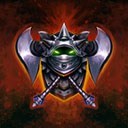 CooLTanG1 votes
I think they look like Garbage cans
 Arkas1 votes
I'm sure soon enough no one will care. They just stick out a little because they've changed.
 Jeddy0171 votes
I imagine the cupcake turret are there because of the SR update.So,yeah. They are here to stay.So let's us make cupcake jokes about the turrets now.
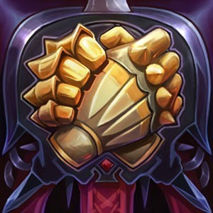 Gallowgrim1 votes
I like the new icons overall.
 ProjectRay121 votes
Reminds me of chess (like others) or a pack of cards.
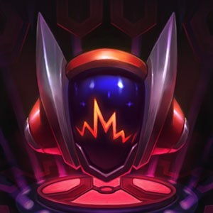 FantasySniper1 votes
I like them, they look like chess pieces :3