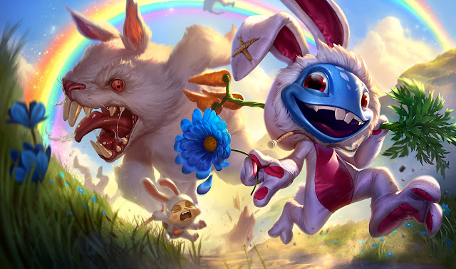
Problems With the New Fiora Art

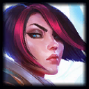
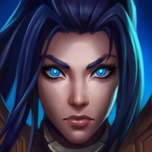
I want to start this by saying that I LOVE the new Fiora kit. It has a more duelist feel and it brings in a new mechanic that seems really unique and fun, so I commend the rework team for creating something awesome. The art, on the other hand, is honestly pretty bad. She looks like some over-exaggerated disney villain. My suggestion to fix her new design is to bring back her old hairstyle (because the new one honestly is shit) and to tone down the features of her face. Old Fiora had a really soft face that was fairly unique, why make it worse looking by accentuating her cheekbones so much? Look at Royal Guard Fiora. That is what her face and hair should look like (except with the pinkish-red streak on her other skins instead of that weird pale pink she has now). Thoughts?






 is on the splash team