
Skip to content

Lux Portrait Update

SteelShadow104··1 votes·722 views
https://support.riotgames.com/hc/en-us/article_attachments/217253547/elementalist-lux-portraits.png

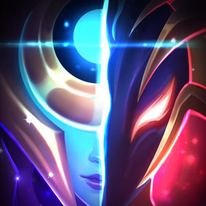
So whenever Elementalist Lux came out, everyone was hyped on how clean the graphics and particle effects were. However I was very disappointed in the portraits for Lux's different forms. They do not look professional and you can tell where they tried and didn't try (light form splash vs. the portraits). Is possible if we can get a more clean look to the portraits? I mean they look like they were fan made. Let me remind you, other than Sona, this is the most expensive skin and is supposed to be an ultimate skin. So consumers would expect it to be perfect.

5 Comments

o0O Madoka O0o1 votes

I personally think they look alright. Which one stands out the most for you as unclean?

SteelShadow1041 votes

Nature for sure, air, ice, and mystic (they honestly are that bad). I just don't like them because they have no life to them, they are flat with no shine to it unlike something like this [] (http://vignette2.wikia.nocookie.net/leagueoflegends/images/b/be/Lux_SpellthiefSkin.jpg/revision/latest?cb=20160720005304)

Fire and water are the only ones that somewhat have it

o0O Madoka O0o1 votes

{quoted}

Nature for sure, air, ice, and mystic (they honestly are that bad). I just don't like them because they have no life to them, they are flat with no shine to it unlike something like this [] (http://vignette2.wikia.nocookie.net/leagueoflegends/images/b/be/Lux_SpellthiefSkin.jpg/revision/latest?cb=20160720005304)

Fire and water are the only ones that somewhat have it

Nature is actually one my favorite up there with water. I dislike air/ice too.I notice you prefer the ones with shadows on the face, and dislike the ones with less. Maybe it's a screen gamma issue. People see differently on the different screens.

I first noticed when people talking about ranked borders, I really liked the platinum boarder, but most people hate it.

Then I see it on my friends' computer, it actually looks crap. The boarder isn't as shinny and colorful as it looks on mine.

Same goes with the winter map. It looks really nice when I tune the monitor to a warmer tone, but it hurts my eyes when my monitor is at its default blue-biased white.

SteelShadow1041 votes

I have looked at them on multiple different screens before, no diff

Really the only reason why i don't like these is because they look like they were drawn in crayon.

Sukishoo1 votes

I think they look great.

More from Gameplay

More by SteelShadow104