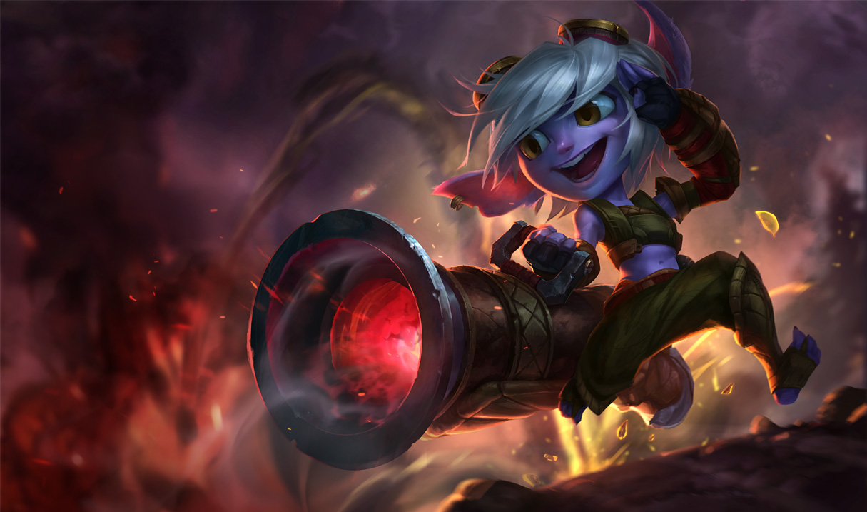
New Tristana splash on PBE (2/13)
I'd say an improvement over the first post-VU one, but can't help but feel she looks a bit like Voyboy....
What do you guys think?
I'd say an improvement over the first post-VU one, but can't help but feel she looks a bit like Voyboy....
What do you guys think?
 ModKnightsKemplar5 votes
Eh... I dunno. This one looks more like her in-game model, so that's at least consistent. The thing isn't that either of the new splashes are bad... It's just that the first splash they re-did for Trist was AMAZING. It will always be my favorite splash that they ever did. It's perfect.
So, no matter how good these are, it just feels like they will never measure up. No offense to the artist who did them, but I REALLY dig the one live currently.
 MrBuffington2 votes
haha yea, me too; honestly though, I'd be fine if they just took her concept art and used it as her splash, even if it's not that 'action pose' they seem to be gravitating towards with their splash arts. Her first updated splash though, really had me thinking hard about using her base skin or rocket girl Tristana; probably sticking with rocket girl Trist unless they do a third update
 Dustogrei1 votes
It's funny cause had they never released that first splash remake then we would probably all be happy - why release a splash if you were planning on completely changing her design afterwards in a VU? They messed up big there.
MrBuffington1 votesWell at this point I'm mostly comparing her to her VU concept art, but same thing applies I guess?
 JamDubs4 votes
I'm... Gonna be flat honest here. I think the first updated splash was better. Artistically, this one is superior, yes. More detail, pushing the boundaries of things more.
But her face straight up looks disfigured. I might get flak for this, but I'd honestly prefer the original update. http://4.bp.blogspot.com/-3vzbLyDxBjs/VMGcFG_v29I/AAAAAAAAiO4/zhe4Zl2Iatw/s1600/Tristana_Splash_0.jpg
MrBuffington1 votesFair enough; my preference still lies with the original updated splash (before her VU) and her VU concept art. I don't think either of the new splash arts really match the VU concept art, but imo the second is a bit closer.
JamDubs1 votesThey really don't match the concept art, I'll agree there. Though obviously I disagree on the second one being closer.
It might be a sort of "uncanny valley" thing I'm seeing, where they tried too hard to make her face look more detailed. But it apparently is just me, as others don't seem to feel the same. Ah well, such is the fickle things that are opinions.
One improvement based entirely on lore-preference I see in the new one is that Tristana now has a visible layer of fur. If they go this route, it at least confirms that all yordles have fur, just varying amounts. Still, the expression, the eyes, the hair, the ears that are even larger than before... It just does not look right to me.
MrBuffington1 votesI feel like there's just this difficulty translating her concept art into this sort of hyper detailed splash art. It's weird. I think expression she has in the first one better matches her personality (though I think her current live splash has the best expression) but the art of this new one better matches her anatomy. I don't know, lol.
 Only Play Darius4 votes
Definitely better than the first, but the current  splash art is just so perfect in everything that there is really nothing Riot can do to make an acceptable replacement.
Sometimes it's better NOT to get it right the first time.
Dustogrei2 votesCompletely agree.
MrBuffington1 votesI mean, I guess they can re color it and change her clothes, lol, but I'm mostly comparing it to her concept art, less her live splash
 Kella3 votes
[deleted]
MrBuffington1 voteshaha I know that feel. It reminds me a lot of Voyboy, I don't know why...
 Bloore2 votes
Looks a million times better.
I still prefer the old Trist though.
MrBuffington2 votesHaha same, that was one of my favorite splashes ever.
 Sukishoo2 votes
I like her body shape more in the new one but liked her face more in the old one http://media-titanium.cursecdn.com/attachments/64/534/635576183666180819.jpg
 DMC750012 votes
Okay, I can see the problem now. The eyes, the teeth, and the ears.
That's what concerns me.
MrBuffington1 votesHer eyebrows (and perhaps her eye shape), smile, and fur color seem off to me. Fur is a little too purple imo, not bluish like in the concept art.
 Forbidden Siren2 votes
She looks better. Definitely better. The other version looked goofy. This one felt more... less cartoony. If that makes any sense.
 disregardable1 votes
They fixed the issue where she wasn't looking at the fire. Could use more explosiony effects and less just "fire", and she still looks disgustingly cartoony.
MrBuffington1 votesI think it's closer to the concept art (which I love personally), but still isn't quite there yet.
 Sharjo1 votes
I like it! Way more polished and looks great! Seems like it could use a bit more polish though...maybe I'm just delusional. I dunno, seems like there's a bit of lacking definition, particularly around Trist's face and chest, but yeah other than that this looks bad ass!
MrBuffington1 votesIt just hasn't really captured my attention like her VU concept art did; I'd say an improvement, but there's room to improve
Jeddy0171 votesWell I like it.I say keep it.
 Purodyuusaa1 votes
I like the anatomy of the new body, but I'll forever miss her tiny yordle mittens.
Rip.
Critique wise, her right (our left) cheek is chubby, or at least it appears that way since her other cheek has a crease from where her mouth turns upwards. I'm not sure how I feel about the eyes and whether or not they're throwing me off. I don't care much for her lashes at least and much more prefer the direction the concept and the other splash art took.
 Grand Viper1 votes
Is she blowing up Noxus?!
 Duke Anax1 votes
Definitely better then the first try, but while fixed a lot of the previous issues they actually intoduced some new ones.
I feel a lot more comfortable looking at her face (not this loony toons/ uncanny valey thing) And her Body has the appropriate bulk now ( no longer head on a stick)
However her ears are too big, her left bracer is too small and her ankle is almost non existant. These were all right in the last splash.