Cosmic Blade Master Yi Analysis

 Hello! This is my first discussion post here!
As someone who mains Master Yi, using different skins, and having spent many hours playing this champion, I believe that I can provide some useful insight to the further development for this skin.
For clarity's sake, I'll be using this video here as a reference for which I'm making this analysis. https://www.youtube.com/watch?v=QVCVGNW6WgU&t=48s
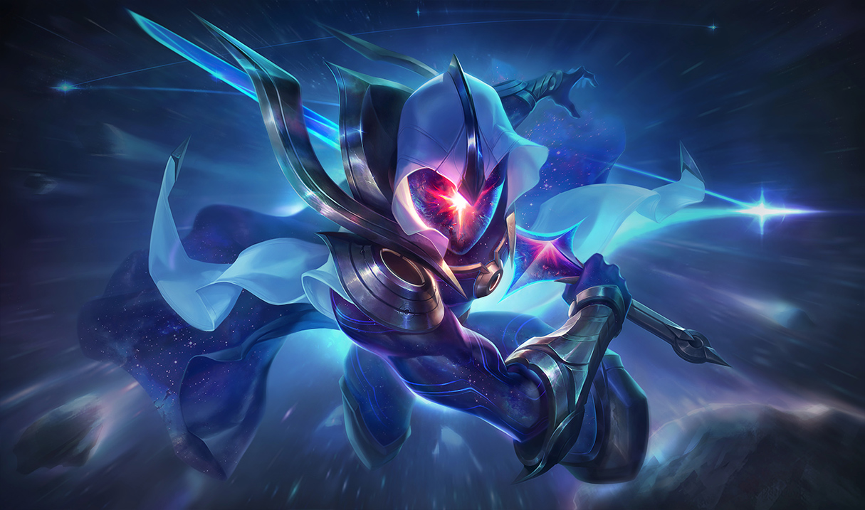
https://3.bp.blogspot.com/-e1pTAMpRimw/WO57ZoLe1EI/AAAAAAAAiNk/Be76FciSRzUbswLMuGiPEC1mw9QUU5hNgCLcB/s1600/2581731c6273b456.jpg Splash Art This...is...Awesome!
Colors
-
When comparing these colors with Cosmic Raver Kassadin's, you can clearly see some differences even though the colors should be more consistent across the cosmic skins.
-
This skin's E may not be noticeable enough. The other yi skins have a very clear color change when his E is active whereas this skin's is much less impactful.
-
On the "cape" for this skin, the cosmic elements should be more noticeable. Cosmic Reaver Kassadin's cape has this effect much more pronounce.
-
When getting a kill in "ultimate form" the blue color indicating that you got a kill is kinda lost within the ultimate's blur.
-
The metal coloring, such as that on the feet and shoulder, should be consistent throughout the entire skin. (I noticed that the metal on the lower half of this skin is a bit darker, perhaps to create the illusion of a shadow?)
Sounds
-
The sounds when using his Q don't sound impactful enough. It sounds more like metal is hitting metal when it should sound epic as if Master yi is creating a constellation. Perhaps the sound should increase in pitch after every hit to signify that Master yi has jumped to the next target (slightly).
-
The sounds for this skin's W is horribly similar to sounds bard would make. There should be a bigger difference or more distinction to set this skin apart in this regard unless this is what you're going for of course which is fine.
-
Master Yi's ultimate sounds too much like Sion's ult sound.
**Animation **
-
The recall animation is pretty awesome although it's lacking the constellations in the background like Cosmic Raver Kass.
-
The Q appears a bit slow (not a deal-breaker)
**Design **
-
The in-game skin should look as close to the splash art as possible. The splash art shows the sword a certain width and that should be matched in-game as well. (I prefer the splash art's thinner design).
-
The overall build/artwork of the skin is nice and isn't too chaotic but the various holes on this skin may be a bit too pronounced. I'd suggest shrinking the holes slightly to take the focus off of them so the rest of the skin can shine.
Positives
-
The W and R animations as well as the hit splashes are near perfect (Maybe a tiny tweek here and there on the ultimate).
-
The extra attention to detail regarding the voice changes.
-
The color and design choices, regarding the clothes, is excellent along with the star for an eye.
Idea
- I hope the sound for Master Yi's ultimate is global (everyone in the game can hear it if they're close enough).
Overall, I think it's a great skin but it has more potential than this. I keep bringing up Cosmic Reaver Kassadin because I believe the inspiration for this skin should be taken from that one. I mean just look at this skin. https://www.youtube.com/watch?v=m1m8-_sxYc0 It's so much more high quality than Cosmic Blade Master Yi's is atm and is the same price 1350RP. It doesn't really feel fully like a Cosmic master Yi in it's current state. I know it's only a teaser but I hope you guys can greatly improve this skin for release.
Thanks for taking our feedback!
If you agree with the above then be sure to +1 this post so it can get recognized!